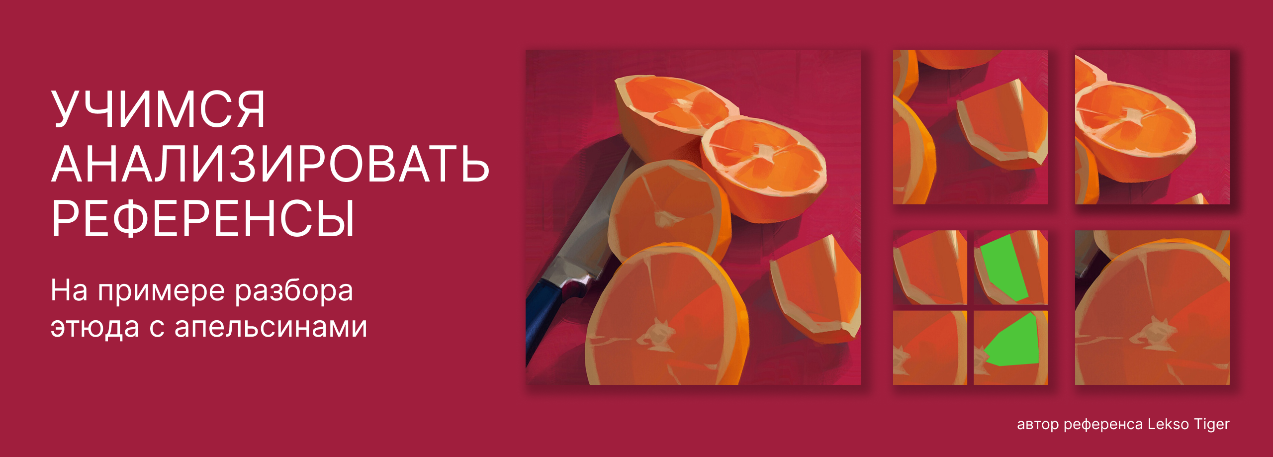
It is important for beginning artists not only to look at other people’s work, but also to analyze it, to note what attracts them and what techniques the author used. This deliberate approach coolly develops a keen eye and helps you find your own style in drawing, digital graphics, illustration.
How to properly analyze references for painting – read in the material from the curator of Skills Up School courses on 2D and Digital Painting Anna Kholomkina.
We’re going to analyze an etude with oranges by Lekso Tiger.
Composition
The composition is based on a triangle. We start with the knife – in tone and shade it is the most contrasting, the most noticeable. The blade points to the distant orange, from it we move to the orange in the foreground: the fruit closer to us becomes larger. Next, in contrast in scale and shape, notice the triangular piece on the right, and from it we go back to the background again.

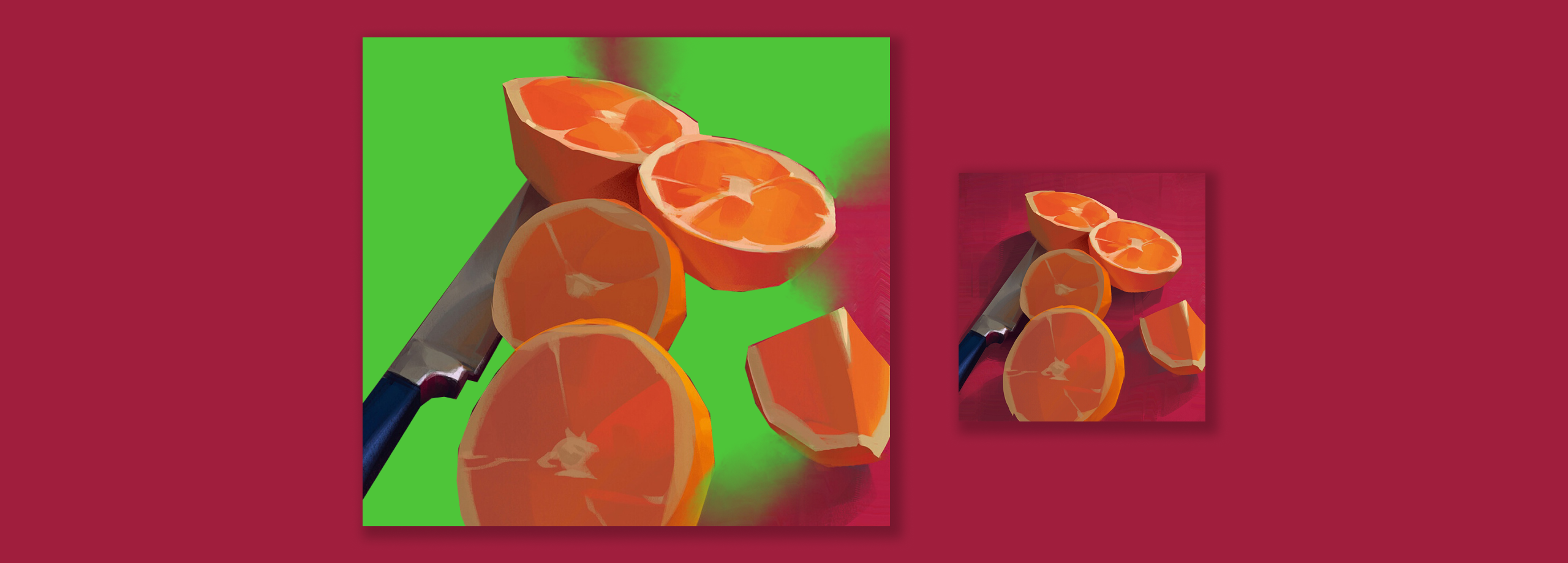
Some parts are partially (knife) or completely (slice) separated from the total mass, forming negative spaces – these are the gaps between objects, what we get if we mentally invert the silhouettes. Also called counterforms – used wisely, they visually enrich the work.
Detailing
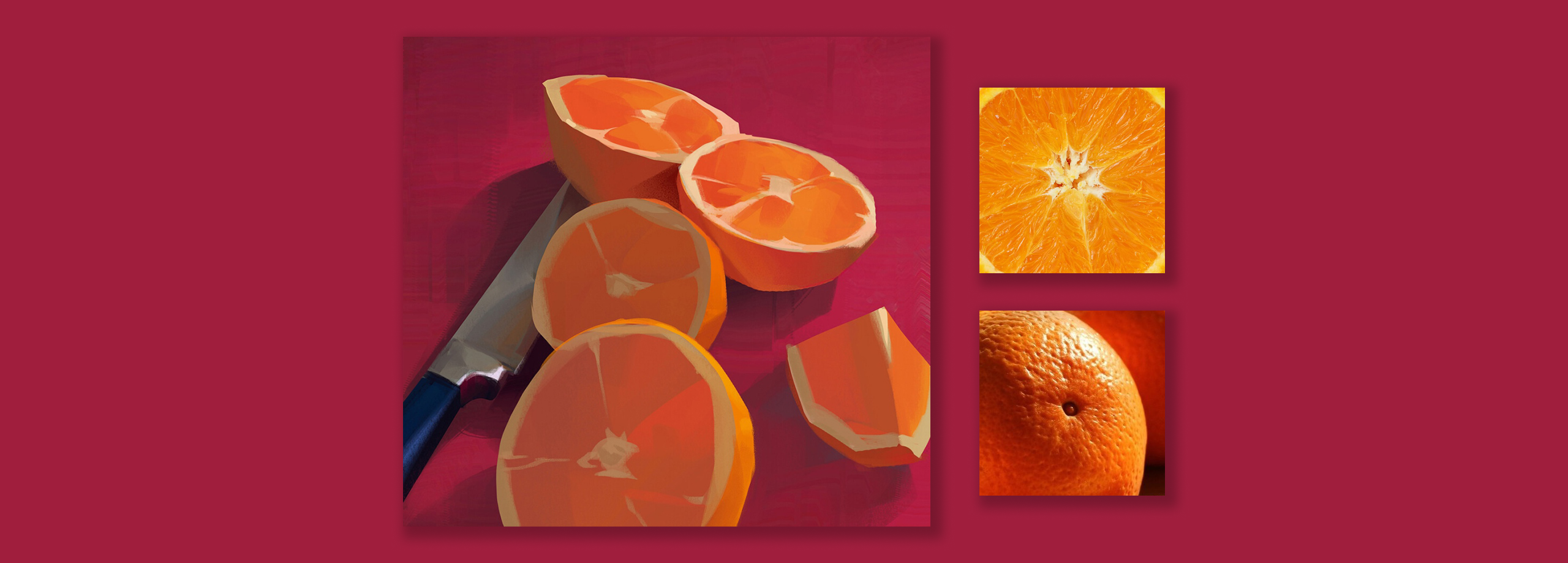
The detailing is minimal: there are no textures on the oranges, only the largest veins are left, the silhouettes are slightly cropped, which is reasonable – this is a study, an exercise in tone, color, light, composition. It turns out that the picture does not automatically copy reality, but emphasizes and sharpens exclusively its most remarkable features.
Heat coldness
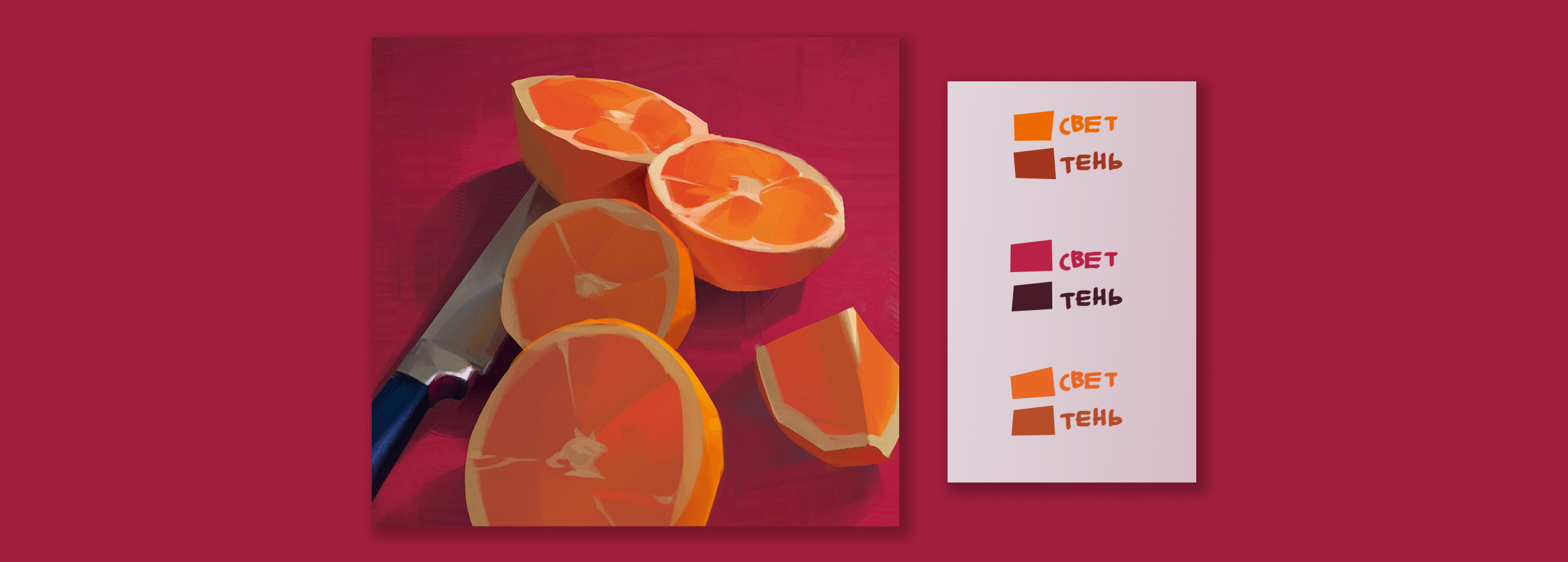
Checking heat-coldness: the light is warm, the shadow is cold. This is best determined by the lighted and shaded parts of the same material, otherwise it is easy to get confused.
For example, the rind color is a bright orange-yellow in the light, but a deeper reddish color in the shade. This is where changing the Saturation scale comes into play. If the saturation of a color from the warm part of the color spectrum increases, it seems warmer to us, while it decreases – cooler.
Thus, it is not necessary to use radically opposite colors for light and shadow areas, but rather to play on the nuances. To be sure, you can double-check yourself by comparing the shades in shade and light on the orange pulp and the raspberry background backing.
Not gray gray gray
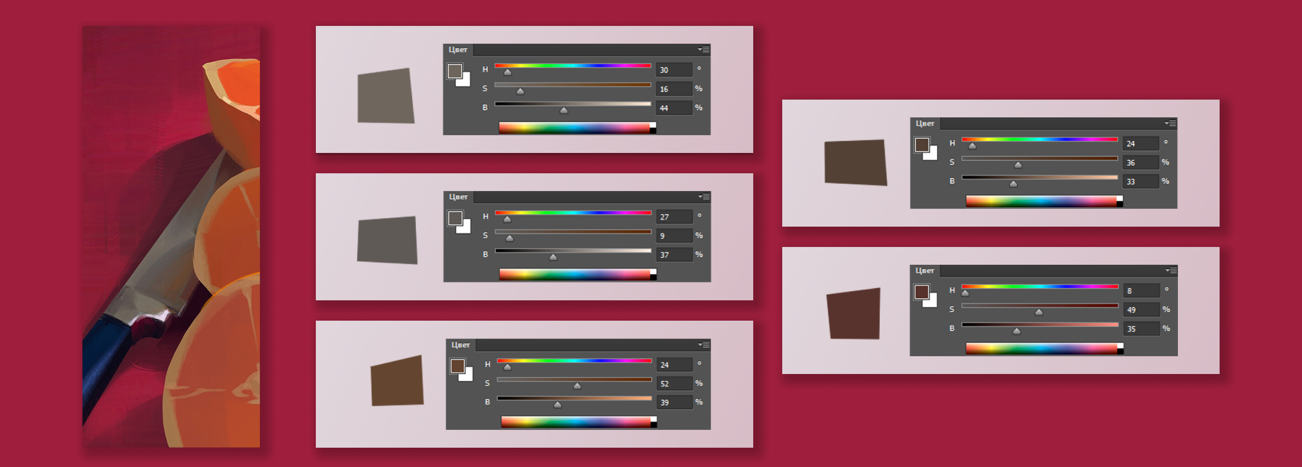
It looks to us like the blade of the knife is gray, but that’s not quite true. By itself, gray is rarely used in painting, it is usually given at least a minimal tint.
So it is here: the seemingly gray detail is painted with derivatives of yellow and orange, only the saturation is minimal. It is these colors that make up the environment of the knife, which due to its material (glossy metal) reflects neighboring objects. And because of the very low saturation against the lush surroundings, the blade appears gray.
Reflexes
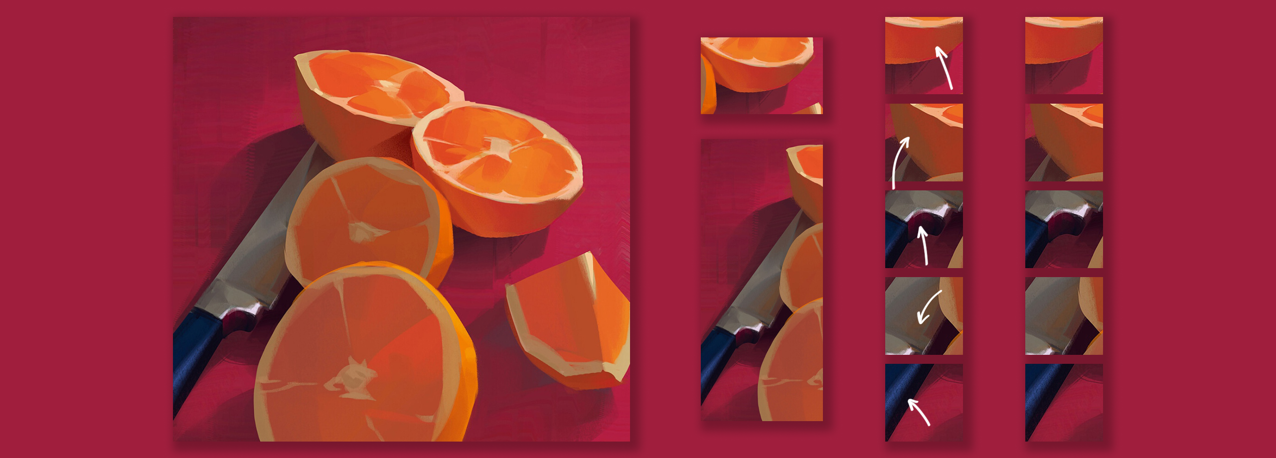
Reflexes appear on all objects, unite them and as if to help neighboring colors to make friends. Without them, the depicted fruit, knife and background would look alien to each other.
Reflexes can be seen on the orange peel (from the raspberry backing and from the grayish blade), on the blade from the backing and the adjacent citrus. Even the dark edge of the knife is slightly off purple – that’s the reflex effect too!
SSS
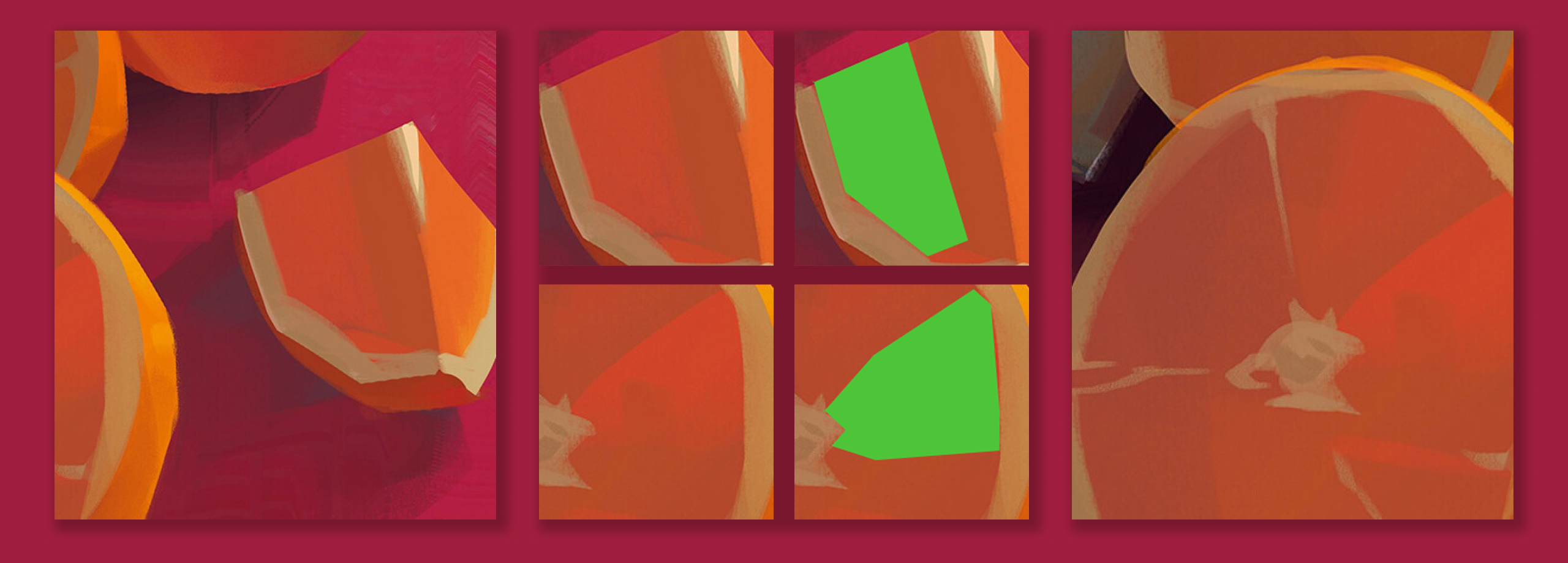
Organics have an inherent SSS effect – subsurface scattering – which is the subsurface scattering of light. The light passes through the translucent body, but does not shine through it, but as if stuck somewhere inside, and because of this we see a spot of greater saturation.
Here such a thing is noted by the author as an important characteristic detail and emphasized by a stroke on the orange pulp. And the same veins don’t have SSS on them because they are denser and don’t let light through.
Brush
And finally, let’s deal with the brush. To do this, you need to study the work carefully, paying attention to the end of the stroke and the edges of objects – often in such places the shape of the brush is more obvious.
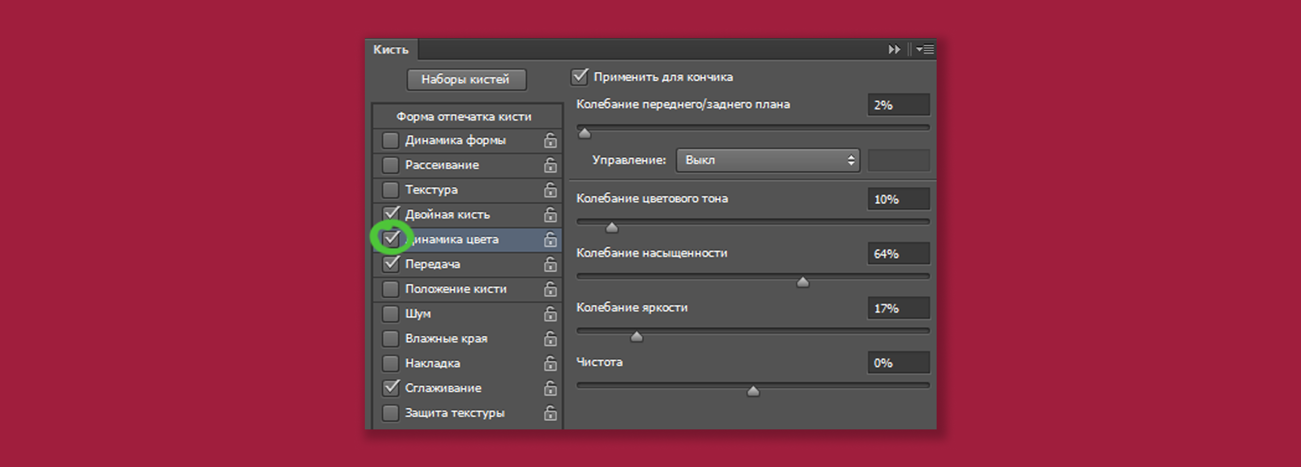
For example, a transfer brush (responsive to pressure) and a slight dynamic shape (the brushstroke becomes thinner when lightly pressed) was used here – this is noticeable on the central part of the orange. The brush is textured – you can tell by the larger strokes.
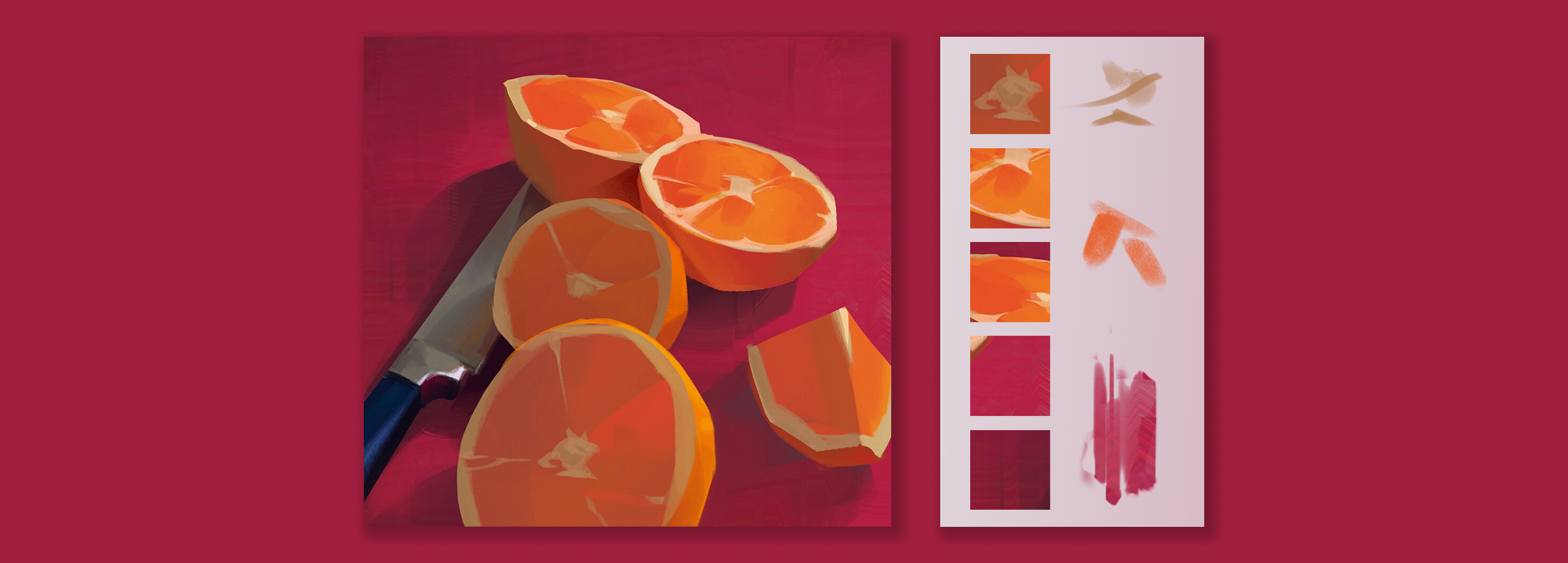
And for the background, to brighten up the homogeneity of the shade, a brush with color dynamics was chosen. But prescribed the background very carefully, literally in a couple of the most empty places – here, the main thing is not to overdo it, otherwise there is a risk of getting too motley.
In Digital Painting courses, we learn how to analyze useful references for artists and illustrators, and then use what we learn in our own work. Learn about the program and sign up:
