ArticleUpdated: July 2, 2026
Color theory in painting: the art of using color
In short
Color theory is the science of the nature of color and light. In painting, it plays a key role, determining the emotional perception of the picture.
2D artist
Color theory is the science of the nature of color and light. In painting, it plays a key role, determining the emotional perception of a picture, its atmosphere and composition. When used correctly, color can serve as a powerful tool in an artist's arsenal.
In this article, we will reveal the secrets of color harmony. Let's go!
 Johannes Itten's color wheel
Color temperature is a concept that helps to determine how color is perceived in the context of emotional and visual perception. Colors are divided into warm and cold, which affects the atmosphere and mood of the image.
Warm colors (red, orange, yellow) create a feeling of warmth, light and energy, while cool colors (blue, green, purple) convey calmness, coolness and distance. These groups of colors play an important role in conveying the space and mood of the picture.
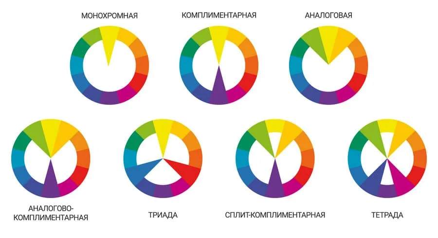
Color harmonies are the principles and methods that are used to create aesthetically pleasing and balanced combinations of colors.
Complementary colors (opposite each other on the color wheel) create a bright contrast, while analogous colors (located next to each other) provide a softer and calmer look. There are many types of color harmonies, here are some of them:
Johannes Itten's color wheel
Color temperature is a concept that helps to determine how color is perceived in the context of emotional and visual perception. Colors are divided into warm and cold, which affects the atmosphere and mood of the image.
Warm colors (red, orange, yellow) create a feeling of warmth, light and energy, while cool colors (blue, green, purple) convey calmness, coolness and distance. These groups of colors play an important role in conveying the space and mood of the picture.
Color harmonies are the principles and methods that are used to create aesthetically pleasing and balanced combinations of colors.
Complementary colors (opposite each other on the color wheel) create a bright contrast, while analogous colors (located next to each other) provide a softer and calmer look. There are many types of color harmonies, here are some of them:
 Color harmonies
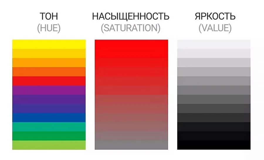 Hue (or color tone) is the main color that we see. It determines what color is perceived, whether it be red, blue, green and so on. Hue is the main characteristic by which we distinguish colors.
 Example of color tonality
Working from nature helps an artist to better understand and feel color, as it allows you to observe its real nuances and interactions in natural light. This practical immersion develops eye-sight, increases the accuracy of color reproduction and deepens the emotional perception of shades. It is not for nothing that studies from nature are one of the most important components of the Digital Painting course.
Example of color tonality
Working from nature helps an artist to better understand and feel color, as it allows you to observe its real nuances and interactions in natural light. This practical immersion develops eye-sight, increases the accuracy of color reproduction and deepens the emotional perception of shades. It is not for nothing that studies from nature are one of the most important components of the Digital Painting course.
Basics of color theory
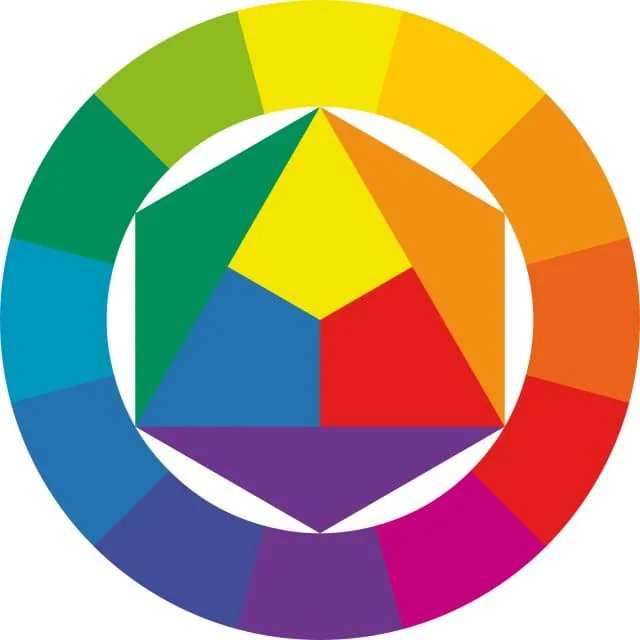
The color wheel is the main tool of color theory. Color wheels help to visualize how colors interact and combine, allowing for the creation of more harmonious combinations. There are many variations of color wheels and color schemes, but most often artists refer to the color wheel developed by Johannes Itten. Itten developed the color wheel as part of his teaching methodology at the Bauhaus. He emphasized the practice and use of the color wheel for educational purposes, which contributed to its spread in educational institutions and design. The twelve-part color wheel includes primary colors (red, blue, yellow), secondary (complementary) colors (orange, green, purple) and tertiary colors (the remaining colors obtained by mixing the colors of the first and second orders).
Johannes Itten's color wheel
Color temperature is a concept that helps to determine how color is perceived in the context of emotional and visual perception. Colors are divided into warm and cold, which affects the atmosphere and mood of the image.
Warm colors (red, orange, yellow) create a feeling of warmth, light and energy, while cool colors (blue, green, purple) convey calmness, coolness and distance. These groups of colors play an important role in conveying the space and mood of the picture.
Color harmonies are the principles and methods that are used to create aesthetically pleasing and balanced combinations of colors.
Complementary colors (opposite each other on the color wheel) create a bright contrast, while analogous colors (located next to each other) provide a softer and calmer look. There are many types of color harmonies, here are some of them:
Color harmonies
Historical context
- Classical painting. In classical painting, for example, in the works of the Renaissance, color theory was aimed at creating realistic and balanced images. Artists used colors to convey volume, light and shadows.
- Impressionism. Impressionists such as Claude Monet and Pierre-Auguste Renoir revolutionized the use of color, paying attention to how light changes the perception of color. They used bright, saturated colors and short strokes to convey momentary sensations.
- Modern and postmodern. In modern and postmodern, artists often played with color to create an emotional or conceptual effect. Artists Vincent van Gogh and Mark Rothko used color to express their inner experiences and ideas.
Main characteristics of color
Hue (or color tone) is the main color that we see. It determines what color is perceived, whether it be red, blue, green and so on. Hue is the main characteristic by which we distinguish colors.
Saturation
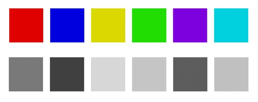
Saturation, also known as intensity or purity of color, determines how pure or gray a color is. This is a characteristic that describes the "brightness" or "darkness" of a color. With high saturation, the color looks bright and intense, with low saturation the color becomes more muted and gray. For example, pastel tones or colors diluted with gray have low saturation.Brightness (Value or Brightness)
Brightness describes the tonality of color, how light or dark it is. Each color has its own tone. If you take colors with the same brightness and saturation, but a different hue, then they will be very different in tone. For example, yellow is itself quite bright in tone, red is dark, and blue or purple are very dark.
Example of color tonality
Working from nature helps an artist to better understand and feel color, as it allows you to observe its real nuances and interactions in natural light. This practical immersion develops eye-sight, increases the accuracy of color reproduction and deepens the emotional perception of shades. It is not for nothing that studies from nature are one of the most important components of the Digital Painting course.
Psychology of color
Related courses
All courses
from 3 900 ₽
-57%
Book illustration: The first page page
9 000 ₽3 900 ₽
Learn more

from 12 000 ₽
-20%
Векторная иллюстрация для начинающих
15 000 ₽12 000 ₽
Learn more

from 4 500 ₽
-55%
Character Concept: My First Hero
10 000 ₽4 500 ₽
Learn more
Color has a significant impact on the perception and mood of the viewer. It has been proven that color has a psychological impact. Considering these points, an artist can create truly strong emotional works.
Here are some examples of the influence of color on emotions:
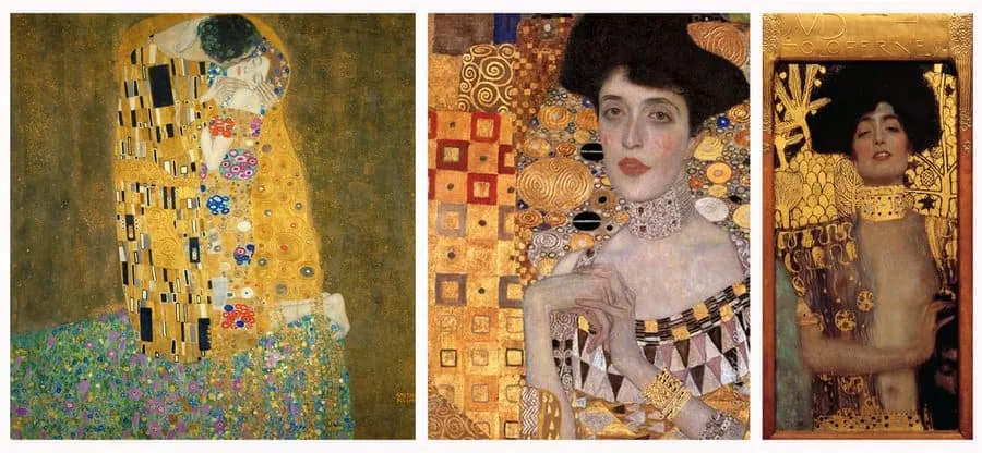 Gustav Klimt is known for using golden shades, as well as bright decorative elements
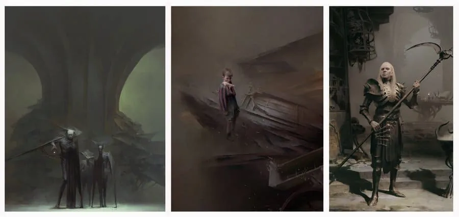 Piotr Jabłoński, on the contrary, is distinguished by a muted gray-brown color scheme. He actively works with nuances
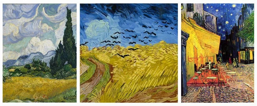 Vincent van Gogh is famous for his love of combining blue and yellow
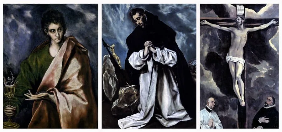 Works by El Greco are characterized by high contrast and a combination of blue and black colors
The influence of color on the atmosphere and mood of the picture we study in more detail on the course Digital Illustration.
Works by El Greco are characterized by high contrast and a combination of blue and black colors
The influence of color on the atmosphere and mood of the picture we study in more detail on the course Digital Illustration.
 The predominance of black and orange in the design of Deathloop
Overwatch has a distinctive visual style that uses a bright and saturated color palette. Colors help to distinguish characters, maps and visual effects, creating a clear and recognizable style.
The predominance of black and orange in the design of Deathloop
Overwatch has a distinctive visual style that uses a bright and saturated color palette. Colors help to distinguish characters, maps and visual effects, creating a clear and recognizable style.
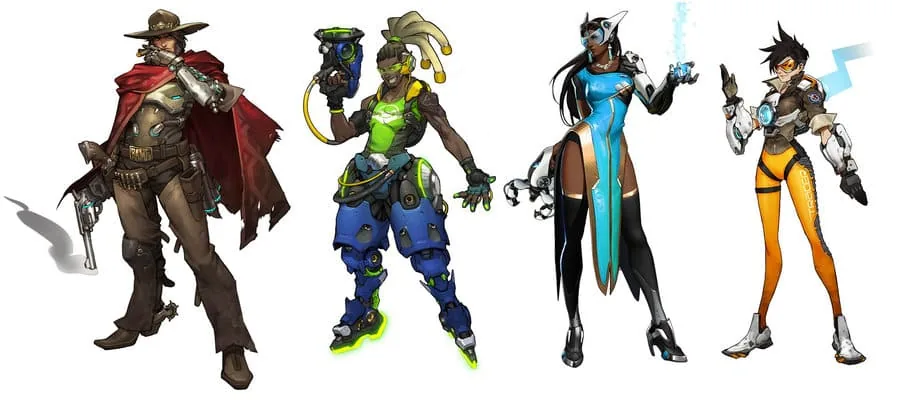 Highlighting characters with color in Overwatch
 Color scheme in the animated film Ratatouille
In the films «The Matrix» the characteristic color scheme includes shades of green, black and blue. In the scenes taking place in the matrix itself, the green color dominates, creating a feeling of technological distortion. In the real world, on the contrary, a cold palette with gray and blue shades is used, which enhances the feeling of gloom and oppression. This contrast helps to emphasize the difference between the two worlds and the mood of each of them.
Color scheme in the animated film Ratatouille
In the films «The Matrix» the characteristic color scheme includes shades of green, black and blue. In the scenes taking place in the matrix itself, the green color dominates, creating a feeling of technological distortion. In the real world, on the contrary, a cold palette with gray and blue shades is used, which enhances the feeling of gloom and oppression. This contrast helps to emphasize the difference between the two worlds and the mood of each of them.
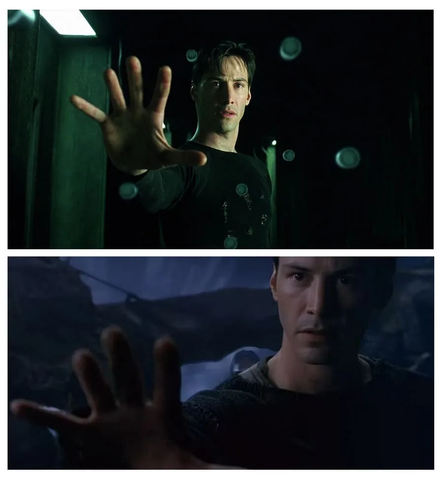 Enhancing the difference between the two worlds with color. Green Matrix and blue real world.
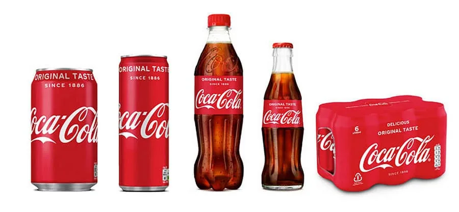 The predominance of red and white in the design of Coca-Cola.
Minimalistic design and the use of neutral and metallic colors in Apple products help to create a feeling of premium and elegance. The color palette contributes to the creation of a unified image and enhances the brand identity.
The predominance of red and white in the design of Coca-Cola.
Minimalistic design and the use of neutral and metallic colors in Apple products help to create a feeling of premium and elegance. The color palette contributes to the creation of a unified image and enhances the brand identity.
 Minimalism in the colors of Apple products
So, we figured out how much color can influence the recognition, readability and expressiveness of a work, a whole project or brands.
Minimalism in the colors of Apple products
So, we figured out how much color can influence the recognition, readability and expressiveness of a work, a whole project or brands.
- Red is often associated with energy and passion;
- Blue can create a sense of calm and tranquility;
- Yellow can evoke joy and optimism;
- Harmonious colors (analogous colors used together) create a sense of consistency and calm;
- Contrasting colors (complementary colors) can add dynamism and tension, making elements more expressive.
Symbolic meaning of color
Color can carry a symbolic meaning that helps to reveal the artist's замысел:- Symbolism of color. For example, white can symbolize purity or innocence, and black — mystery or mourning;
- Cultural associations. Colors can have different meanings in different cultures, which can also be used to enhance the conceptual aspects of the picture.
- Emotional mismatch. Incorrect choice can distort emotions and reduce expressiveness;
- Problems with depth and spatial perception, which can lead to flattening of the image, lack of planning and air. Objects can merge with each other or be too irritating and repulsive;
- Symbolic and cultural misunderstanding. Incorrectly chosen colors can convey the wrong or undesirable message — consider this when working with your audience and fulfilling commercial orders.
Gustav Klimt is known for using golden shades, as well as bright decorative elements
Piotr Jabłoński, on the contrary, is distinguished by a muted gray-brown color scheme. He actively works with nuances
Vincent van Gogh is famous for his love of combining blue and yellow
Works by El Greco are characterized by high contrast and a combination of blue and black colors
The influence of color on the atmosphere and mood of the picture we study in more detail on the course Digital Illustration.
Color and brand recognition
Color also plays a key role in creating and strengthening the identity of projects and brands. It helps to establish a unique visual style and make the project easily recognizable. Let's look at a few examples.Games
Deathloop uses rich and contrasting colors to create a stylish and memorable visual image. The main color accents include bright shades of orange, red and black, which contrast with more neutral backgrounds. The color palette supports the atmosphere of retro-futurism of the 1960s in an alternative universe.
The predominance of black and orange in the design of Deathloop
Overwatch has a distinctive visual style that uses a bright and saturated color palette. Colors help to distinguish characters, maps and visual effects, creating a clear and recognizable style.
Highlighting characters with color in Overwatch
Cinema
The color palette in the animated film «Ratatouille» was carefully selected to create a cozy and colorful atmosphere of Paris. The use of warm shades of red, orange and brown helps to convey the atmosphere of French cooking and culture.
Color scheme in the animated film Ratatouille
In the films «The Matrix» the characteristic color scheme includes shades of green, black and blue. In the scenes taking place in the matrix itself, the green color dominates, creating a feeling of technological distortion. In the real world, on the contrary, a cold palette with gray and blue shades is used, which enhances the feeling of gloom and oppression. This contrast helps to emphasize the difference between the two worlds and the mood of each of them.
Enhancing the difference between the two worlds with color. Green Matrix and blue real world.
Branding and advertising
The red color in the logo and packaging of Coca-Cola has become a symbol of the brand and a recognizable element of its identity. Bright red color is associated with energy, passion and joy.
The predominance of red and white in the design of Coca-Cola.
Minimalistic design and the use of neutral and metallic colors in Apple products help to create a feeling of premium and elegance. The color palette contributes to the creation of a unified image and enhances the brand identity.
Minimalism in the colors of Apple products
So, we figured out how much color can influence the recognition, readability and expressiveness of a work, a whole project or brands.
At the end, we want to give you a few tips...
Study color theory! Knowledge in the field of color theory will become a solid foundation for building your artistic style. Get acquainted with the basics of the color wheel, the complementarity of colors on the example of various schemes. Analyze the works of masters. When studying the paintings of famous artists, pay attention to how they use colors. Try to determine which colors dominate in the work, highlight a certain gamut or combination, understand how color affects your perception of the picture. Try to work with a limited palette. Using a limited number of colors helps to focus on their interaction, develops a sense of contrast and harmony. Experiment with different color schemes (for example, monochromatic, complementary or analogous) to see how they affect the composition and mood of your work. Practice painting from nature: write sketches to develop the ability to observe and reproduce real color relationships. This will help you learn to better see and use colors in your works. Don't be afraid of mistakes. Analyze what didn't work out and find ways to correct and improve your work. Mistakes are an important part of the learning process.And to make learning even more effective, come to our courses:
Color theory in painting covers both theoretical and practical aspects of using color. Having mastered it, you will learn not only to create harmonious and expressive paintings, but also to form a unique style that will distinguish you from other artists. In each shade there is a unique story, and each color is a tool that can breathe life into your creativity. Do not be afraid to experiment and create boldly. Let each stroke become a step towards new heights!Related materials

Article
Basics of color theory and composition
December 27, 2024

Tutorial
How to draw a palm tree
September 18, 2023

Article
Digital painting. Skills of a modern artist
August 9, 2024

Article
Color theory for artists: complementary color scheme
September 18, 2023

Tutorial
Color in digital painting
February 13, 2025

News
NVIDIA рассказывает об изменениях в создании контента и рабочих процессах с использованием искусственного интеллекта
December 11, 2025