Color in digital painting
How to choose colors, create a harmonious palette and convey the atmosphere in digital painting. Tips, examples and practical exercises for artists.
Today we will delve again into the mysteries of color: how to choose a palette, create harmony, and make your works sparkle with new colors. Digital painting is a whole world of opportunities for self-expression and experimentation. Whether it's bright accents, soft transitions, or deep contrasts — color becomes the key that opens the doors to the vast expanses of creativity.
And yes, there will be a lot of practice and examples, so get ready not only to learn something new, but also to apply new knowledge in practice.
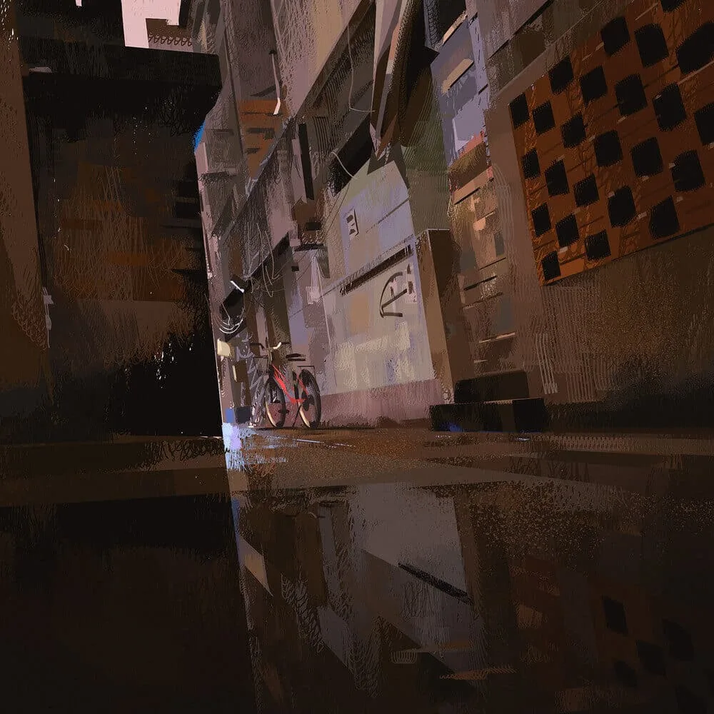
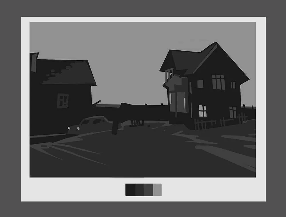
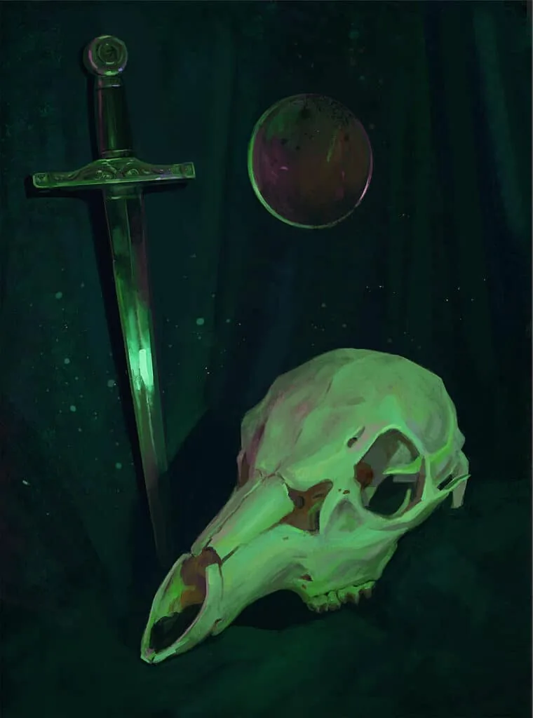 Work by student Alla Khodyushina, Digital Painting course
Why is color needed in digital painting?
Color in digital painting plays a key role, transforming simple shapes and lines into expressive, lively images. It helps create atmosphere, convey emotions, and highlight important elements of the composition. Color allows the artist to control the viewer's perception and focus attention on the right parts of the picture. It is important to understand how color interacts with lighting, shapes, and textures to create a harmonious and impressive work. In digital painting, color is not only about aesthetics, but also a powerful tool for storytelling and visual communication.
Step 1: Analysis of references
Before you start working, find references. These can be photographs, frames from movies, or paintings by other artists.
Analyzing the works of other artists is important, but not to copy someone else's ideas. This is the key to development and awareness of mistakes. First, you study how masters use color, light, composition, and what techniques they apply. Knowledge of these techniques helps to avoid stupid cliches and make your work unique. Second, analyzing references helps to better understand the context. Why did a particular artist choose this approach? What did he want to say with this color or lighting? And finally, you just expand your horizons. Even if you don't copy someone else's work, you learn to see in a new way. Each analysis helps you understand how you can make your style stronger and more interesting. Analyzing the works of other artists is an integral part of growth. You don't just look at paintings, you learn from masters. It's like learning from those who have already gone down this path. This allows you to understand what works and what doesn't. For example, why does one artist's light fall so interestingly, and another's — банально. And you begin to feel this, applying it to your own works.Besides, through analysis, we understand what lies behind each detail. It's like solving a puzzle. An exciting and затягивающий process. Analyzing the works of other artists helps to develop your own style, enrich it with new ideas. It's like getting mental tools that will help you improve.
 Copies are one of the cool ways to learn from your favorite artists. Trying to repeat their manner, you unravel the sequence of work from the inside. In the example above — educational copies from fragments of paintings by artists Sergei Kolesov and Andrey Surnov.
When choosing photo references for painting, it is important to pay attention to several key points so that your work does not become just a copy, but comes to life on the canvas.
Lighting. This is probably the main thing. Light and shadows determine the atmosphere of the picture. Pay attention to how light falls on objects — this will help you create the right mood and volume. Look for photos with interesting light accents, contrasts. They can add dynamics and depth to your work.
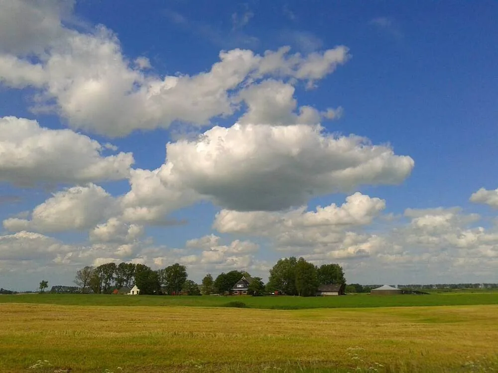
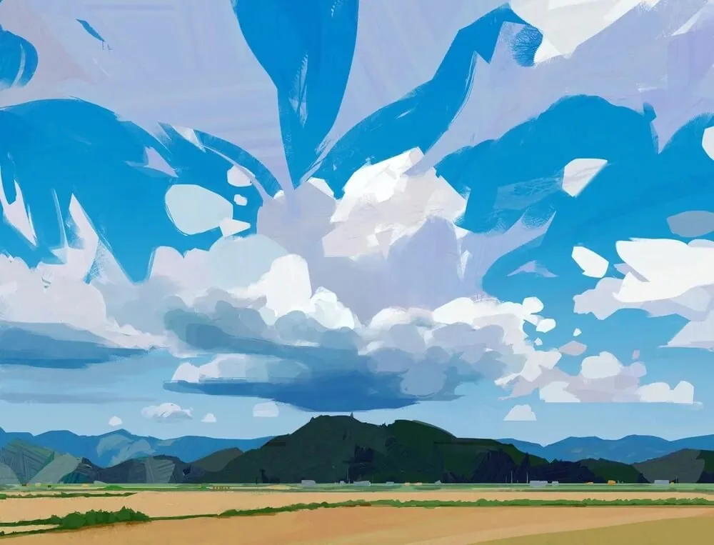 Work by Fatima Mandouh and an example of a reference that would be suitable as the basis for a similar picture. The author skillfully enhances the strong features of the reference, making the sky richer and adding dynamics to the clouds.
Composition. Think about how the elements in the photo are placed in the frame. Where is the compositional center? Where is the empty space and rest zone? A well-balanced composition in the reference can give you ideas for the structure of your work and help you avoid chaos.
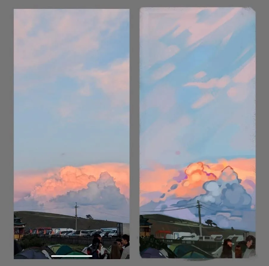 The lower third of the work is filled with details, a bright cloud, enhanced by color accents, becomes the focal point for the viewer. The remaining two-thirds of the work is occupied by a simple, soft sky, supporting the balance in the composition. Work by student Ksenia Yuryeva, Digital Painting course.
Color. This is also critically important. Colors in the reference can be a source of inspiration for your palette. Pay special attention to how different shades interact with each other. Sometimes unexpected combinations can give an interesting result.
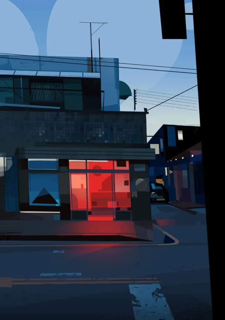 Subdued cold gamma with an accent in the form of red light, work by Patricio Betteo
Textures and details. If you are working with a certain surface, texture, or fabric, pay attention to how it is displayed in the photo. This will help you convey naturalism.
 Masterful work with textures in the painting by artist Lea Pinto
Angle and perspective. Think about from which angle you want to show the object or scene. Photos with an interesting perspective can add depth and dynamics to your work. So choose references with interesting angles.
 Static and dynamic perspective in the works of Yun Ling
In general, choose a photo that inspires you and that helps you reveal the atmosphere and emotions that you want to convey in painting.
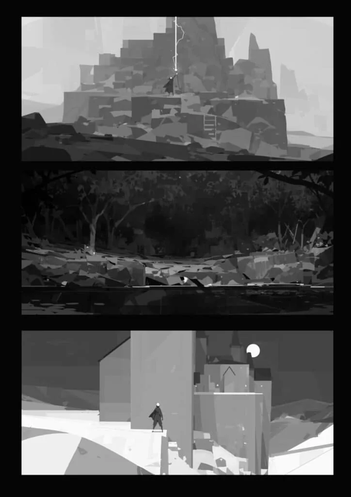
Step 2: Creating a black and white sketch
Color is important, but don't rush to start with it. First, create a tonal composition.
How to do it:
- Draw a sketch of the scene using only three tones: light, medium, and dark.
- Determine where the main light sources and shadows will be.
- Make sure the composition is readable even without color.
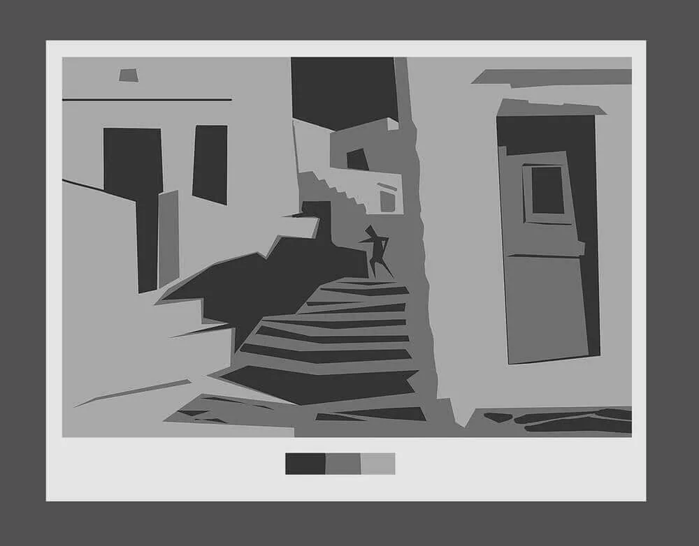
 Tonal sketches. Work by student Solomona Darya.
Tone in painting is one of the most important things, because it is tone that determines the volume and depth of your work. If you do not work out the tone, the picture will be flat, like cardboard.
Tone helps to understand where the light and dark areas are, and how they interact with each other to create illumination and shadows. In general, if the tone is not thought out, the whole composition can lose its meaning and atmosphere.
Tonal sketches. Work by student Solomona Darya.
Tone in painting is one of the most important things, because it is tone that determines the volume and depth of your work. If you do not work out the tone, the picture will be flat, like cardboard.
Tone helps to understand where the light and dark areas are, and how they interact with each other to create illumination and shadows. In general, if the tone is not thought out, the whole composition can lose its meaning and atmosphere.
When creating a tonal sketch in a digital drawing, everything starts with basic steps, and they can be different depending on what you want to get in the end.
Main tone layer. First, choose a neutral color, usually gray, and start laying down the general light and dark areas. This is a kind of map that helps to determine where there will be light and where there will be shadows. Don't go into details much, just place the main tone blocks.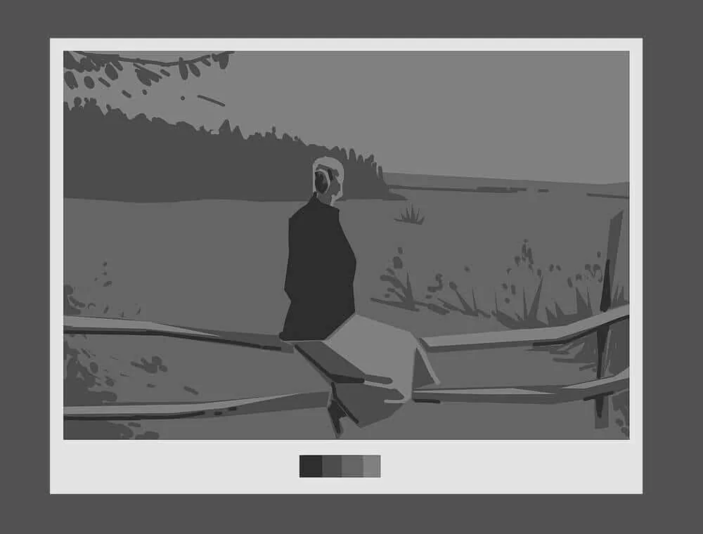 Example of tonal sketches, using 3-4 tones. By the way, we do such exercises in the course Digital Painting :)
Determining the light source. The tonal sketch helps to clearly understand where the light comes from. This is important because, knowing the direction of the light, you can accurately place the shadows and highlights so that the picture is not "blurred". Determine from which side the light is and experiment how it will look in general terms.
Example of tonal sketches, using 3-4 tones. By the way, we do such exercises in the course Digital Painting :)
Determining the light source. The tonal sketch helps to clearly understand where the light comes from. This is important because, knowing the direction of the light, you can accurately place the shadows and highlights so that the picture is not "blurred". Determine from which side the light is and experiment how it will look in general terms.
 Contrasts and brightness. It is important that your sketch is not gray and boring. Play with contrasts. On dark areas, intensify the shadow, and on light areas, make the highlights brighter. This will help create depth and avoid flatness.
Shape and structure. Working with tone, you begin to understand how the shape of an object in space will be perceived. See how shadows form its outlines and add depth to the details.
Contrasts and brightness. It is important that your sketch is not gray and boring. Play with contrasts. On dark areas, intensify the shadow, and on light areas, make the highlights brighter. This will help create depth and avoid flatness.
Shape and structure. Working with tone, you begin to understand how the shape of an object in space will be perceived. See how shadows form its outlines and add depth to the details.
When you make a tonal sketch, you will already know exactly where the light and shadow will be. It's like a frame on which you can then superimpose all the other details: colors, textures, final touches. Without this stage, the drawing will look flat, even if you add a lot of little things. Tone is what makes your drawing come to life.
Related courses
All courses
Book illustration: The first page page
9 000 ₽3 900 ₽
Векторная иллюстрация для начинающих
15 000 ₽12 000 ₽

Character Concept: My First Hero
10 000 ₽4 500 ₽
Step 3: Color fills
When you have already made a tonal sketch, it's time to move on to color. This, of course, is an important stage, but it should be started from the basics so as not to drown in the chaos of shades. Let's figure out how not to get confused and start confidently.
Decide on color temperature. The first thing is to decide what general climate the picture will have: warm or cold? This will set the direction for the whole palette. If the work will have bright light, sun, or a cozy atmosphere — warm tones such as orange, yellow, red are likely to be suitable. If you want to create a colder or more dramatic mood — choose cold shades, for example, blue, purple, gray.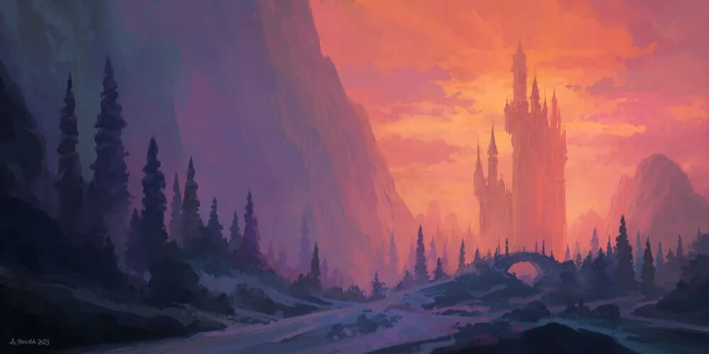
In the landscape by Andreas Rocha, warm and cold colors are combined because we look at the castle in the sunset rays of the sun. However, the blue-violet cold color prevails over the warm one.
Choose a dominant color. After you have decided on the temperature, choose one color that will be the main one in the picture. It could be the color of the main object or the background. The dominant color creates mood and compositional integrity. For example, if you are drawing a sunset, perhaps your dominant color will be orange or red, and all other shades will work to support it.
Here is a great example — speed painting by artist Jordan Grimmer. Yellow color is dominant, it attracts attention and keeps it on the silhouette of distant rocks. While there is a diverse flow of colors into each other around, yellow organizes the space.
Creating a palette. Now that you have the main direction, you need to make a palette. It doesn't have to be something very complicated, the main thing is to find harmony between the colors. For example, if you have a warm main color (for example, orange), add several shades of it and complement them with contrasts with cold colors (for example, blue or green). This will give the necessary balance. Selecting shades for shadows and light. It is important to remember that shadows and light also have their own color. You can start from the overall color scheme and light temperature. If the light is warm — make the shadows colder, and vice versa. Don't be afraid to slightly increase the color saturation in the shadows, it will make them deeper and clearer. Remember that shadows and light should not just be darker and lighter, but fit harmoniously into the overall palette. Palette based on a limited number of colors. One way not to get confused is to limit the number of colors in the palette. For example, work with three primary colors and several shades. This will help to keep the picture in one color scheme, and not turn it into a chaos of bright spots.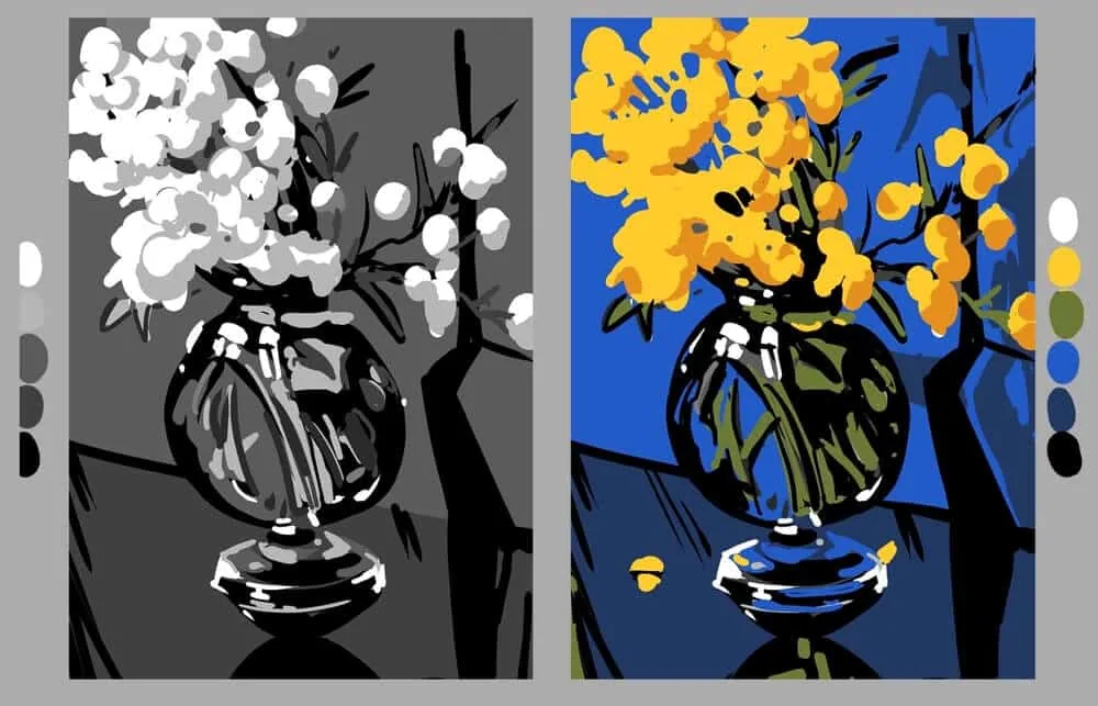 Tonal and color sketches in a limited palette. Work by student Solomona Darya, Digital Painting course.
Don't forget about the atmosphere. If you want the picture to look realistic or convey a certain atmosphere, pay attention to the ambient light and reflections. For example, if the object is in warm sunlight, there may be small shades of orange or yellow on its shadows, and if in the shade — cool blues and violets.
Tonal and color sketches in a limited palette. Work by student Solomona Darya, Digital Painting course.
Don't forget about the atmosphere. If you want the picture to look realistic or convey a certain atmosphere, pay attention to the ambient light and reflections. For example, if the object is in warm sunlight, there may be small shades of orange or yellow on its shadows, and if in the shade — cool blues and violets.
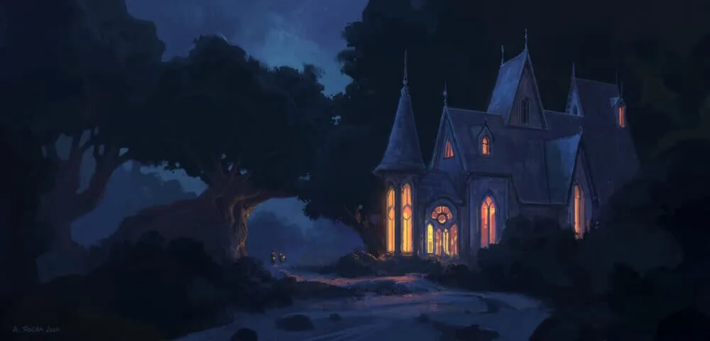
The windows of the house are lit with warm peach light. The light from them is reflected in the surrounding space: on the bushes, the tree trunk, and the path. Along with the warm reflections from the house, we see cold reflections on it from the moonlight hidden behind the clouds. This is a cold gray-blue-turquoise color on the roof and walls on the left side. Author: Andreas Rocha.
Tip: Try to make a palette of 5-7 key colors based on the reference. This will save time and set the tone for the work.
Once you decide on the palette, you can safely proceed to filling in the main color spots, continuing to follow the same principle as at the stage of the tonal sketch: light areas remain light, and dark areas remain dark. The main thing is not to forget that color is a continuation of light and shadow, and not just paint on the canvas.
Tips for working with color:
- Study nature: Natural shades are the best source of inspiration.
- Use color wheels: This will help you understand which colors go together better. We wrote more about them in our article Basics of color theory.
- Experiment: Sometimes the most unusual combinations work best.
Step 4: Detailing and completion of the work
Completing the work is always a key part of the process, because it is at this stage that the picture becomes "alive". Here it is important to correctly place tonal and color accents, as well as to think about how much you want to introduce detailing into the picture. Let's analyze each moment to clearly understand how to approach the final stage.
Tonal accentsWhen the picture is almost ready, it is important to highlight those areas that should attract the viewer's attention. This is done through tonal accents. Based on the general tonal key of the picture, decide how best to emphasize the compositional center? You can highlight it with a bright spot or make it the darkest of everything around.
 Works by Petter Faustino
It is important to remember that accents should be moderate. If you paint the entire work in light or dark tones, the whole harmony will be lost. The idea of accents is to highlight the key parts of the work, not to overload the picture.
Color accents
Works by Petter Faustino
It is important to remember that accents should be moderate. If you paint the entire work in light or dark tones, the whole harmony will be lost. The idea of accents is to highlight the key parts of the work, not to overload the picture.
Color accents
Now that we have decided on the tonal structure, we can add color accents that will enhance the perception. Color accents should not be too bright or too saturated, they should be supportive.
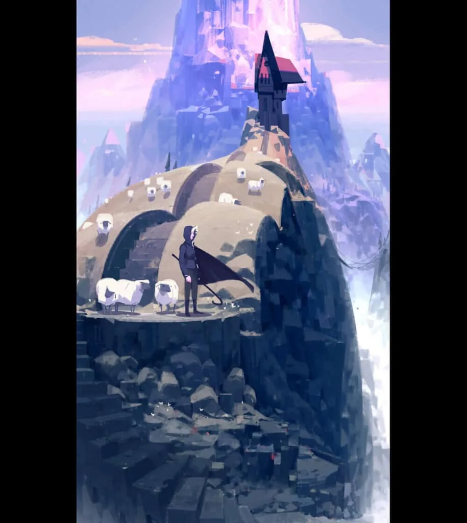 Work by Petter Faustino. The main color is cold and subdued, but pink and red shades serve as an accent, attracting the viewer's attention to the house on top of the hill and maintaining variety in the overall palette of the painting.
Detailing
Work by Petter Faustino. The main color is cold and subdued, but pink and red shades serve as an accent, attracting the viewer's attention to the house on top of the hill and maintaining variety in the overall palette of the painting.
Detailing
Detailing is not always about drawing every line. Sometimes it is important to make a choice: where to add details and where to leave it simple. This helps the painting to be balanced and not overloaded. Let's consider detailing on the example of a landscape by the artist Renaud Perochon.
Right details: Usually, in those parts of the painting where you want to focus the viewer's attention, it is worth adding more details. For example, if it is a portrait, the details of the face — eyes, lips, skin texture — should be clearly drawn. This gives the character liveliness and makes it more attractive to the eye. Fewer details in the background: You can use roughly drawn shapes in the background to avoid distracting attention from the main object. Details in the background can be simple or blurred to maintain focus on the compositional center.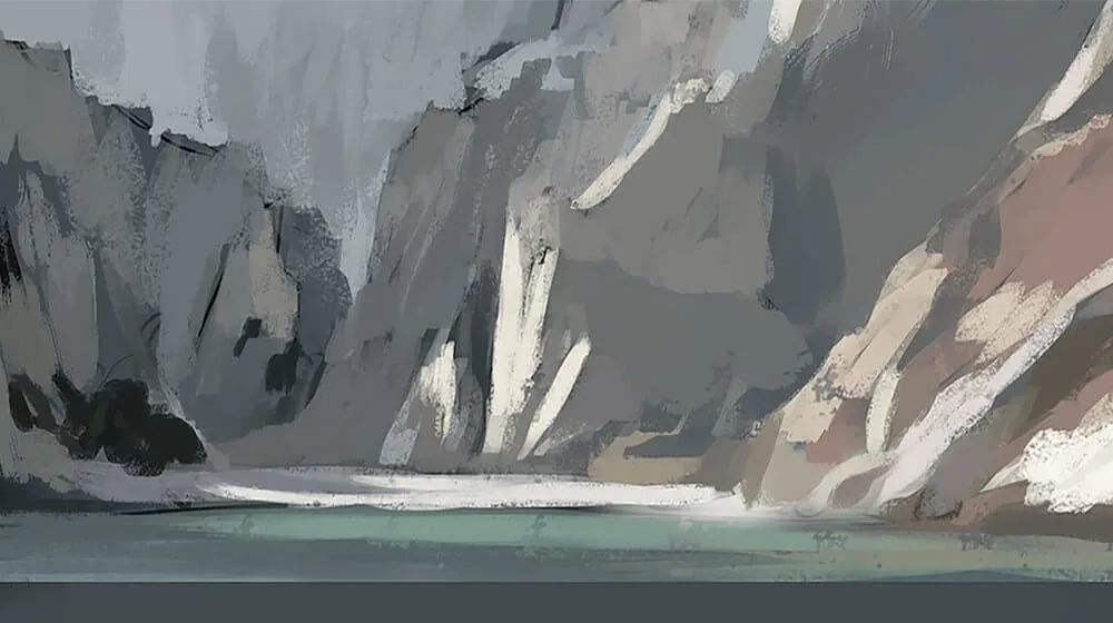
In the early stages, the artist laid down the main elements of the rocks and water. The background will remain at a similar level, but the ones closest to us will be refined. The background is always secondary and should not interfere with the foreground.
Textures and elements: Textures (fabric, wood, stone, etc.) add depth to the painting, but it is important not to get carried away with them. If you pay too much attention to each fold of the fabric, drawing it with incredible detail, you risk losing the естественность of the work. It is better to work with textures restrainedly so as not to disturb the overall balance of the image elaboration.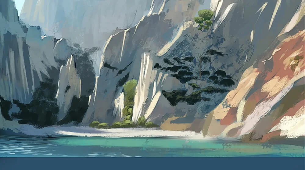 Finishing touches: When everything is generally ready, the last touch is the addition of final accents: light highlights on the details, small strokes that help to complete the work. For example, you can add shine to the eyes or metal surfaces, depending on what is depicted in the picture.
In general, completing the work is not only about adding details, but more about setting accents and harmoniously completing the picture. Make sure that the viewer's attention goes where you want it to, and that the picture is not overloaded with excessive details. This is the balance between simplicity and complexity, between clarity and softness.
To make sure that the work is completed, it is like crossing the finish line, but before that you need to carefully check all the details. Sometimes artists can continue to add strokes and edits indefinitely, but it is important to know when to stop.
And to make sure that the work is completed, we have prepared a small checklist for completing the drawing:
Check the composition:- Are all the elements in their places?
- Is there harmony between the different parts of the drawing?
- Are all the shadows logical?
- Is there volume, and is the light distributed over the objects correctly?
- Do the colors harmonize with each other?
- Do color accents emphasize important details?
- Where required, have the necessary details been added?
- In places where necessary, is there restrained detailing of the background or less important parts?
- Does the general style of the picture hold up?
- Is there a feeling of completeness and integrity of the work?
- Take a few steps back and evaluate the work as a whole. Can you identify those moments that can be improved?
- Does the picture fit its concept or theme? Is everything you wanted to convey reflected in it?
If you can answer «yes» to most of these points, your work is most likely completed! But it is always useful to take a short break and come back to the picture later — a fresh look often helps to notice something important that you might have missed during the work process.
Conclusion
Color in digital painting is a powerful tool that helps to convey emotions and make your work memorable. Do not be afraid to experiment, to learn from nature and to be inspired by other artists. And remember: in art there are no strict rules, only guidelines that you can change at your discretion.
Lessons
Now, let's apply the knowledge in practice! On the example of writing a simple landscape, we will analyze the sequence of work from the spot, and as a bonus, we will lift the veil of secrecy of using mix brushes! (in fact, it's not such a secret, but everything in order)
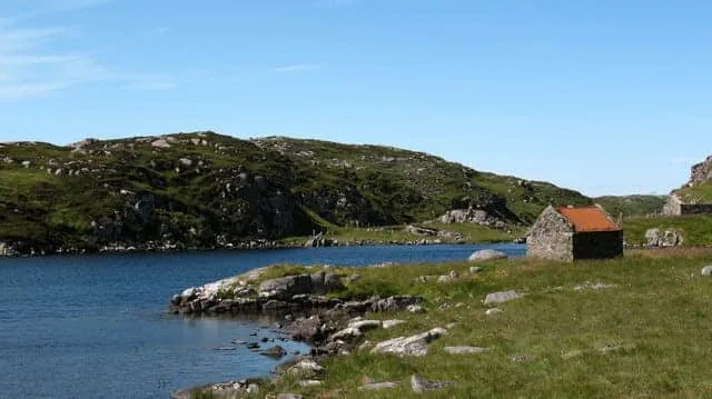
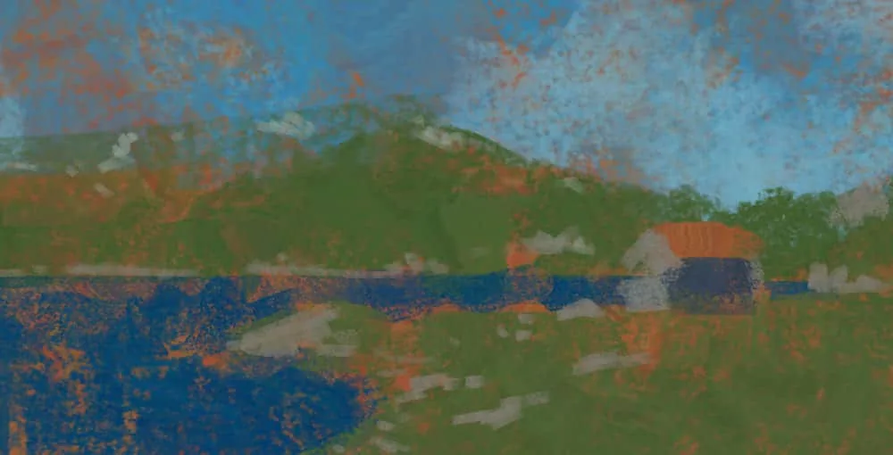
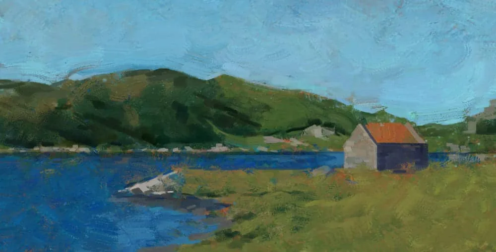
Stage 1. Color подложки and the first large color spots.Of course, any etude begins with a reference, and for myself I chose this one. It has a diverse landscape, there are stones, water, greenery, as well as a point of interest — a house in the middle ground.
I do not like to start work with a white canvas. It will brightly dazzle the eyes and interfere with the correct perception of color and tone. Therefore, I rather paint the canvas with some color. Usually, for the подложки I take colors opposite to the main gamut of the future drawing, or complementing it. It is intuitive, choose the color of the подложки to your taste.
This time I started with a subdued shade of orange, I wanted it to show through the cold sky and greenery.
Then I add medium spots. Cold shadows on the hill and light stones. At this stage, we gradually enhance the contrast.
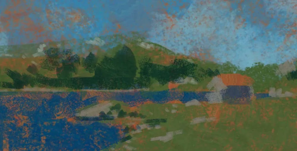
 Stage 2. Adding colors
At this stage, I experiment with brushes and introduce more color diversity. Various texture brushes and the «color dynamics» parameter come in handy. This parameter in the brush settings allows you to «randomize» the color of the stroke. Depending on how much you twist the color dynamics sliders, your colors can become more colorful and random. Experiment with this setting and different texture brushes.
But! Moderation is important in everything, and at this stage our task is to add variety without losing the overall gamut and tonality of the picture.
 Stage 3. Clarifying the picture and getting acquainted with Mixer brush
The next stage I «collect» the picture a little, parsing the whole chaos introduced in the previous step. Our color spots added earlier serve as an excellent basis for including the Mixer brush tool in the work.
 Making the image more coherent
What is Mixer brush/Mix brush?
Making the image more coherent
What is Mixer brush/Mix brush?
Mix brush is an unusual variation of the Brush tool in Photoshop. The main difference is that the «pipette» brush does not simply take color from a certain area, but a small fragment of this area. And also, depending on the Humidity and Mixing parameters, this brush not only writes, but also mixes colors around it.
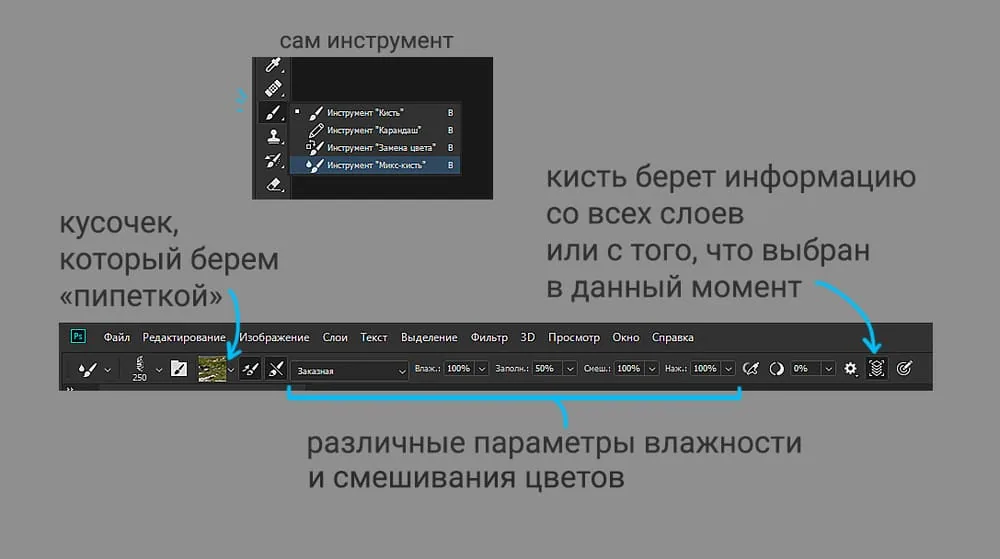 In the top panel you can see the various settings of this tool.
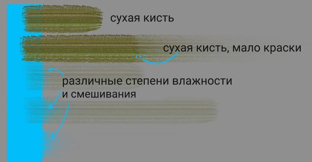
On this diagram you can see how different parameters affect the mixing of colors. A dry brush does not pick up color from the blue rectangle. If there is not enough paint, the stroke gradually fades. If the mixing and humidity parameters are high, the brush not only leaves a colored stroke, but also captures all the neighboring colors.
Experiment with the settings of this tool to find the most successful parameters for your needs.
 Mix brush creates an effect similar to oil painting
Any brush in your set can become a mix brush, in fact. Just choose this tool and your favorite brush. And then with the pipette (ALT key) click on some fragment of your picture and try to make a few strokes.
To make the mix brush stroke even more interesting — increase the interval between brush strokes.
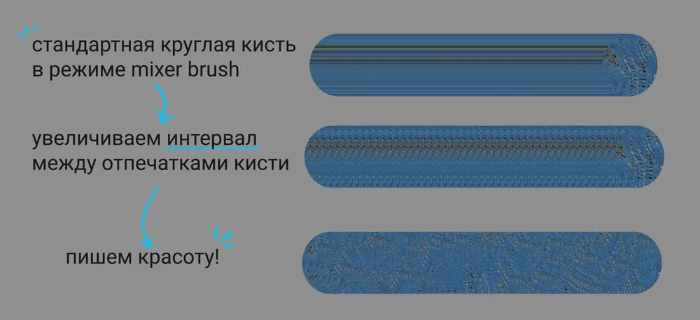 On the example of a standard round brush
 Unlocking the potential of the mix brush
Stage 4. Working out and detailing.
Unlocking the potential of the mix brush
Stage 4. Working out and detailing.
After working with the mix brush, I return to the usual brushes again, add contrast and clarify the colors.
 Continuing to clarify
Our work is moving towards completion. I use both ordinary and mix brushes to work on the picture, trying to maintain a balance between these tools. It seemed to me that the sky lacked variety, so with the mix brush I make wavy strokes. With an ordinary brush I add small details and stones, with a mix brush I slightly blur the boundaries of the strokes.
 Almost done…
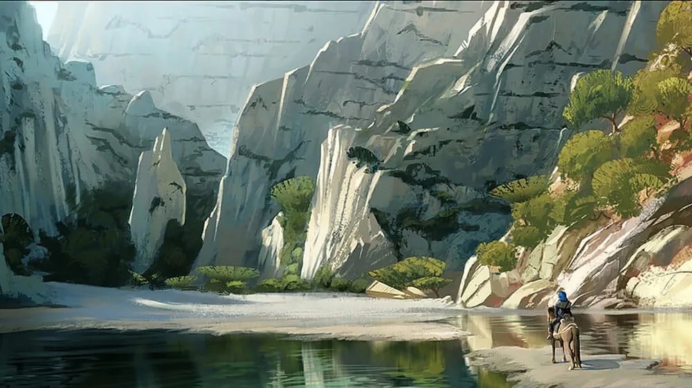
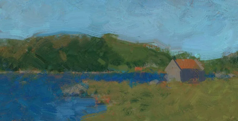
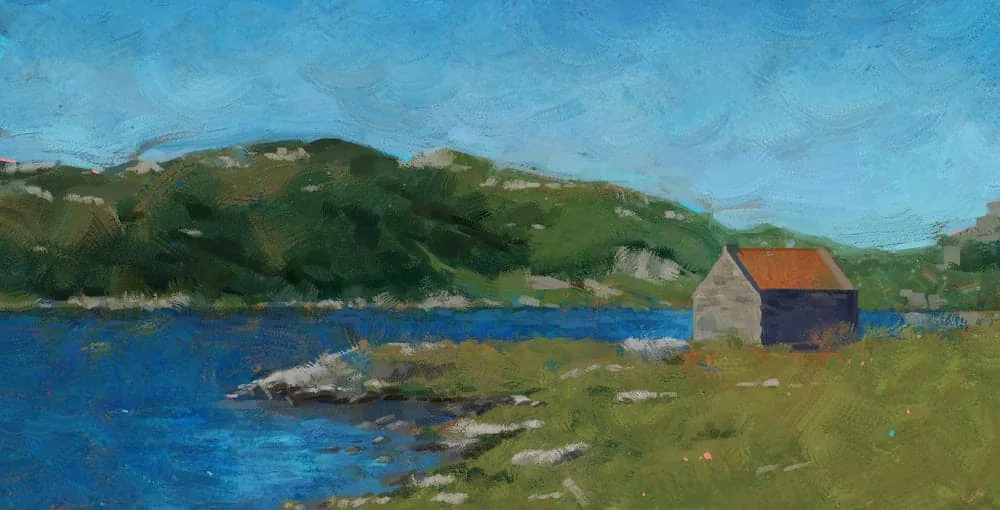
Stage 5. Setting accents and completing the work
At the final stage, we look at the picture as a whole. Remember our checklist above. I decided to darken the sky a little towards the top to add depth. For variety, I added thin strokes of turquoise and peach color on the hillside, as well as small strokes of the same colors in the clearing (because it's just cool :). I add a little shine to the water in the foreground, and in the background I soften the tones of the hill behind the house.
 The work is completed!
A little life hack: if you want the textures of the strokes to be more noticeable, use the Sharpen filter at the end of the work. I often use this effect in my paintings.
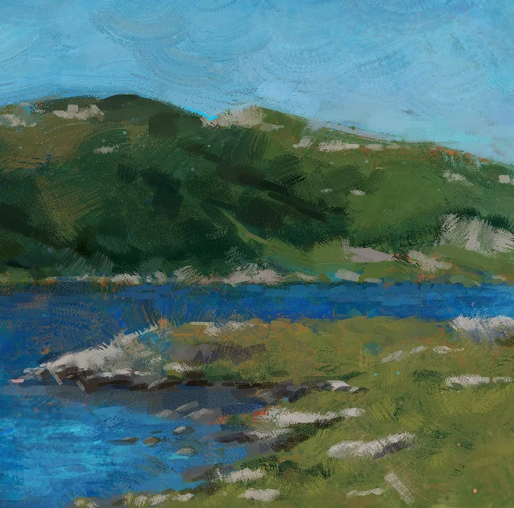 Fragment of the work
As a bonus, keep a couple of tips on how to coolly set up the mix brush.
- Use a texture brush. An unusual shape of the brush print itself adds variety to the tool.
- To make the texture even more noticeable — you can increase the intervals between brush strokes. This is done in the brush settings > brush stroke shape.
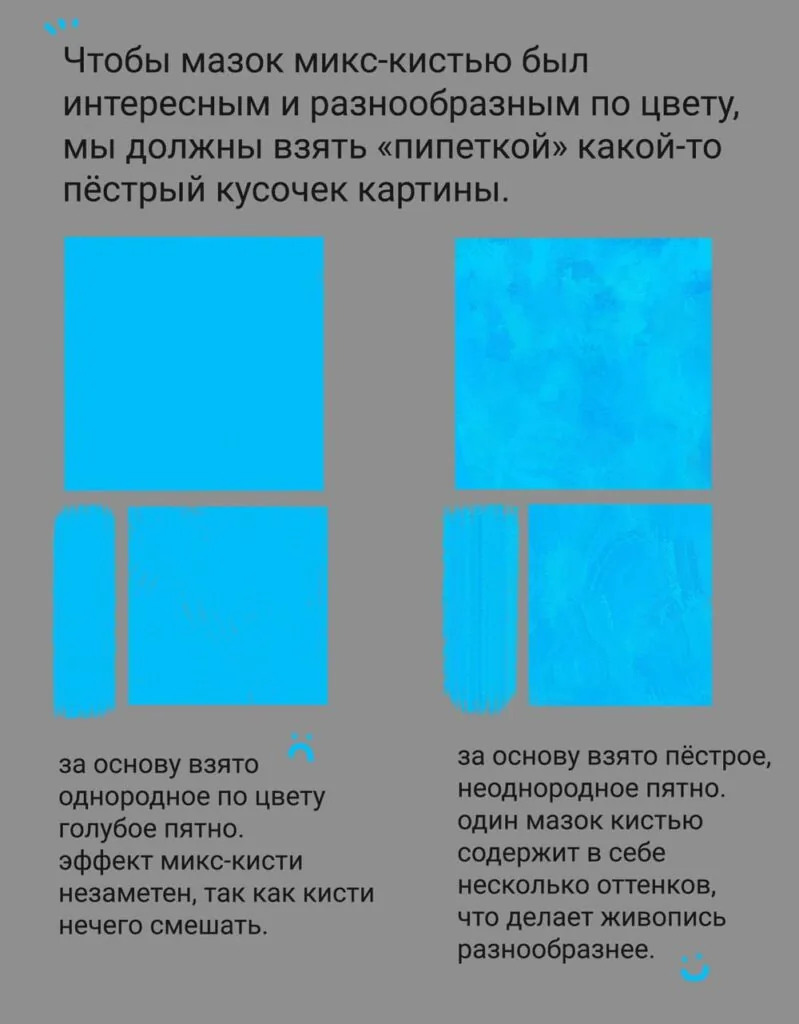
- Try to take motley spots with the pipette. As a kind of palette, you can use not only your own picture, but also images from the Internet, having selected fragments in the desired color гамме.
I hope this lesson was interesting and useful for you.
Remember that every stroke you put on the canvas is a step towards improving your skills. Do not be afraid to experiment, to study new techniques and to be inspired by the world around you.
Want to see colour and palette in practice? Check out the step-by-step guide on how to draw a landscape in a cool, close palette.
Related materials

Digital painting in Photoshop
How to draw a human head

Digital painting for beginners

Color theory in painting: the art of using color
Моделирование и текстурирование интересного 3D-персонажа для игр, выполненного в технике ручной живописи
