TutorialUpdated: July 2, 2026
Digital painting for beginners
In short
My name is Marina Peregud, I am a curator of the Digital Painting course at Skills Up School. In this article, I will tell you about digital painting.
2D artist (illustrator)
User:
Hello everyone! My name is Marina Peregud, I am the curator of the course Digital Painting at Skills Up School. In this article, I will tell you about digital painting, its types and styles, and after the theoretical part, we will move on to practice and draw a cat's portrait.
More and more artists are becoming interested in digital painting. It has gained immense popularity due to its versatility, a combination of traditional drawing methods and modern technologies.
But many people do not know where to start. This article will serve as a guide to the world of digital painting and will be interesting to both beginners and more experienced artists.
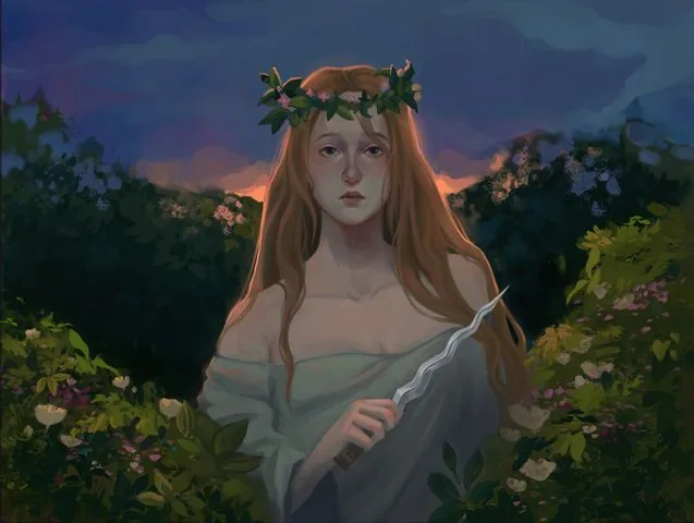
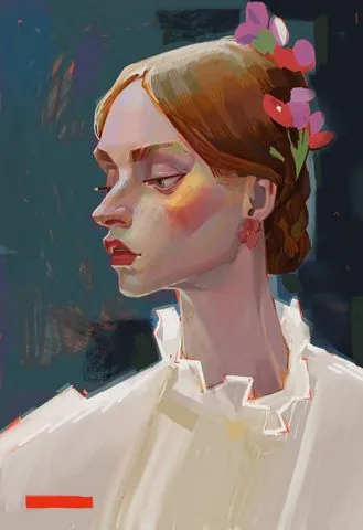
 Author of the work: Valeria Pronko
 Work by student of the Digital Painting course Egor Lobachev
Composition in digital painting is similar to classical composition in traditional art. Artists use the same laws and rules of composition, regardless of the material. But a significant difference in modern digital compositions can often be seen in the choice of plot and technique of execution.
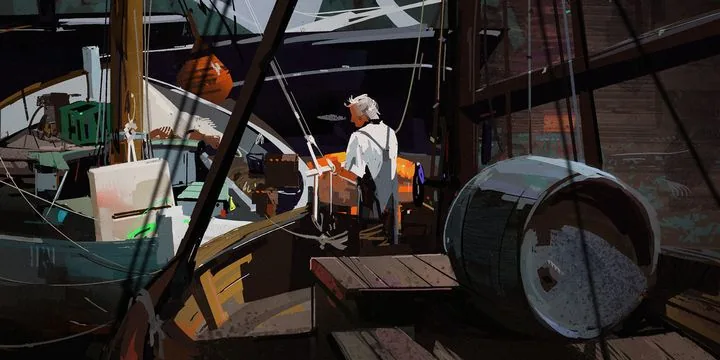
In the works of modern artist and friend of Skills Up School Andrey Surnov, we can see a combination of the realistic world with magical or futuristic elements. Andrey often works from натуры, honing his skills in working with light and color. Thanks to the practice of working from натуры, he manages to convey so authentically the light we are familiar with from car headlights, reflections of the sun on metal surfaces and the shine of wet asphalt.
Let's add an unusual manner of writing: using a round brush standard for any editor, the author collects the shape from strokes of different directions, layering them on top of each other, practically not softening or blurring the edges. Such rounded dot strokes have become the визитной карточкой of Andrey Surnov's style.
This approach and techniques together create a unique atmosphere in the artist's paintings and make them memorable.
By the way, Andrey Surnov has repeatedly performed in our school with lectures and master classes, creating works from натуры right in the audience. We share with you one of such works performed at a master class at Skills Up School in St. Petersburg in 2017.
The recording of the master class and other useful materials can be viewed on our YouTube channel: «Digital painting and drawing» — Master class by Andrey Surnov
No less fascinating is the direction of Digital drawing — we start studying it after mastering the basics of academic drawing. Digital drawing is more closely tied to the traditional one, it also uses line and stroke as a means of expression, it can be both linear-constructive and tonal.
Drawing helps to understand the shape and structure of objects more deeply and is the basis of fine art. At Skills Up School, we teach both traditional and digital academic drawing from scratch to Pro level on our courses.
Work by student of the Digital Painting course Egor Lobachev
Composition in digital painting is similar to classical composition in traditional art. Artists use the same laws and rules of composition, regardless of the material. But a significant difference in modern digital compositions can often be seen in the choice of plot and technique of execution.
In the works of modern artist and friend of Skills Up School Andrey Surnov, we can see a combination of the realistic world with magical or futuristic elements. Andrey often works from натуры, honing his skills in working with light and color. Thanks to the practice of working from натуры, he manages to convey so authentically the light we are familiar with from car headlights, reflections of the sun on metal surfaces and the shine of wet asphalt.
Let's add an unusual manner of writing: using a round brush standard for any editor, the author collects the shape from strokes of different directions, layering them on top of each other, practically not softening or blurring the edges. Such rounded dot strokes have become the визитной карточкой of Andrey Surnov's style.
This approach and techniques together create a unique atmosphere in the artist's paintings and make them memorable.
By the way, Andrey Surnov has repeatedly performed in our school with lectures and master classes, creating works from натуры right in the audience. We share with you one of such works performed at a master class at Skills Up School in St. Petersburg in 2017.
The recording of the master class and other useful materials can be viewed on our YouTube channel: «Digital painting and drawing» — Master class by Andrey Surnov
No less fascinating is the direction of Digital drawing — we start studying it after mastering the basics of academic drawing. Digital drawing is more closely tied to the traditional one, it also uses line and stroke as a means of expression, it can be both linear-constructive and tonal.
Drawing helps to understand the shape and structure of objects more deeply and is the basis of fine art. At Skills Up School, we teach both traditional and digital academic drawing from scratch to Pro level on our courses.
 Works by curator of the Basic, Middle and High Drawing courses Anton Korostov
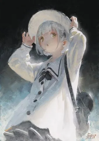
 Work by student of the Digital Painting course Sofia Boldyreva
Modern digital painting in terms of quality, execution and scale of works is not inferior to traditional works of the past, and it has room to grow further.
The power of computers is increasing, software is changing and improving, new techniques for creating works and image visualization devices — projectors and holography — are appearing, which make digital painting interactive. And its widespread distribution through media and the Internet makes art more accessible than ever before.
However, despite all the advantages, digital painting also causes debates about its place in art: some critics believe that it cannot stand on a par with traditional art because it lacks tactility and physical nature.
Ultimately, this is a matter of taste and preferences of the artist and the viewer :)
A digital art exhibition can be organized in various ways. The most popular are online galleries such as Artstation, Behance and Instagram. Some artists use their own website or blog.
Although digital art is usually created to be displayed in electronic format, it can also be printed and exhibited in physical space. Galleries and exhibition halls are increasingly giving artists the opportunity to present their works in the form of prints, canvases or installed monitors.
Digital art can be reproduced in an interactive form, for example, in the form of installations or game projects. Such works can be exhibited at specialized exhibitions and festivals dedicated to interactive art and new media.
It is important to understand that a computer in digital painting and drawing is the same tool as a brush and pencil. In order to draw well on a computer, you need to study and be able to apply all the knowledge and experience accumulated by generations of artists: understand color theory, work with light, linear and aerial perspective, etc.
What is digital painting for you? We asked this question to the artist and curator of the Digital Portrait course, Elena Churkina:
«For me, digital painting is an improvisation, a breath of colorfulness and taste in the world of digital graphics. The specifics of the gaming industry do not always allow the artist's soul to unfold, but virtual plein airs and picturesque productions provide the opportunity to play with brushes and techniques.
I use both simple and textured brushes. Periodically, I abandon complex brushes and work only with basic tools. Constant work with textures can make the eye tired, so breaks are needed.
Returning to textures every time after such «holidays» is pleasant and new. Thus, thanks to the regular change of tools, the understanding and progress of painting is enhanced».
Work by student of the Digital Painting course Sofia Boldyreva
Modern digital painting in terms of quality, execution and scale of works is not inferior to traditional works of the past, and it has room to grow further.
The power of computers is increasing, software is changing and improving, new techniques for creating works and image visualization devices — projectors and holography — are appearing, which make digital painting interactive. And its widespread distribution through media and the Internet makes art more accessible than ever before.
However, despite all the advantages, digital painting also causes debates about its place in art: some critics believe that it cannot stand on a par with traditional art because it lacks tactility and physical nature.
Ultimately, this is a matter of taste and preferences of the artist and the viewer :)
A digital art exhibition can be organized in various ways. The most popular are online galleries such as Artstation, Behance and Instagram. Some artists use their own website or blog.
Although digital art is usually created to be displayed in electronic format, it can also be printed and exhibited in physical space. Galleries and exhibition halls are increasingly giving artists the opportunity to present their works in the form of prints, canvases or installed monitors.
Digital art can be reproduced in an interactive form, for example, in the form of installations or game projects. Such works can be exhibited at specialized exhibitions and festivals dedicated to interactive art and new media.
It is important to understand that a computer in digital painting and drawing is the same tool as a brush and pencil. In order to draw well on a computer, you need to study and be able to apply all the knowledge and experience accumulated by generations of artists: understand color theory, work with light, linear and aerial perspective, etc.
What is digital painting for you? We asked this question to the artist and curator of the Digital Portrait course, Elena Churkina:
«For me, digital painting is an improvisation, a breath of colorfulness and taste in the world of digital graphics. The specifics of the gaming industry do not always allow the artist's soul to unfold, but virtual plein airs and picturesque productions provide the opportunity to play with brushes and techniques.
I use both simple and textured brushes. Periodically, I abandon complex brushes and work only with basic tools. Constant work with textures can make the eye tired, so breaks are needed.
Returning to textures every time after such «holidays» is pleasant and new. Thus, thanks to the regular change of tools, the understanding and progress of painting is enhanced».
 Works by curator of the Digital Portrait course Elena Churkina
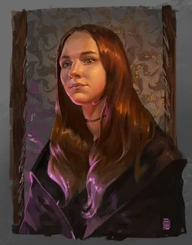
Author of the work: Valeria Pronko
Differences between digital painting and traditional painting
Traditional and digital painting are two different approaches to creating works of art. Let's look at their main differences.Materials and tools
For traditional painting, you need canvas, paints, brushes, easel, etc. You need space to work with them, and it can be problematic to take them with you to the plein air because of their bulkiness. But the advantage of such materials is the unique tactile experience that the artist gets while working with them. In digital painting, a computer, program and graphics tablet are used. They require little space, and if you work on an iPad or similar portable device, you can start work at home on the computer and continue on the road. Separately, it should be noted that when working with a tablet, you will not get paint on your clothes and you will not need to wash the brushes afterwards :)Process and techniques
In classical painting, the artist applies paint to the canvas using a wide range of tools (brush, palette knife, sponge, etc.), using various techniques, working with thin layers (glazing) or pastose textured strokes. The toolkit of digital painting can not only imitate traditional techniques and textures, but also edit lighting, color гамму, tone, objects, layers, etc. at any stage. This allows you to achieve a result that would be more difficult or impossible to achieve in traditional painting.Changes and corrections
On canvas or paper, corrections are limited because paint is not always easy to remove or adjust. It can be difficult to correct a mistake without redoing the work from scratch. In the "digital" version, the artist can easily undo and go back to the previous stage of work, and edit any part of the image without loss of quality.Storage
Traditional paintings can be physically voluminous, they are subject to the effects of time and environmental factors, so they require special storage space and protection. In digital painting, the artist can save their works in electronic form in the memory of the device on a hard drive or in the cloud. They do not need special storage conditions, and you can access them at any time. Some artists prefer to work in traditional techniques, enjoying the direct interaction with the material on paper, while others prefer to use the digital format because of its flexibility and convenient tools.
Work by student of the Digital Painting course Egor Lobachev
Composition in digital painting is similar to classical composition in traditional art. Artists use the same laws and rules of composition, regardless of the material. But a significant difference in modern digital compositions can often be seen in the choice of plot and technique of execution.
In the works of modern artist and friend of Skills Up School Andrey Surnov, we can see a combination of the realistic world with magical or futuristic elements. Andrey often works from натуры, honing his skills in working with light and color. Thanks to the practice of working from натуры, he manages to convey so authentically the light we are familiar with from car headlights, reflections of the sun on metal surfaces and the shine of wet asphalt.
Let's add an unusual manner of writing: using a round brush standard for any editor, the author collects the shape from strokes of different directions, layering them on top of each other, practically not softening or blurring the edges. Such rounded dot strokes have become the визитной карточкой of Andrey Surnov's style.
This approach and techniques together create a unique atmosphere in the artist's paintings and make them memorable.
By the way, Andrey Surnov has repeatedly performed in our school with lectures and master classes, creating works from натуры right in the audience. We share with you one of such works performed at a master class at Skills Up School in St. Petersburg in 2017.
The recording of the master class and other useful materials can be viewed on our YouTube channel: «Digital painting and drawing» — Master class by Andrey Surnov
No less fascinating is the direction of Digital drawing — we start studying it after mastering the basics of academic drawing. Digital drawing is more closely tied to the traditional one, it also uses line and stroke as a means of expression, it can be both linear-constructive and tonal.
Drawing helps to understand the shape and structure of objects more deeply and is the basis of fine art. At Skills Up School, we teach both traditional and digital academic drawing from scratch to Pro level on our courses.
Works by curator of the Basic, Middle and High Drawing courses Anton Korostov
Digital painting — new art
We at Skills Up consider digital painting one of the examples of new art. We help students master the basics of drawing and color work skills, and then together we create interesting living compositions.
Work by student of the Digital Painting course Sofia Boldyreva
Modern digital painting in terms of quality, execution and scale of works is not inferior to traditional works of the past, and it has room to grow further.
The power of computers is increasing, software is changing and improving, new techniques for creating works and image visualization devices — projectors and holography — are appearing, which make digital painting interactive. And its widespread distribution through media and the Internet makes art more accessible than ever before.
However, despite all the advantages, digital painting also causes debates about its place in art: some critics believe that it cannot stand on a par with traditional art because it lacks tactility and physical nature.
Ultimately, this is a matter of taste and preferences of the artist and the viewer :)
A digital art exhibition can be organized in various ways. The most popular are online galleries such as Artstation, Behance and Instagram. Some artists use their own website or blog.
Although digital art is usually created to be displayed in electronic format, it can also be printed and exhibited in physical space. Galleries and exhibition halls are increasingly giving artists the opportunity to present their works in the form of prints, canvases or installed monitors.
Digital art can be reproduced in an interactive form, for example, in the form of installations or game projects. Such works can be exhibited at specialized exhibitions and festivals dedicated to interactive art and new media.
It is important to understand that a computer in digital painting and drawing is the same tool as a brush and pencil. In order to draw well on a computer, you need to study and be able to apply all the knowledge and experience accumulated by generations of artists: understand color theory, work with light, linear and aerial perspective, etc.
What is digital painting for you? We asked this question to the artist and curator of the Digital Portrait course, Elena Churkina:
«For me, digital painting is an improvisation, a breath of colorfulness and taste in the world of digital graphics. The specifics of the gaming industry do not always allow the artist's soul to unfold, but virtual plein airs and picturesque productions provide the opportunity to play with brushes and techniques.
I use both simple and textured brushes. Periodically, I abandon complex brushes and work only with basic tools. Constant work with textures can make the eye tired, so breaks are needed.
Returning to textures every time after such «holidays» is pleasant and new. Thus, thanks to the regular change of tools, the understanding and progress of painting is enhanced».
Works by curator of the Digital Portrait course Elena Churkina
Types of digital painting
Related courses
All courses
from 3 900 ₽
-57%
Book illustration: The first page page
9 000 ₽3 900 ₽
Learn more
from 12 000 ₽
-20%
Векторная иллюстрация для начинающих
15 000 ₽12 000 ₽
Learn more

from 4 500 ₽
-55%
Character Concept: My First Hero
10 000 ₽4 500 ₽
Learn more
Types of digital painting are very diverse and it is not easy to distinguish them. But we can distinguish several types based on the fields of application and types of tasks for which digital painting skills are required.
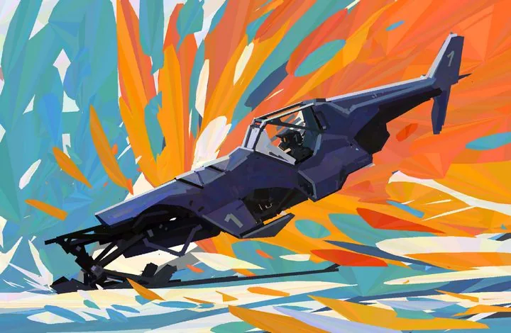
Concept art. Yes, this direction can be picturesque! Concepts are needed mainly for cinema and video games. This direction, in turn, can be divided into several more types:
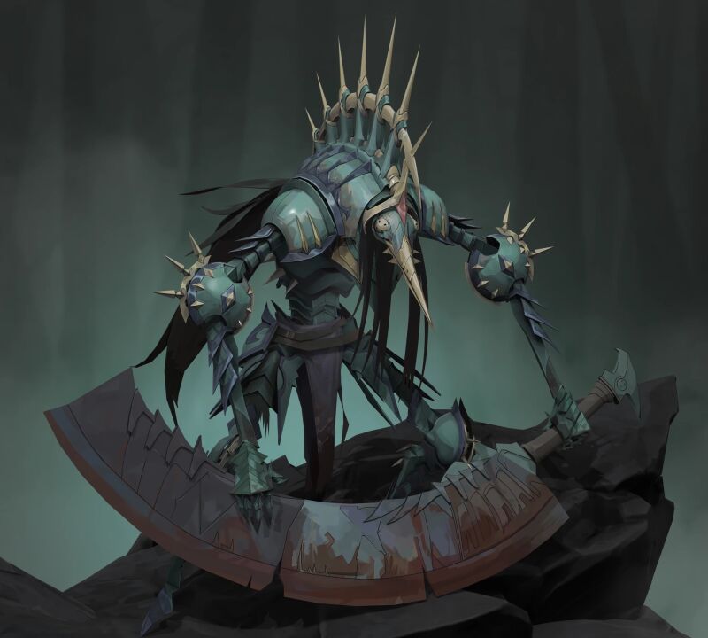
Characters. The appearance of creatures and heroes, reflection of their characters through portrait, clothes and other details. Requires a good knowledge of anatomy.
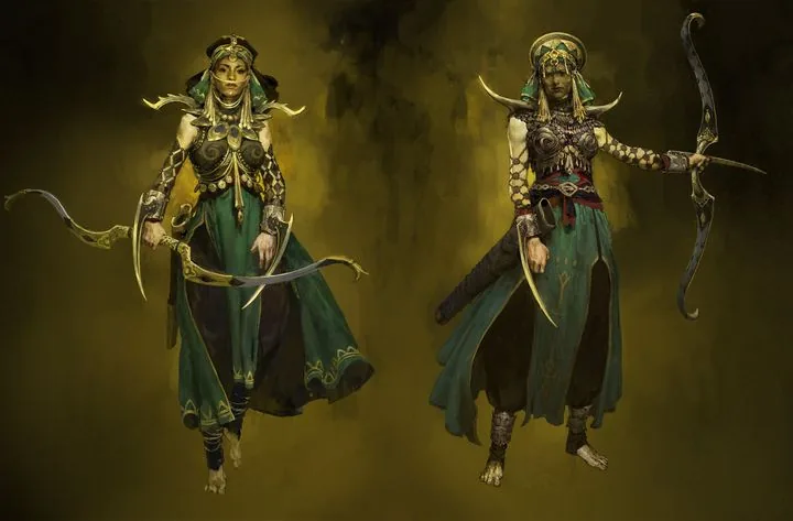 Painting render in character concept art, author: Roman Kupriyanov
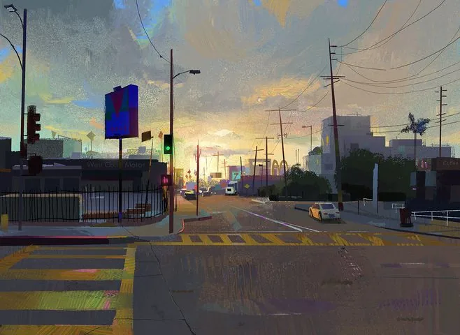
Surroundings. Creating landscapes and interiors, thinking up locations and working on the atmosphere of the surrounding world — perspective knowledge and lighting skills are especially valued here.
Painting render in character concept art, author: Roman Kupriyanov
Surroundings. Creating landscapes and interiors, thinking up locations and working on the atmosphere of the surrounding world — perspective knowledge and lighting skills are especially valued here.
 Work by artist Angela Sung
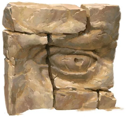
Props (objects). Design of things that fill locations and complement the appearance of heroes. Through objects, the artist can also tell a story: what is this thing, is it old or new, what material is it made of and who does it belong to? Answers to these questions are found by the concept artist in their works, and skills in linear construction, special attention to textures and textures are required here.
Work by artist Angela Sung
Props (objects). Design of things that fill locations and complement the appearance of heroes. Through objects, the artist can also tell a story: what is this thing, is it old or new, what material is it made of and who does it belong to? Answers to these questions are found by the concept artist in their works, and skills in linear construction, special attention to textures and textures are required here.
 Work by artist Clint Cearley
Often it is the skills of digital painting and the individual manner of the artist that determine the style and appearance of the future project.
Work by artist Clint Cearley
Often it is the skills of digital painting and the individual manner of the artist that determine the style and appearance of the future project.
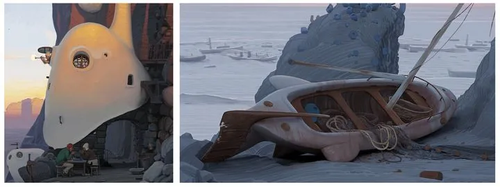
 Concept art by artist Andrey Surnov for the Jusant game and the final appearance of objects in the game
Illustration. This can be both the familiar book illustration and an independent work. In the digital environment, we usually mean by this type one or several paintings united by a common theme or plot.
They can be the artist's personal work or commercial work commissioned. In such works, the artist's skills are most fully revealed, since creating a painting is a complex work that requires the artist to use the entire arsenal of accumulated knowledge. Good illustrations are remembered, become the визитной карточкой of the author and an excellent addition to the portfolio.
Concept art by artist Andrey Surnov for the Jusant game and the final appearance of objects in the game
Illustration. This can be both the familiar book illustration and an independent work. In the digital environment, we usually mean by this type one or several paintings united by a common theme or plot.
They can be the artist's personal work or commercial work commissioned. In such works, the artist's skills are most fully revealed, since creating a painting is a complex work that requires the artist to use the entire arsenal of accumulated knowledge. Good illustrations are remembered, become the визитной карточкой of the author and an excellent addition to the portfolio.
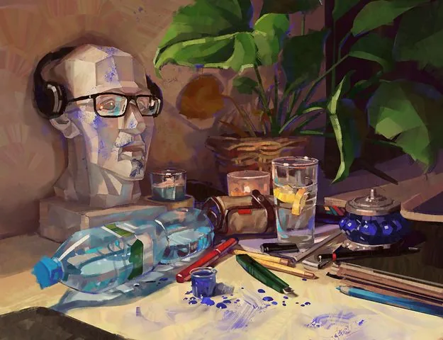
 Work by curator of the Digital Painting course Marina Peregud
Advertising and promo art. Creating illustrations and designing products for brands and companies from various fields. Such collaboration between an artist and a brand is an excellent advertising move for the company, and for the artist — a great way to express themselves, try something new and demonstrate their creativity to a large audience.
Work by curator of the Digital Painting course Marina Peregud
Advertising and promo art. Creating illustrations and designing products for brands and companies from various fields. Such collaboration between an artist and a brand is an excellent advertising move for the company, and for the artist — a great way to express themselves, try something new and demonstrate their creativity to a large audience.
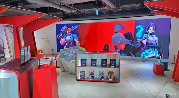 Design of the Riot Arcade pavilion at Incheon Airport, works by artist Atey Ghailan were used
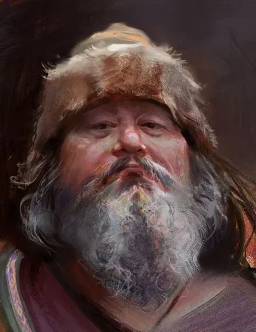
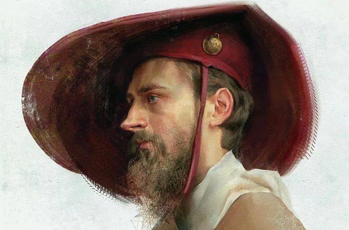 Realistic portrait, work of the curator of the Digital Painting course by Yana Struchok
 Work in anime style, author: Enze Fu
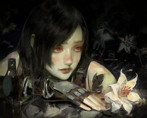 Semi-realism, author Sebijy
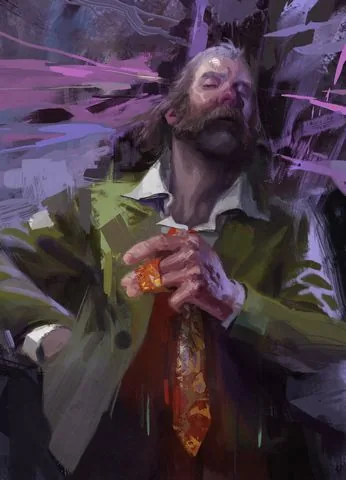
 Expressionism in the works of artist Alexander Rostov
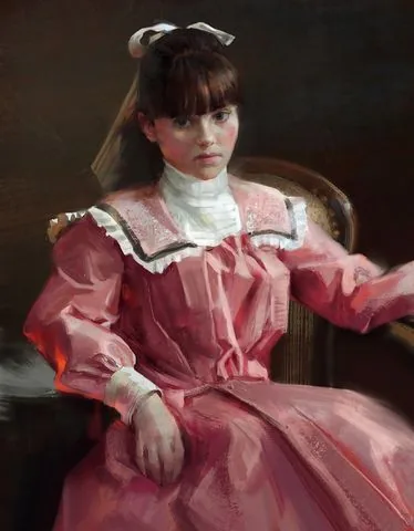
 Styled portrait, work of the course curator and founder of Skills Up School Azat Nurgaleev
The diversity of styles and approaches available in digital painting is amazing. From photorealism and hyperrealism to abstraction and surrealism — each artist can find their own unique style. Digital tools allow you to experiment with textures, shapes and colors, opening up new horizons for creativity.
Yana Struchok, curator of the Digital Painting course, talks about her favorite tools:
«I like to look for interesting techniques using texture brushes. In oil painting, we used sponges, pieces of newspapers, palette knives to play with the texture of the paint. In digital painting, you can simply choose or reconfigure the brush, and eventually make your own.
A special love is given to brushes with color dynamics: they help to quickly stir up the overall palette of the work. I really like to use blending modes, especially Overlay and Multiply. At the same time, most often I use the overlay not on the layer, but on the brush itself: when such overlays are superimposed on each other, very cool colors are obtained — this usually helps to arrange accents in the work.
Besides the "brush" tool, I very often use a variety of "fingers" and "mix brushes". Both of them mix, smear and allow you to work with touches in different ways.
The mix brush is a very interesting thing: when we use the pipette in normal mode, it takes only one color sample. When we use the pipette with a mix brush, it acts like a stamp and takes not one color, but a piece of the image — it's like in traditional painting you could have several shades on the brush at once without mixing them with each other. This tool, together with the overlays, allows me to achieve picturesqueness and a riot of colors in digital painting.
Freedom and variety of tools give rise to my curiosity and excitement, the constant "what if". That's why I'm never bored, the main thing is to let go of myself and go and try».
Styled portrait, work of the course curator and founder of Skills Up School Azat Nurgaleev
The diversity of styles and approaches available in digital painting is amazing. From photorealism and hyperrealism to abstraction and surrealism — each artist can find their own unique style. Digital tools allow you to experiment with textures, shapes and colors, opening up new horizons for creativity.
Yana Struchok, curator of the Digital Painting course, talks about her favorite tools:
«I like to look for interesting techniques using texture brushes. In oil painting, we used sponges, pieces of newspapers, palette knives to play with the texture of the paint. In digital painting, you can simply choose or reconfigure the brush, and eventually make your own.
A special love is given to brushes with color dynamics: they help to quickly stir up the overall palette of the work. I really like to use blending modes, especially Overlay and Multiply. At the same time, most often I use the overlay not on the layer, but on the brush itself: when such overlays are superimposed on each other, very cool colors are obtained — this usually helps to arrange accents in the work.
Besides the "brush" tool, I very often use a variety of "fingers" and "mix brushes". Both of them mix, smear and allow you to work with touches in different ways.
The mix brush is a very interesting thing: when we use the pipette in normal mode, it takes only one color sample. When we use the pipette with a mix brush, it acts like a stamp and takes not one color, but a piece of the image — it's like in traditional painting you could have several shades on the brush at once without mixing them with each other. This tool, together with the overlays, allows me to achieve picturesqueness and a riot of colors in digital painting.
Freedom and variety of tools give rise to my curiosity and excitement, the constant "what if". That's why I'm never bored, the main thing is to let go of myself and go and try».
 Works of the curator of the Digital Painting course - Yana Struchok
If you are just trying your hand at digital drawing, we recommend that you read the articles: How to draw in Procreate and How to draw in Adobe Photoshop.
Works of the curator of the Digital Painting course - Yana Struchok
If you are just trying your hand at digital drawing, we recommend that you read the articles: How to draw in Procreate and How to draw in Adobe Photoshop.
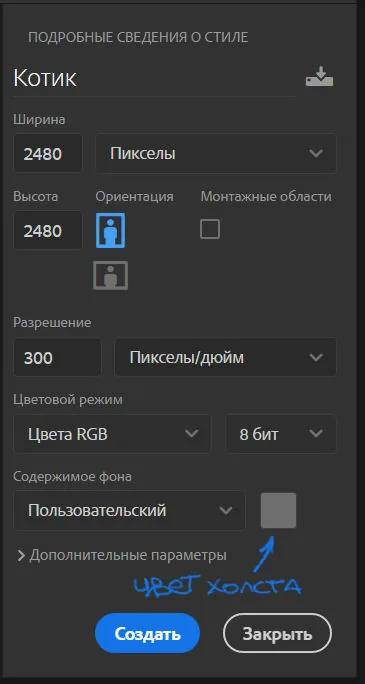
 Reference
I will be doing the work in Photoshop. Creating a canvas: I chose a square format of 2480x2480 pixels. The default resolution is 300 dpi, I change the color of the canvas to gray, because it is more convenient for me to work with tone and color, and the background does not blind you when working.
Reference
I will be doing the work in Photoshop. Creating a canvas: I chose a square format of 2480x2480 pixels. The default resolution is 300 dpi, I change the color of the canvas to gray, because it is more convenient for me to work with tone and color, and the background does not blind you when working.
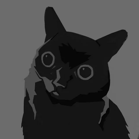
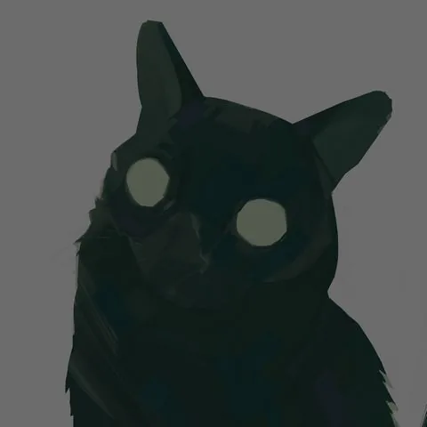
 Let's start by creating a tonal sketch. Above the layer with the background, we create a new layer — on it we will draw. At this stage, I use a stiff brush without texture and three tones: light, medium, dark.
Please note that I use rather subdued tones. If you make the image too contrasting, it will look unnatural. Since the cat itself is dark, I use gray for the light parts, not white. Tone is more important than color — keep an eye on it throughout the work.
Also at this stage, I slightly correct the silhouette of the cat: since it is not clear in what pose the cat is in the photo, I cut off the shape on the right to make the silhouette readable — this small work with composition is done at the sketch stage, while it is easy and quick to make such changes.
At this stage, it is important not to go into excessive detailing. The sketch should be simple, fast and convey only the most necessary in the drawing.
Let's start by creating a tonal sketch. Above the layer with the background, we create a new layer — on it we will draw. At this stage, I use a stiff brush without texture and three tones: light, medium, dark.
Please note that I use rather subdued tones. If you make the image too contrasting, it will look unnatural. Since the cat itself is dark, I use gray for the light parts, not white. Tone is more important than color — keep an eye on it throughout the work.
Also at this stage, I slightly correct the silhouette of the cat: since it is not clear in what pose the cat is in the photo, I cut off the shape on the right to make the silhouette readable — this small work with composition is done at the sketch stage, while it is easy and quick to make such changes.
At this stage, it is important not to go into excessive detailing. The sketch should be simple, fast and convey only the most necessary in the drawing.
 Sketch
Then I duplicate the layer with the sketch by pressing the key combination ctrl+j. I paint the duplicate layer entirely with a subdued gray-yellow shade to create a substrate — on this layer I will continue working in color.
It is important to note that there are an infinite number of work pipelines, and there is no единственно верного way to write a picturesque work. Some artists will prefer to color a ready-made black and white sketch, but I prefer to work in color on top, painting over all the gray elements.
The sketch serves as an assistant for me: I look at it when I work in color and compare the tone, but in fact I write from scratch. Thus, gray and black unsaturated spots do not mix with saturated shades in the work, and the colors remain "pure".
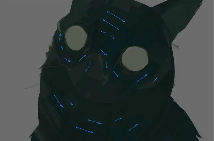
Flooding the layer, we start writing the cat with subdued, but not too dark colors. Be guided by the tonal sketch — these will be the main tone and colors of our cat.
Already at this stage, we apply a picturesque approach in the image — we sculpt the shape with strokes. Note how large and medium strokes lie.
Brush movements are short: put one or two strokes, then change the shade on the palette a little and again — one or two strokes. The direction of the brush strokes should follow the shape you want to show.
Do not be lazy to change shades more often in the process — your palette should always be at hand and easily accessible. Slightly shifting the shade or saturation slider, you will achieve color diversity at this stage. Do not be afraid to add colors that are not in the reference: believe me, it will make your work richer and more expressive!
All strokes may differ in color, but should be very close in tone so that our picture does not turn into a motley mosaic.
Sketch
Then I duplicate the layer with the sketch by pressing the key combination ctrl+j. I paint the duplicate layer entirely with a subdued gray-yellow shade to create a substrate — on this layer I will continue working in color.
It is important to note that there are an infinite number of work pipelines, and there is no единственно верного way to write a picturesque work. Some artists will prefer to color a ready-made black and white sketch, but I prefer to work in color on top, painting over all the gray elements.
The sketch serves as an assistant for me: I look at it when I work in color and compare the tone, but in fact I write from scratch. Thus, gray and black unsaturated spots do not mix with saturated shades in the work, and the colors remain "pure".
Flooding the layer, we start writing the cat with subdued, but not too dark colors. Be guided by the tonal sketch — these will be the main tone and colors of our cat.
Already at this stage, we apply a picturesque approach in the image — we sculpt the shape with strokes. Note how large and medium strokes lie.
Brush movements are short: put one or two strokes, then change the shade on the palette a little and again — one or two strokes. The direction of the brush strokes should follow the shape you want to show.
Do not be lazy to change shades more often in the process — your palette should always be at hand and easily accessible. Slightly shifting the shade or saturation slider, you will achieve color diversity at this stage. Do not be afraid to add colors that are not in the reference: believe me, it will make your work richer and more expressive!
All strokes may differ in color, but should be very close in tone so that our picture does not turn into a motley mosaic.
 Stroke direction
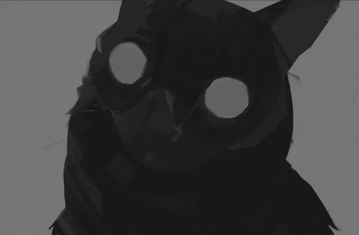 Checking the tone
 Main color
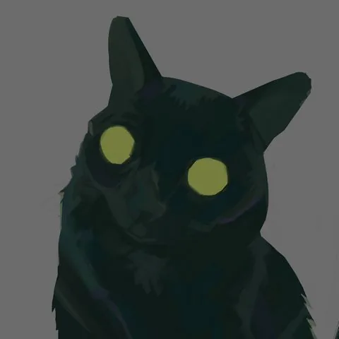
At the next stage, I make the cat's eyes yellow and start introducing a lighter tone, gradually revealing the lighting and volume. Do not rush to make the illuminated areas bright right away, smoothly build up the contrast.
To create light and dark spots on the work, it is not enough to just move the brightness slider on the palette: do not forget about color and the variety of shades! I use medium and small size strokes, continuing to put them in shape, clarifying the work.
Main color
At the next stage, I make the cat's eyes yellow and start introducing a lighter tone, gradually revealing the lighting and volume. Do not rush to make the illuminated areas bright right away, smoothly build up the contrast.
To create light and dark spots on the work, it is not enough to just move the brightness slider on the palette: do not forget about color and the variety of shades! I use medium and small size strokes, continuing to put them in shape, clarifying the work.
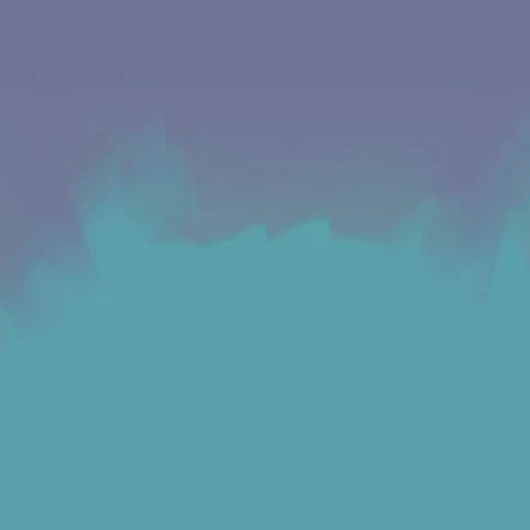
 Now let's take a little detour and create a background. Under the layer with the cat, we create a new one: I decided not to take the background from the reference, but to tint it with blue-lilac shades. To make the background not look boring, I also draw it with a brush, leaving brushstroke marks.
 Let's go back to the layer with the cat. I add even more light, focusing on the photo, in the tonal sketch I make the illuminated areas lighter, add a spot of fur on the chest.
Eyes — we work on them in parallel, performing actions on one eye and immediately on the other. First, we mark the shape of the pupils: I draw them with simple blue-green spots.
Then, taking a darker shade and a smaller brush, I draw a dark contour with a few strokes. My flat brush leaves an angular stroke, and I use this throughout the picture without smoothing out the resulting fractures.
I put a couple of dark strokes in the lower part of the pupil and highlights — in the upper part. The highlights are colored, not too bright, but they are the brightest spots on the eye.
Let's go back to the layer with the cat. I add even more light, focusing on the photo, in the tonal sketch I make the illuminated areas lighter, add a spot of fur on the chest.
Eyes — we work on them in parallel, performing actions on one eye and immediately on the other. First, we mark the shape of the pupils: I draw them with simple blue-green spots.
Then, taking a darker shade and a smaller brush, I draw a dark contour with a few strokes. My flat brush leaves an angular stroke, and I use this throughout the picture without smoothing out the resulting fractures.
I put a couple of dark strokes in the lower part of the pupil and highlights — in the upper part. The highlights are colored, not too bright, but they are the brightest spots on the eye.
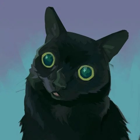
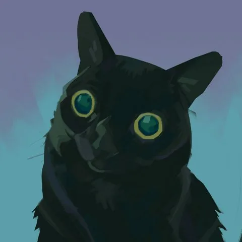 We add contrasting dark spots, clarify the light spots according to the shape, add fur along the edges of the muzzle with short strokes. We enhance the dark spot on the forehead and under the muzzle. Try not to take a pure black color: the shade can be very dark, but it is better to take a more saturated color. For example, deep blue, green.
With a small brush, we draw the mouth and tongue. With a very small brush, we add whiskers and hairs in the ears.
We add contrasting dark spots, clarify the light spots according to the shape, add fur along the edges of the muzzle with short strokes. We enhance the dark spot on the forehead and under the muzzle. Try not to take a pure black color: the shade can be very dark, but it is better to take a more saturated color. For example, deep blue, green.
With a small brush, we draw the mouth and tongue. With a very small brush, we add whiskers and hairs in the ears.
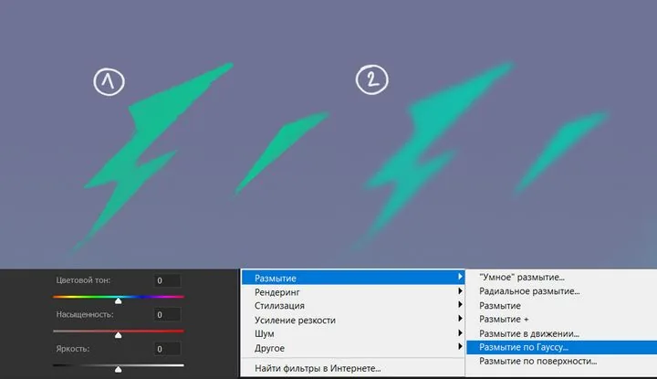
 To prevent the background from being empty, I add neon stars and lightning. I draw them with a brush on a new layer in bright green.
To give them a glow, I duplicate the layer with the key combination ctrl+j. We go to the lower layer with the stars, disable the visibility of the upper layer by clicking on the eye icon on this layer.
The color of the lower stars is changed to a more blue one. By pressing the hotkey ctrl+u, you will open the parameters for changing the color tone and saturation: move the color tone strip and leave the shade you like.
Then, to soften them, we go to the "Filters" tab in the top menu of the program. We choose blur — Gaussian blur. In the window that appears, we move the slider, choosing the degree of blurring we need.
To prevent the background from being empty, I add neon stars and lightning. I draw them with a brush on a new layer in bright green.
To give them a glow, I duplicate the layer with the key combination ctrl+j. We go to the lower layer with the stars, disable the visibility of the upper layer by clicking on the eye icon on this layer.
The color of the lower stars is changed to a more blue one. By pressing the hotkey ctrl+u, you will open the parameters for changing the color tone and saturation: move the color tone strip and leave the shade you like.
Then, to soften them, we go to the "Filters" tab in the top menu of the program. We choose blur — Gaussian blur. In the window that appears, we move the slider, choosing the degree of blurring we need.
 And, as a final touch, I draw highlights-stars in the cat's eyes to connect it with the background. And also because they are cool!
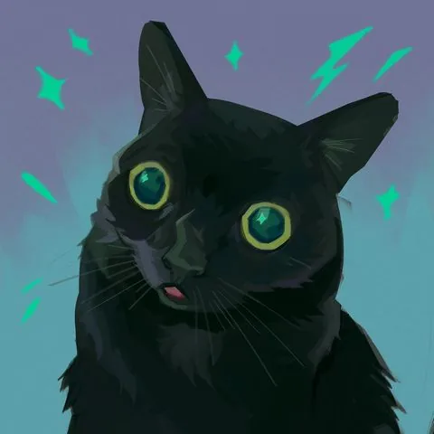 Done! Here is such a picturesque portrait of a cat we have got.
At the end, I would like to give a few tips to beginners:
Done! Here is such a picturesque portrait of a cat we have got.
At the end, I would like to give a few tips to beginners:
Painting render in character concept art, author: Roman Kupriyanov
Surroundings. Creating landscapes and interiors, thinking up locations and working on the atmosphere of the surrounding world — perspective knowledge and lighting skills are especially valued here.
Work by artist Angela Sung
Props (objects). Design of things that fill locations and complement the appearance of heroes. Through objects, the artist can also tell a story: what is this thing, is it old or new, what material is it made of and who does it belong to? Answers to these questions are found by the concept artist in their works, and skills in linear construction, special attention to textures and textures are required here.
Work by artist Clint Cearley
Often it is the skills of digital painting and the individual manner of the artist that determine the style and appearance of the future project.
Concept art by artist Andrey Surnov for the Jusant game and the final appearance of objects in the game
Illustration. This can be both the familiar book illustration and an independent work. In the digital environment, we usually mean by this type one or several paintings united by a common theme or plot.
They can be the artist's personal work or commercial work commissioned. In such works, the artist's skills are most fully revealed, since creating a painting is a complex work that requires the artist to use the entire arsenal of accumulated knowledge. Good illustrations are remembered, become the визитной карточкой of the author and an excellent addition to the portfolio.
Work by curator of the Digital Painting course Marina Peregud
Advertising and promo art. Creating illustrations and designing products for brands and companies from various fields. Such collaboration between an artist and a brand is an excellent advertising move for the company, and for the artist — a great way to express themselves, try something new and demonstrate their creativity to a large audience.
Design of the Riot Arcade pavilion at Incheon Airport, works by artist Atey Ghailan were used
Styles of digital painting
Digital art is extremely diverse and includes many styles: from anime to realistic images. And they can all be picturesque! There are two main factors in choosing the style:- Artistic vision of the author and their own creative method. They are formed under the influence of the artist's taste preferences, experience, individual skills, inspiration by certain currents in art, works and projects, as well as the cultural environment.
- General concept of the project. When it comes to commercial work, the artist adjusts to the tasks of the project, choosing the style that best suits the topic. Various genres may require a certain style and aesthetics to achieve the desired atmosphere. Casual style is more suitable for mobile projects, while semi-realism and realistic style are suitable for cinema, games and projects with serious themes.
Realistic portrait, work of the curator of the Digital Painting course by Yana Struchok
Work in anime style, author: Enze Fu
Semi-realism, author Sebijy
Expressionism in the works of artist Alexander Rostov
Styled portrait, work of the course curator and founder of Skills Up School Azat Nurgaleev
The diversity of styles and approaches available in digital painting is amazing. From photorealism and hyperrealism to abstraction and surrealism — each artist can find their own unique style. Digital tools allow you to experiment with textures, shapes and colors, opening up new horizons for creativity.
Yana Struchok, curator of the Digital Painting course, talks about her favorite tools:
«I like to look for interesting techniques using texture brushes. In oil painting, we used sponges, pieces of newspapers, palette knives to play with the texture of the paint. In digital painting, you can simply choose or reconfigure the brush, and eventually make your own.
A special love is given to brushes with color dynamics: they help to quickly stir up the overall palette of the work. I really like to use blending modes, especially Overlay and Multiply. At the same time, most often I use the overlay not on the layer, but on the brush itself: when such overlays are superimposed on each other, very cool colors are obtained — this usually helps to arrange accents in the work.
Besides the "brush" tool, I very often use a variety of "fingers" and "mix brushes". Both of them mix, smear and allow you to work with touches in different ways.
The mix brush is a very interesting thing: when we use the pipette in normal mode, it takes only one color sample. When we use the pipette with a mix brush, it acts like a stamp and takes not one color, but a piece of the image — it's like in traditional painting you could have several shades on the brush at once without mixing them with each other. This tool, together with the overlays, allows me to achieve picturesqueness and a riot of colors in digital painting.
Freedom and variety of tools give rise to my curiosity and excitement, the constant "what if". That's why I'm never bored, the main thing is to let go of myself and go and try».
Works of the curator of the Digital Painting course - Yana Struchok
If you are just trying your hand at digital drawing, we recommend that you read the articles: How to draw in Procreate and How to draw in Adobe Photoshop.
Tutorial on digital painting
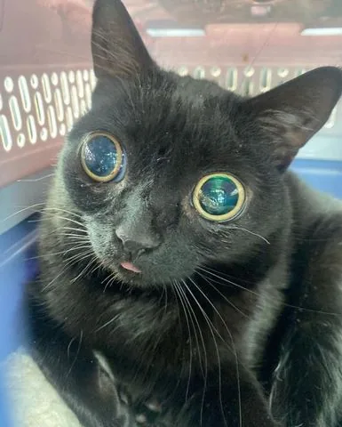
The most interesting part begins — practice! In this tutorial, we will analyze the sequence of creating a picturesque etude, working with tone and color, and step by step we will create a bright and запоминающийся portrait of a cat. Let's go! Let's start with searching for a reference. I often use Pinterest, but I also look for photos on Google and take photos myself. Pay attention to the reference, first of all, to the tones and shape of the object — this will help you convey the volume in your drawing. The color scheme does not have to be taken from the photo, I often add colors of my own, based on my knowledge of color theory and my own flair. For the work, I chose a photo of such a funny cat :D
Reference
I will be doing the work in Photoshop. Creating a canvas: I chose a square format of 2480x2480 pixels. The default resolution is 300 dpi, I change the color of the canvas to gray, because it is more convenient for me to work with tone and color, and the background does not blind you when working.
Let's start by creating a tonal sketch. Above the layer with the background, we create a new layer — on it we will draw. At this stage, I use a stiff brush without texture and three tones: light, medium, dark.
Please note that I use rather subdued tones. If you make the image too contrasting, it will look unnatural. Since the cat itself is dark, I use gray for the light parts, not white. Tone is more important than color — keep an eye on it throughout the work.
Also at this stage, I slightly correct the silhouette of the cat: since it is not clear in what pose the cat is in the photo, I cut off the shape on the right to make the silhouette readable — this small work with composition is done at the sketch stage, while it is easy and quick to make such changes.
At this stage, it is important not to go into excessive detailing. The sketch should be simple, fast and convey only the most necessary in the drawing.
Sketch
Then I duplicate the layer with the sketch by pressing the key combination ctrl+j. I paint the duplicate layer entirely with a subdued gray-yellow shade to create a substrate — on this layer I will continue working in color.
It is important to note that there are an infinite number of work pipelines, and there is no единственно верного way to write a picturesque work. Some artists will prefer to color a ready-made black and white sketch, but I prefer to work in color on top, painting over all the gray elements.
The sketch serves as an assistant for me: I look at it when I work in color and compare the tone, but in fact I write from scratch. Thus, gray and black unsaturated spots do not mix with saturated shades in the work, and the colors remain "pure".
Flooding the layer, we start writing the cat with subdued, but not too dark colors. Be guided by the tonal sketch — these will be the main tone and colors of our cat.
Already at this stage, we apply a picturesque approach in the image — we sculpt the shape with strokes. Note how large and medium strokes lie.
Brush movements are short: put one or two strokes, then change the shade on the palette a little and again — one or two strokes. The direction of the brush strokes should follow the shape you want to show.
Do not be lazy to change shades more often in the process — your palette should always be at hand and easily accessible. Slightly shifting the shade or saturation slider, you will achieve color diversity at this stage. Do not be afraid to add colors that are not in the reference: believe me, it will make your work richer and more expressive!
All strokes may differ in color, but should be very close in tone so that our picture does not turn into a motley mosaic.
Stroke direction
Checking the tone
Main color
At the next stage, I make the cat's eyes yellow and start introducing a lighter tone, gradually revealing the lighting and volume. Do not rush to make the illuminated areas bright right away, smoothly build up the contrast.
To create light and dark spots on the work, it is not enough to just move the brightness slider on the palette: do not forget about color and the variety of shades! I use medium and small size strokes, continuing to put them in shape, clarifying the work.
Now let's take a little detour and create a background. Under the layer with the cat, we create a new one: I decided not to take the background from the reference, but to tint it with blue-lilac shades. To make the background not look boring, I also draw it with a brush, leaving brushstroke marks.
Let's go back to the layer with the cat. I add even more light, focusing on the photo, in the tonal sketch I make the illuminated areas lighter, add a spot of fur on the chest.
Eyes — we work on them in parallel, performing actions on one eye and immediately on the other. First, we mark the shape of the pupils: I draw them with simple blue-green spots.
Then, taking a darker shade and a smaller brush, I draw a dark contour with a few strokes. My flat brush leaves an angular stroke, and I use this throughout the picture without smoothing out the resulting fractures.
I put a couple of dark strokes in the lower part of the pupil and highlights — in the upper part. The highlights are colored, not too bright, but they are the brightest spots on the eye.
We add contrasting dark spots, clarify the light spots according to the shape, add fur along the edges of the muzzle with short strokes. We enhance the dark spot on the forehead and under the muzzle. Try not to take a pure black color: the shade can be very dark, but it is better to take a more saturated color. For example, deep blue, green.
With a small brush, we draw the mouth and tongue. With a very small brush, we add whiskers and hairs in the ears.
To prevent the background from being empty, I add neon stars and lightning. I draw them with a brush on a new layer in bright green.
To give them a glow, I duplicate the layer with the key combination ctrl+j. We go to the lower layer with the stars, disable the visibility of the upper layer by clicking on the eye icon on this layer.
The color of the lower stars is changed to a more blue one. By pressing the hotkey ctrl+u, you will open the parameters for changing the color tone and saturation: move the color tone strip and leave the shade you like.
Then, to soften them, we go to the "Filters" tab in the top menu of the program. We choose blur — Gaussian blur. In the window that appears, we move the slider, choosing the degree of blurring we need.
And, as a final touch, I draw highlights-stars in the cat's eyes to connect it with the background. And also because they are cool!
Done! Here is such a picturesque portrait of a cat we have got.
At the end, I would like to give a few tips to beginners:
- Start with the basics — such as composition, perspective, color theory and chiaroscuro. Understanding these principles will help you at the beginning of your creative journey.
- Devote time to studying programs and devices. Get acquainted with the main tools, menus, settings and functions. If you are just starting to work in digital, it may take some time to get used to this tool — take your time!
- Regular practice is the key to improving your drawing and painting skills. Set aside time to write short sketches and sketches, in parallel with conducting long-term works. The more you practice, the faster you will achieve results.
- Do not be afraid to experiment with different techniques, brushes and drawing styles — this will help you find your own unique style and develop as an artist.
- Get inspired by other artists! Studying the works of other artists, both digital and traditional, develops observation, which helps to diversify your creativity. Often artists post records of the work process (speed painting) — this can also help you find a new approach to drawing and learn something new.
- Be prepared for the fact that the initial results may not always be ideal. Do not despair and keep drawing, do not forget that development in digital painting takes time and effort. Be patient, enjoy the process! Remember that each artist has their own path of development, and it is important to maintain motivation and passion for art.
Related materials

Tutorial
Color in digital painting
February 13, 2025
Tutorial
Sketching for beginners
January 30, 2024

Tutorial
Digital painting in Photoshop
August 12, 2024

Tutorial
Blender 3D lessons for beginners
December 27, 2024

Tutorial
Zbrush lesson for beginners
December 23, 2024

Article
Digital painting. Skills of a modern artist
August 9, 2024
News
Моделирование и текстурирование интересного 3D-персонажа для игр, выполненного в технике ручной живописи
June 15, 2026