Basics of color theory and composition
The basics of color theory: history, color palettes, psychology and cultural differences. Discover how color affects emotions and composition in art.
A little about history. Ancient philosophy and the first theories
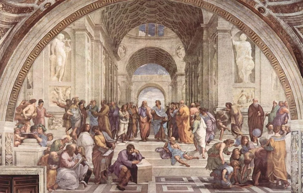 The School of Athens. Work by Raphael Santi
Middle Ages and the Renaissance
In the Middle Ages and the Renaissance, color continued to be studied within the framework of philosophy and art. Oh, these philosophers, they come up with theories and hypotheses, and then we have to figure it out... However, their approach had many good ideas explaining the specifics of color in the context of painting and decorative arts. Many artists, including Leonardo da Vinci, actively explored how light and shadows affect the perception of colors. For example, in his works, he focused on the influence of the environment and light sources on the change in the perception of a particular shade. During the Renaissance, the emphasis of color research shifted more towards the emotional influence of color on the viewer's perception.
XVII and XVIII centuries: the beginning of experiments
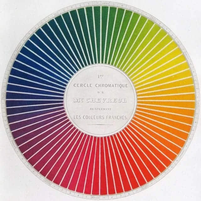
The stellar hour of color theory came in the 18th century: Isaac Newton, studying light, made one of the most important discoveries in the history of color science. In 1704, Newton published his work "Optics", in which he explained the decomposition of white light into a spectrum of colors. He conducted a famous experiment by passing light through a prism and decomposing it into seven colors — red, orange, yellow, green, blue, indigo, and violet. This discovery became the basis for further research in the field of color theory and understanding its physical nature. Newton also introduced the concept of a "color wheel", which became an essential tool in the further study of color and its mixing. We still use it as a color science cheat sheet in painting classes :)
XIX century: systematization and development
With the development of science in the XIX century, scientists began to systematize knowledge about the mixing and perception of colors. One of the important stages was the contribution of the French chemist and artist Auguste Chevreul. He introduced the concept of "contrast" and "optical effect", demonstrating how neighboring colors can enhance each other or create different visual effects depending on their arrangement. And his theory of "color mixing" revealed color from a new angle. We are gradually creeping closer and closer to our century. At the end of the XIX century, the first color models began to develop, and the research of physicist scientists revealed the connection between colors and physical phenomena. Did you know that the color depends on the wavelength of light? The shortest wave corresponds to violet, and the longest to red. Well, now color science does not seem to us to be full of magical inexplicable phenomena.
XX century: Color theory and color science as separate sciences
In the XX century, color began to be considered not only from the point of view of physics, but also psychology, art, and design. New disciplines appeared: color theory and color science. Color theory focuses on the theory and practice of using color in art and design. The main works in this area were related to the formation of color palettes, color harmonies, and the use of color in composition. Important works on color theory were carried out by theoretician artists Johannes Itten and Vasily Kandinsky, who developed theories of the use of color in art and painting education. Color science, in turn, is associated with scientific research into human perception of color, its physiological and psychological aspects. Color science has become an independent discipline within the framework of psychology and neuroscience, especially with the development of cognitive psychology and neurophysiology.
Modernity: Color science as an interdisciplinary science
Today, color theory and color science continue to develop and are applied not only in art, but also in marketing, advertising, web design, fashion, as well as in psychology and neurobiology. With the development of technology (digital graphics and computer color modeling), these sciences are becoming even more important for understanding how color affects perception, mood, and human behavior. Color has been discussed by philosophers, psychologists, chemists, and physicists for many years of human history. Well, now it's our turn to discuss it, the turn of artists!
Basic terms
You've probably heard about color tone, saturation, and brightness. Did you know that colors have their own temperature? These are important parameters for understanding color, without them no painting can be written. Earlier we have already disassembled these terms in more detail — in this article, we recommend to read it. For now, let's move on :)
Color theory and the basics of composition
Color theory and the basics of composition are closely interrelated. Color theory helps to understand how different shades, their combinations, and contrasts can influence the viewer's perception and emotions, while the basics of composition determine how elements, including color, interact and are arranged in space.
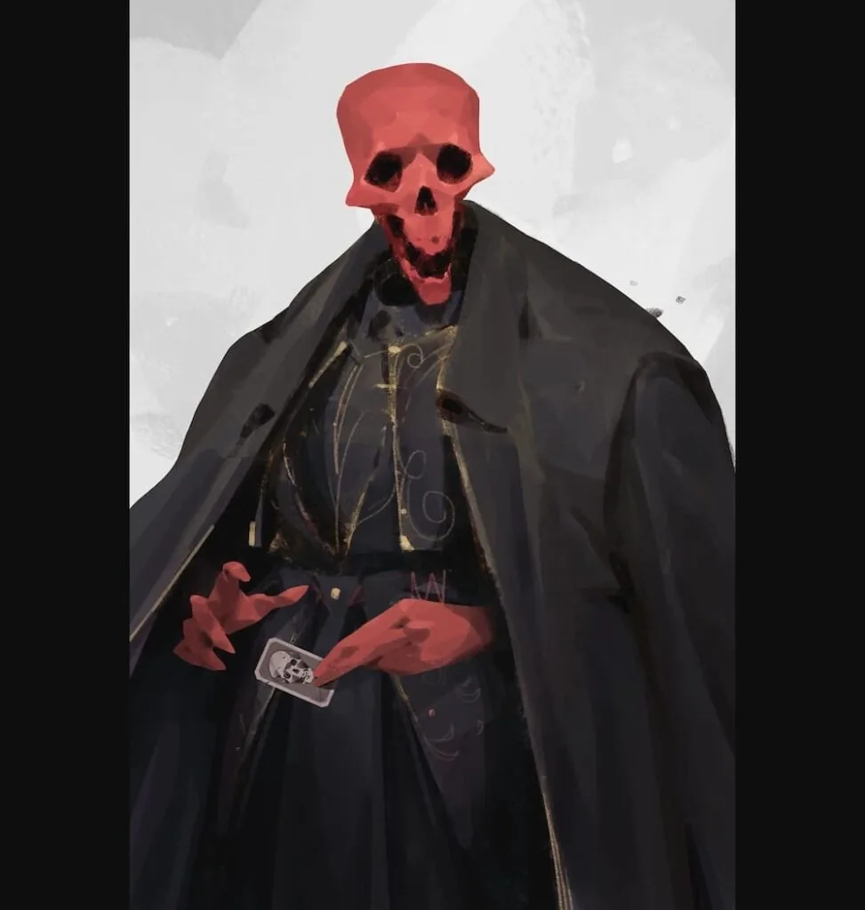
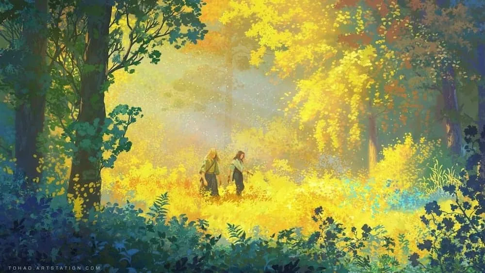
Color as an element of harmony and contrast. One of the key tasks of composition is to create visual harmony. Harmony in composition is achieved with the help of analogous colors (colors located next to each other on the color wheel). For example, a combination of shades of blue, green, and light blue will create a calm and peaceful atmosphere.
Related courses
All courses
Book illustration: The first page page
9 000 ₽3 900 ₽

Векторная иллюстрация для начинающих
15 000 ₽12 000 ₽

Character Concept: My First Hero
10 000 ₽4 500 ₽
Contrast can be achieved with the help of complementary colors (colors located opposite each other on the color wheel, for example, red and green). Such contrast attracts attention and creates a dynamic feeling in the composition. Triadic colors (three colors evenly spaced on the color wheel, for example, red, blue, and yellow) create a balanced but bright composition.
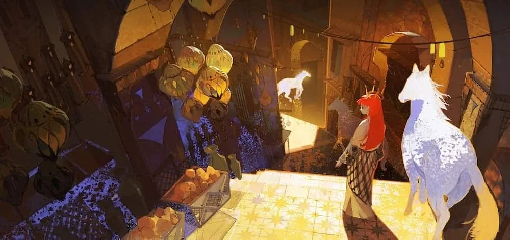
Warm and cold colors can be used to highlight objects or zones in the composition. And by working with the temperature of color, we can delimit the plans of the composition, create the effect of depth and space. Cold shades are usually associated with the far plane and create a sense of distance and airiness, while contrasting, active tones and warm shades are perceived as elements that are closer to the viewer.
In composition, color palettes play an important role. They play a key role in creating a certain atmosphere and mood. There are a great many such palettes, or as they are also called - color schemes, we will consider several of the main ones.
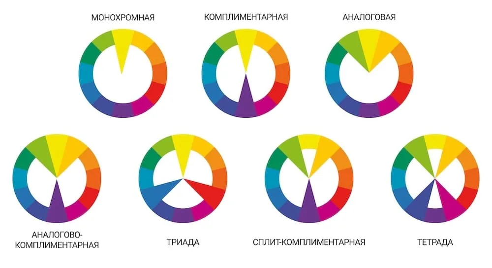
Monochromatic palette
A monochromatic palette uses one color, gradations of its brightness and saturation. Such a palette is often used in minimalist compositions.

Analogous palette
An analogous palette uses 3 colors located next to each other on the color wheel. A little more complicated than monochrome and gives greater variability. After all, we have not just three colors, but also their shades, different saturation and brightness. Such a palette creates smooth transitions and harmonious, soft combinations.
Complementary palette
A complementary palette uses two colors located opposite each other on the color wheel. For example, blue and orange. This color scheme is one of the simplest, most understandable, and most popular. We also take their gradations in lightness and saturation from the two selected colors. Such combinations always create a bright contrast, and they are often used for accents and highlighting important elements of the composition.
Triadic palette
A triadic palette uses three colors equidistant on the color wheel. This combination usually gives balanced but bright compositions.
Tetradic palette
A tetradic palette uses four colors that form two sets of complementary colors. This is a more complex palette that can be used to create compositions where both contrast and balance are important. Suitable for creating complex and layered designs with bright and saturated content.
Split-complementary palette
This is a variation of the complementary palette, where instead of one color, two adjacent colors from the opposite one in the color palette are used. This creates contrast, but not as sharp as when using direct complementary colors, without excessive brightness or tension. Suitable for softer and more harmonious solutions with elements of contrast. The key to the effective use of this palette is to choose a dominant color, and use the other two as an accent and support.
Basic principles of the psychology of color
Emotional impact
Each color evokes certain emotions and associations in a person. For example, warm colors (red, orange, yellow) are often associated with activity, energy, and excitement, while cold colors (blue, green, purple) can evoke a sense of calm, relaxation, and умиротворение.
Impact on the perception of time
Surprisingly, colors can also affect our perception of time. For example, warm and bright colors can create the feeling that time is flying faster, while cooler, calmer shades slow down the perception of time and create a sense of duration. Maybe that's why summer flies by so quickly, and winter seems so long?
Context and combination of colors
The influence of color can change depending on the context and its combination with other colors. For example, green can be associated with nature, calmness, but if combined with yellow or orange, it can become more energetic and active. Bright chartreuse color is often associated with something toxic, notice if we paint the contents of some bottle in green - it will certainly be associated with poison and poisoning.
Cultural differences in the perception of colors
Have you not broken down from color theories, palettes, and features? Then we go further and talk about the meaning of color in different cultures. In Western culture, colors are often perceived from the point of view of emotions and psychological impact, while in Eastern cultures, color symbols often have deeper historical and philosophical roots. Cultural differences in the perception of color are an important aspect that affects our emotions, behavior, and perception of the world around us. Understanding these differences is important when developing international projects, advertising campaigns, or design solutions related to the cultural characteristics of different peoples.
Colors that one culture may symbolize joy and prosperity, for another they may be associated with grief or danger. Considering these factors, you can create more interesting visual solutions, avoiding misunderstandings or negative associations. Below is a comparison of the perception of different colors in Western and Eastern cultures.
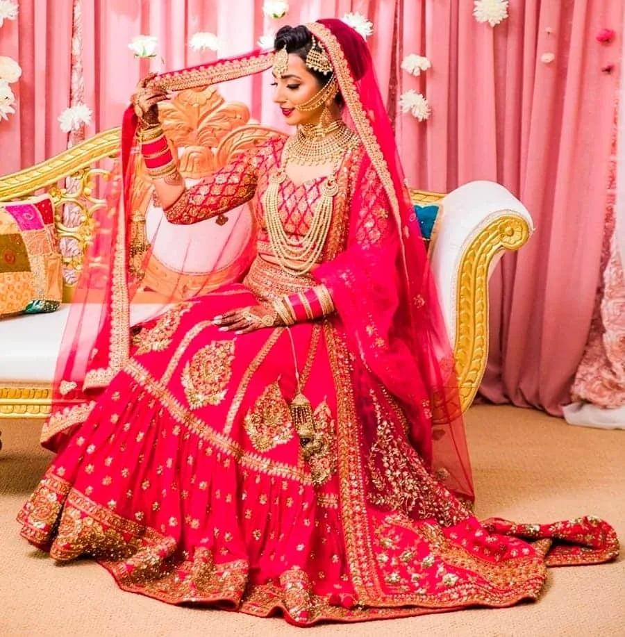
Red color
In most Western countries, red is associated with love, passion, energy, and even danger. It symbolizes both positive and negative emotions. For example, red is often used on Valentine's Day to express love, but at the same time — to indicate danger (red traffic signals).
In Chinese culture, red is a color of luck, well-being, and prosperity. It is actively used at weddings and holidays, such as the Chinese New Year, and is associated with favorable events.
In India, red symbolizes strength, wealth, and wedding blessings. It is one of the traditional colors of wedding dresses for the bride. It can also be associated with religious symbols and holidays.
White color
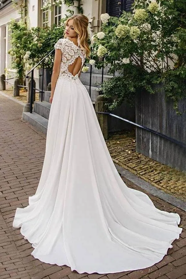
In Western culture, white is traditionally associated with purity, innocence, and peace. It is also a popular color for wedding dresses, symbolizing purity and a new beginning. In Eastern countries, white color is often associated with mourning and death. White clothes can be worn at funerals, and white color is a symbol of grief and loss. Widows in India wear white dresses during mourning.
Black color
In Western countries, black is often associated with elegance, formality, and power (for example, a black suit or evening dress). However, black is also associated with mourning and death and is used at funerals.
In China, black can symbolize protection, secrecy, and strength, but it is also associated with negative aspects of death and evil.
Indian culture perceives black as a bad color, associated with failure or evil energy. Black color is avoided at wedding ceremonies, as it can foreshadow unhappiness.

Yellow color
User: Yellow color in the West is usually associated with joy, optimism, and the sun. It evokes positive emotions and is the color of happiness. However, bright yellow shades can be associated with warnings or danger (for example, yellow warning signs). Yellow has traditionally been the imperial color in China and symbolized power, wealth, and honor. It was associated with the imperial family and used in clothing and architecture. In India, yellow is associated with spirituality, sacredness, and wealth. It is a color worn at many religious festivals and is important in Hindu culture.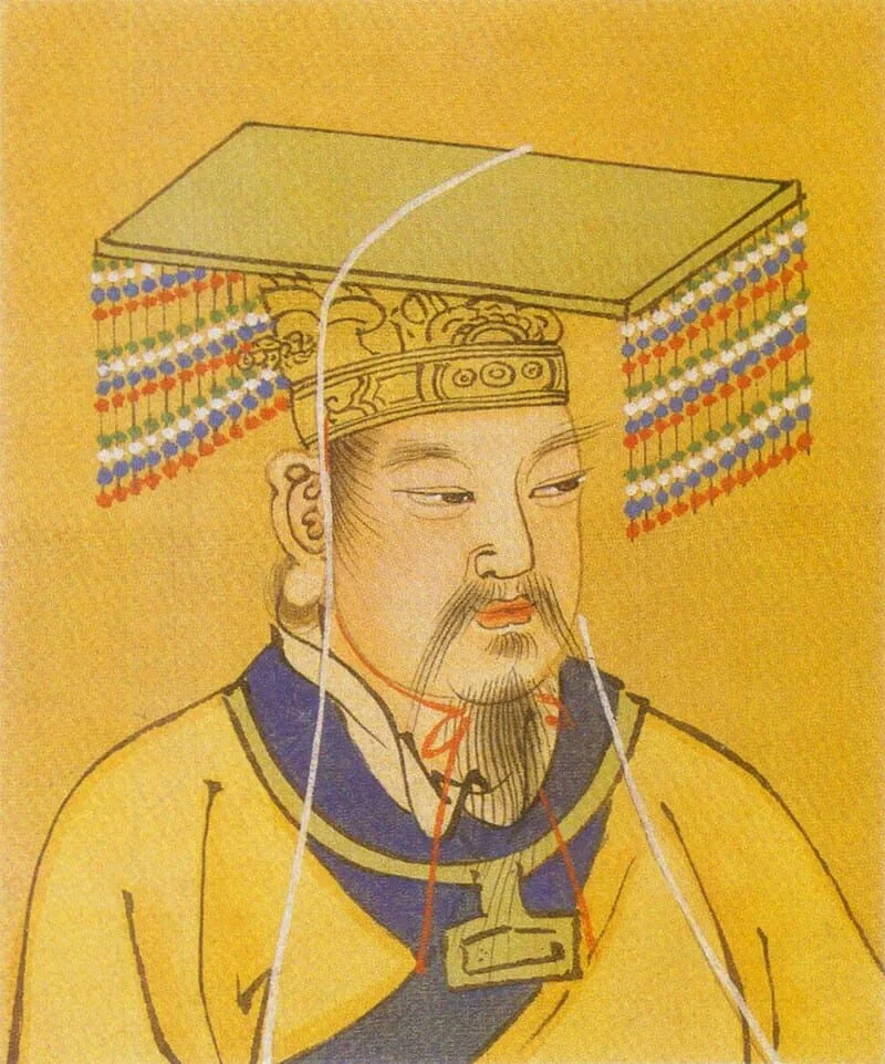 Huang-di, whose name also translates as the Yellow Emperor - the legendary ruler of China and mythical character
Green color
In Western countries, green is often associated with nature, health, and freshness. It can also symbolize growth and recovery. More saturated, "acid" green colors are often associated with poisons and toxins. In China, green is traditionally associated with prosperity, good luck, and harmony. This color is used to attract good luck, especially when combined with red. In India, green symbolizes nature, wealth, health, and freshness. It is also a color associated with Islamic culture, where green is considered a sacred color.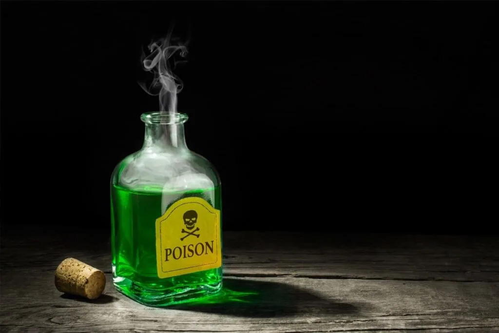 The contents of a bottle of poison will certainly be painted green (although real poisons and toxins are often colorless)
Blue color
Blue is traditionally associated with peace, calm, and reliability. It is a color that evokes a sense of stability and trust. In business, blue is used for brands that want to demonstrate their reliability. Chinese culture also associates blue with peace, but in some cases it can be associated with sadness. In India, blue has religious significance, especially in the context of Hinduism. It is the color of the god Krishna and symbolizes divine power and protection. Krishna - one of the most popular Hindu deities
Purple color
In Western culture, purple is associated with luxury, royalty, and elegance. In China, purple can be associated with spirituality, and in some cases with the afterlife and death. However, it is also considered a color for religious rituals. In India, purple has similar associations with spirituality and mysticism, symbolizing higher levels of consciousness and mystical power.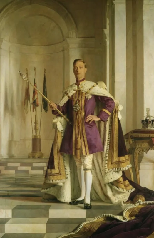 King George IV of Great Britain in purple robes, work by artist Gerald Kelly
Color is an incredibly diverse and fascinating phenomenon. It is a constant companion, a faithful friend, but at the same time a complex and confusing puzzle for an artist. Interaction with color, studying the features and subtleties of color combinations is an integral part of our profession. We hope that our article has revealed to you several secrets of working with color. We delve even deeper into the knowledge of its secrets in the courses Digital painting.
Do not be afraid of bold experiments and daring color combinations! And may skill be with you ;)
King George IV of Great Britain in purple robes, work by artist Gerald Kelly
Color is an incredibly diverse and fascinating phenomenon. It is a constant companion, a faithful friend, but at the same time a complex and confusing puzzle for an artist. Interaction with color, studying the features and subtleties of color combinations is an integral part of our profession. We hope that our article has revealed to you several secrets of working with color. We delve even deeper into the knowledge of its secrets in the courses Digital painting.
Do not be afraid of bold experiments and daring color combinations! And may skill be with you ;)Related materials

Color theory for artists: complementary color scheme

How to get the most out of Skills Up School courses?

Color theory in painting: the art of using color
Composition in the drawing

How to draw silhouettes: basics, tricks and step-by-step lesson