Color theory for artists: complementary color scheme
In painting, traditional or digital, color plays one of the main roles. Well-chosen color combinations set the atmosphere and control the viewer's attention.

Have you ever noticed how saturated colors — the green of foliage, the blue of snowdrops, the pink petals of blooming apple trees — lift your spirits?
Similarly, in painting, traditional or digital, color plays one of the main roles. Properly selected color combinations set the atmosphere and control the viewer's attention. And you can learn it! You just need to know a few fundamental rules, develop your observational skills and, of course, practice more.
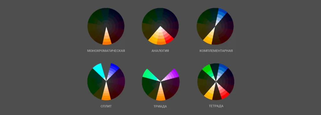
Knowledge of color schemes — combinations of colors that allow them to harmoniously exist within the same image — significantly simplifies work with color.
There are six main color schemes: monochromatic, analogy, complementary, triad, split and tetrad. For clarity, we show them on the color wheel:
Related courses
All courses
Book illustration: The first page page
9 000 ₽3 900 ₽

Векторная иллюстрация для начинающих
15 000 ₽12 000 ₽

Character Concept: My First Hero
10 000 ₽4 500 ₽
Each of the schemes has its own characteristics. For example, the monochromatic one uses one spectrum, only saturation and brightness change. It is often used in concepts for movies, games, and cartoons, especially well suited for environment concepts. Imagine the ice of Antarctica or the hot desert — they are associated with certain colors.
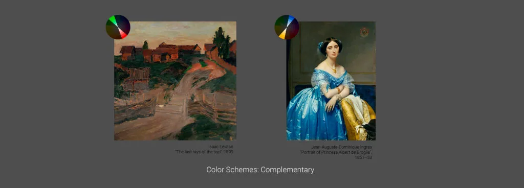
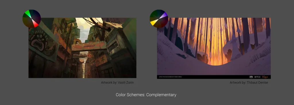
The most popular scheme is complementary. In it, the colors on the color wheel are located opposite each other. The colors are contrasting and at the same time complement each other well.

Two examples from classical painting: in Levitan's painting, different derivatives of red are diluted with muted emerald, and this gives an expressive contrast. And in the portrait of Princess de Broglie, the combination of yellow and blue attracts the eye, but the contrast does not look heavy.
Another combination of red and green — this time in the modern illustration by Vasily Zorin. It looks expressive! And in the work of Thibaut Denise, the combination looks so harmonious because it is borrowed from nature itself — cold snow, which looks purple, and warm, saturated orange sunset.
In 2D graphics courses, we pay a lot of attention to the study of color.
On 2D Basic (by the way, you saw a small fragment of a lecture on color theory from this course in this letter), we analyze the basics of the color spectrum, tone, saturation, and learn how to harmoniously combine colors.
On 2D Middle and the course Stylization, we also study the topic of color in detail and analyze how color can convey the general idea, the atmosphere of the project.
In the course Character Design in Animation, we touch on the topic of the meaning of color in character design — his appearance, costumes, details of the image.
Related materials

Basics of color theory and composition

3D for 2D illustration: A comprehensive guide for artists

The artist's dictionary: your guide in the world of creativity

Color theory in painting: the art of using color

Digital painting. Skills of a modern artist

How to draw a crystal. Step-by-step guide for artists