ArticleUpdated: July 2, 2026
Composition in the drawing
In short
We study types of composition in drawing for начинающих artists. Rules, basic laws of composition in drawing. Educational video.
2D artist (illustrator)
Composition for an artist is the cornerstone of a successfully executed work. No matter how wonderfully an illustration is rendered or a style is chosen, without good composition, art will not attract attention. What rules should be followed to achieve a successful composition? We understand this in this article.
We have developed a new course for beginners and experienced artists - «Compositional sketching».
The course will give you a composition system that will make your drawings convincing and expressive. You will learn to manage the viewer's attention, enhance emotions and achieve an impressive result faster in any genre - from portrait to complex scene.
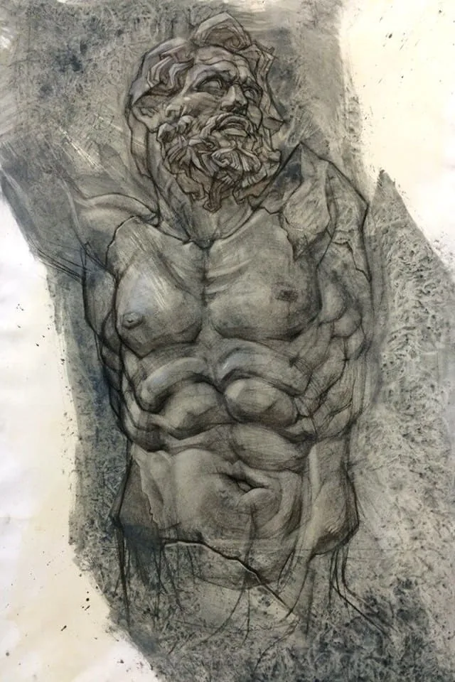 All attention is drawn to the diagonal gray spot in which the figure is located. White areas in the corners are rest areas for the eyes. It is important to remember about the harmony of increased attention and weakened attention so as not to create a «borscht». Author: Azat Nurgaleev.
At the very beginning, it is important to decide what kind of work we want to do: an analytical drawing, a series of sketches, a complex illustration, a portrait, a pattern or a picturesque still life. Depending on the task, the composition will develop differently.
All attention is drawn to the diagonal gray spot in which the figure is located. White areas in the corners are rest areas for the eyes. It is important to remember about the harmony of increased attention and weakened attention so as not to create a «borscht». Author: Azat Nurgaleev.
At the very beginning, it is important to decide what kind of work we want to do: an analytical drawing, a series of sketches, a complex illustration, a portrait, a pattern or a picturesque still life. Depending on the task, the composition will develop differently.
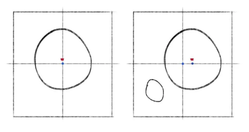 On the left diagram, the circle is located symmetrically in the center of the vertical axis. Its center is slightly raised above the horizontal axis. When we have more distance from the bottom of the object, the image looks lighter. On the right diagram, the circle is shifted to the right – toomposition is asymmetrical. To avoid the feeling of imbalance, it is necessary to add an additional object for visual stabilization – this will not violate the feeling of asymmetry.
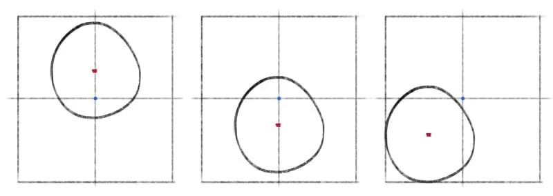 These are examples of unstable composition. It looks losing. The first picture – the circle rose too high, it is difficult for us to concentrate our gaze on it. The second picture – the circle dropped down too much. There is a feeling of heaviness, as if the background is pressing on it from above. The third picture – the circle fell down and touched the edges of the sheet. You should not place the main object at the edge or cut it with the edges.
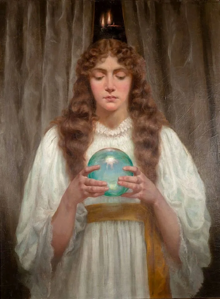 In Legh Mulhall Kilpin's work «Crystal Ball» we see a symmetrical composition, the girl is stably located on the canvas, without movement. We look only at her in a frozen moment.
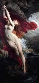 In Jules Louis Masher's painting «Andromeda Chained to a Rock» dynamics is very strongly felt, the figure is shifted from the center diagonally to the left, the landscape also helps to feel the movement.
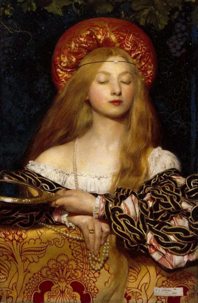 On this canvas there is hidden dynamics. In a symmetrical composition there are asymmetrical details and inclined lines (curls fall in different directions, the right elbow is lowered lower than the left, the face is slightly turned to the right, and the gaze is down to the left). Author: Frank Cadogan Cowper, «Vanity».
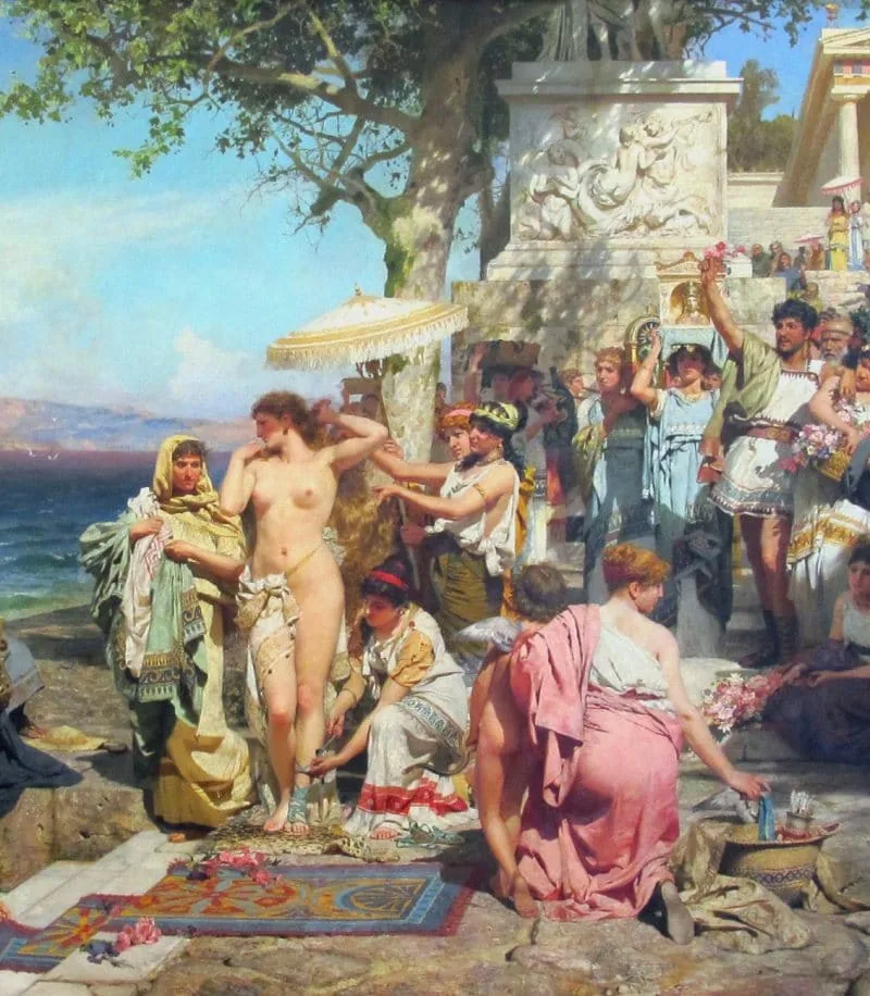
 Both examples illustrate well the harmony of characters, environment, objects among each other. The composition is whole, not fractional. The first work is by Heinrich Semiradsky, fragment of the painting «Phryne at the Poseidon Festival in Eleusis», the second is by Nikolai Andreychenko, High 2D Graphics course.
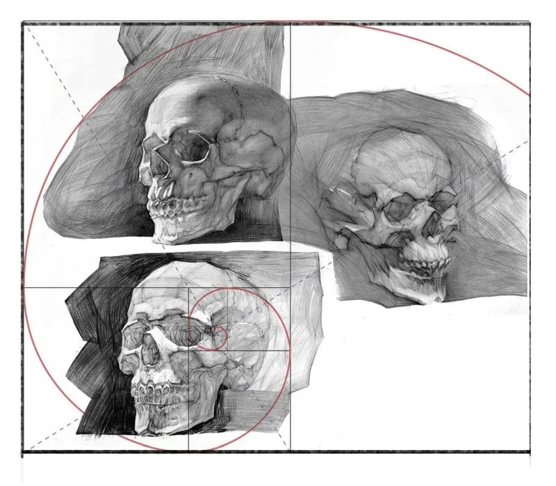 Suranov's skulls are located along the movement of the golden section curl.
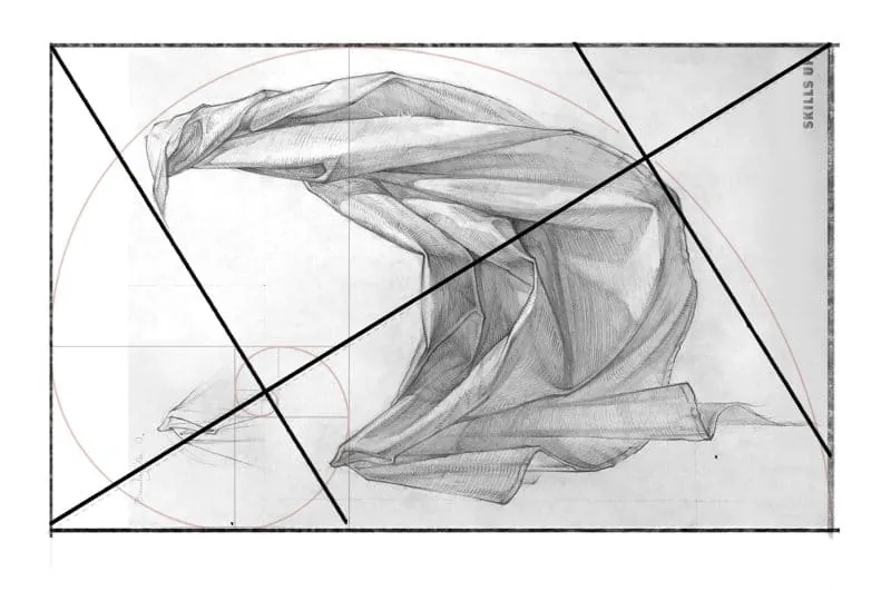 Drawing course. width="800" height="531" />
In the golden section, triangles formed by the diagonals of proportional figures to each other are used. We use these diagonals intersecting at an angle of 90 degrees. The drapery is rhymed with them. Author: Anna Vinokurova, Drawing course.
It must be remembered that you can experiment with techniques and move the center within the found areas. The compositional center is not a point or a pixel, but a whole area. The compositional center can be one object, or it can consist of several.
Drawing course. width="800" height="531" />
In the golden section, triangles formed by the diagonals of proportional figures to each other are used. We use these diagonals intersecting at an angle of 90 degrees. The drapery is rhymed with them. Author: Anna Vinokurova, Drawing course.
It must be remembered that you can experiment with techniques and move the center within the found areas. The compositional center is not a point or a pixel, but a whole area. The compositional center can be one object, or it can consist of several.
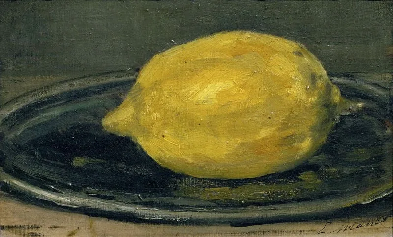 In Eduard Manet's lemon etude, the main and central thing is the lemon.
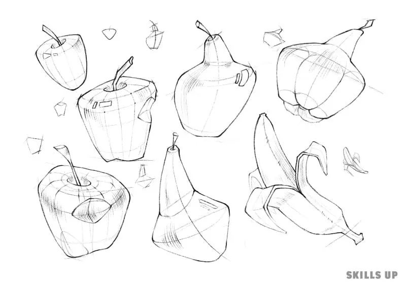 On the sheet there is a whole series of fruits. They form a pattern, their family is read visually as a single whole. Author: Alyona Mukhorryanova, Express sketching course.
What is composition
Composition is the arrangement of lines, spots, dots, objects, characters, additional details, light, strokes, brushstrokes – in general, everything that we see on the sheet. These elements create areas of attraction of the viewer's attention or, conversely, rest areas. We recommend a useful article: Chiaroscuro in drawing
All attention is drawn to the diagonal gray spot in which the figure is located. White areas in the corners are rest areas for the eyes. It is important to remember about the harmony of increased attention and weakened attention so as not to create a «borscht». Author: Azat Nurgaleev.
At the very beginning, it is important to decide what kind of work we want to do: an analytical drawing, a series of sketches, a complex illustration, a portrait, a pattern or a picturesque still life. Depending on the task, the composition will develop differently.
What kind of composition exists
Since we work on a sheet or a digital canvas, we are limited by their format, and within it we will consider the key properties of the composition. The arrangement of the object inside the sheet is an interesting task, and you can approach its solution from different sides.Composition by feelings
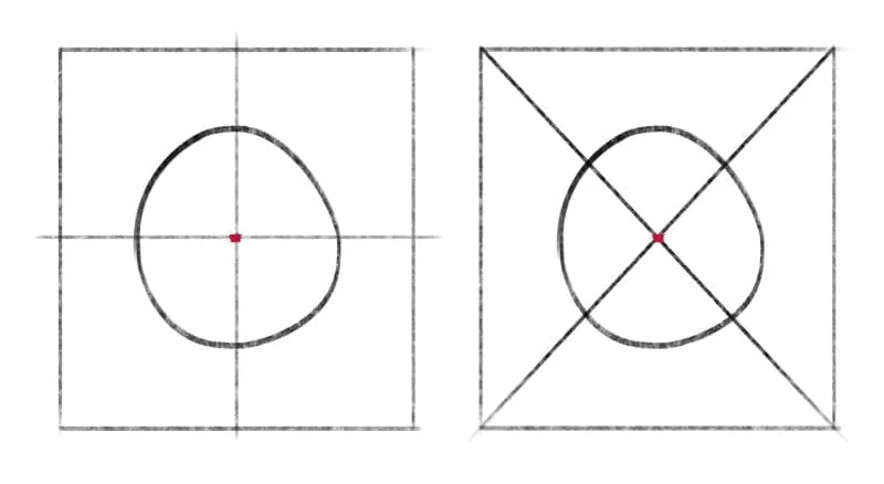
Composition can be stable or unstable. Stable composition is the arrangement of objects in the central part of the sheet. At the same time, we do not have the feeling that they ended up too low to the edge of the sheet, or jumped high up, or timidly gathered in some corner. Unstable – when we feel an imbalance in the arrangement of objects. In order to use a stable, confident layout, we need to determine the compositional center in the sheet – this is the depicted object to which the viewer's attention will be directed. Its location depends on simple introductory: symmetry and asymmetry. It turns out that a stable composition is symmetrical composition, unstable – asymmetrical.
On the left diagram, the circle is located symmetrically in the center of the vertical axis. Its center is slightly raised above the horizontal axis. When we have more distance from the bottom of the object, the image looks lighter. On the right diagram, the circle is shifted to the right – toomposition is asymmetrical. To avoid the feeling of imbalance, it is necessary to add an additional object for visual stabilization – this will not violate the feeling of asymmetry.
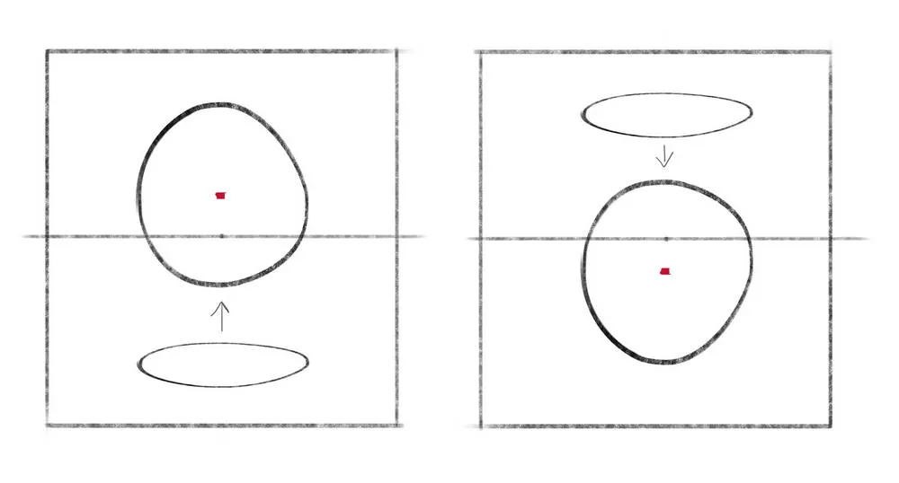
These are examples of unstable composition. It looks losing. The first picture – the circle rose too high, it is difficult for us to concentrate our gaze on it. The second picture – the circle dropped down too much. There is a feeling of heaviness, as if the background is pressing on it from above. The third picture – the circle fell down and touched the edges of the sheet. You should not place the main object at the edge or cut it with the edges.
Movement in composition
Symmetry leads to statics, asymmetry – to dynamics. And our composition can be either static, motionless, confident and very balanced, or dynamic, playful, with energetic movements.
In Legh Mulhall Kilpin's work «Crystal Ball» we see a symmetrical composition, the girl is stably located on the canvas, without movement. We look only at her in a frozen moment.
In Jules Louis Masher's painting «Andromeda Chained to a Rock» dynamics is very strongly felt, the figure is shifted from the center diagonally to the left, the landscape also helps to feel the movement.
On this canvas there is hidden dynamics. In a symmetrical composition there are asymmetrical details and inclined lines (curls fall in different directions, the right elbow is lowered lower than the left, the face is slightly turned to the right, and the gaze is down to the left). Author: Frank Cadogan Cowper, «Vanity».
Unity in composition
Paintings, drawings, arts consist of many components. In a good successful work, they look harmonious, smoothly rhymed with each other. Composition can be whole or fractional. When all the elements in our sheet are not subordinate to each other, the main accent is not revealed, all objects differ in shape, color, then we get a fractional composition.
Both examples illustrate well the harmony of characters, environment, objects among each other. The composition is whole, not fractional. The first work is by Heinrich Semiradsky, fragment of the painting «Phryne at the Poseidon Festival in Eleusis», the second is by Nikolai Andreychenko, High 2D Graphics course.
Basics of composition for beginning artists: basic rules for building an illustration
The basis of any composition is the compositional center. In other words, the main depicted object. In the search for the compositional center, several techniques will help us:- Intersection of diagonals and axes
- Rule of shares
- Rule of thirds
- Golden section
Suranov's skulls are located along the movement of the golden section curl.
Drawing course. width="800" height="531" />
In the golden section, triangles formed by the diagonals of proportional figures to each other are used. We use these diagonals intersecting at an angle of 90 degrees. The drapery is rhymed with them. Author: Anna Vinokurova, Drawing course.
It must be remembered that you can experiment with techniques and move the center within the found areas. The compositional center is not a point or a pixel, but a whole area. The compositional center can be one object, or it can consist of several.
In Eduard Manet's lemon etude, the main and central thing is the lemon.
On the sheet there is a whole series of fruits. They form a pattern, their family is read visually as a single whole. Author: Alyona Mukhorryanova, Express sketching course.
How to build a grid for composition in digital drawing
Related courses
All courses
from 3 900 ₽
-57%
Book illustration: The first page page
9 000 ₽3 900 ₽
Learn more

from 12 000 ₽
-20%
Векторная иллюстрация для начинающих
15 000 ₽12 000 ₽
Learn more

from 4 500 ₽
-55%
Character Concept: My First Hero
10 000 ₽4 500 ₽
Learn more
In drawing programs it is doubly convenient to use grids. They can be made translucent, turned on and off, peeked at and quickly corrected mistakes.
The grid can be drawn manually, setting up a hint: in Adobe Photoshop on the «View» panel, find the «Show» item and select «Grid».
We recommend a useful article: How to draw in Adobe Photoshop
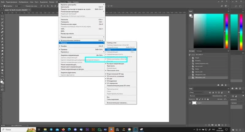 A grid will appear, after which you need to adjust its parameters according to the compositional rule of shares or thirds that you are comfortable with.
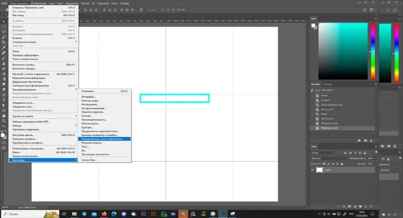
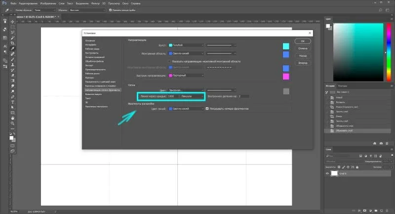 Change the values in the «Line every» item to increase or decrease the number of guides. With the CTRL+H key combination, you can turn the grid on and off.
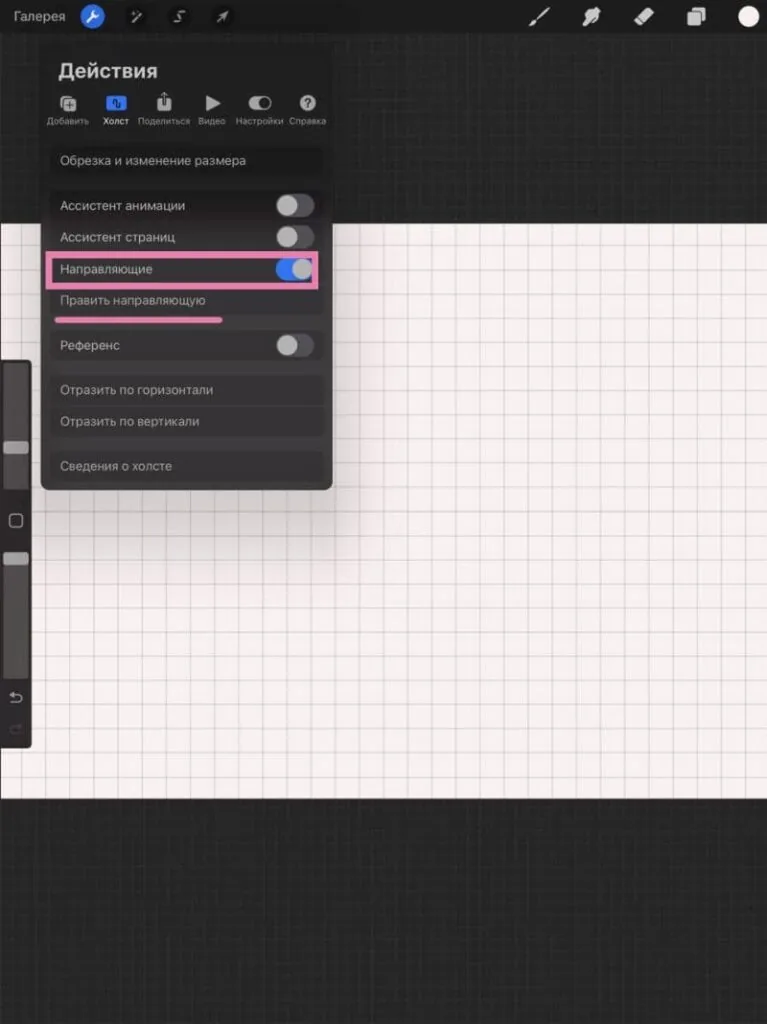
In Procreate you can also adjust the grid. Go to the «Actions» panel, select «Canvas», turn on «Guides» and go to «Edit guides». You will go to a window in which you can adjust the number of axes, transparency, color and angle of the grid.
We recommend a useful article: How to draw in Procreate
Change the values in the «Line every» item to increase or decrease the number of guides. With the CTRL+H key combination, you can turn the grid on and off.
In Procreate you can also adjust the grid. Go to the «Actions» panel, select «Canvas», turn on «Guides» and go to «Edit guides». You will go to a window in which you can adjust the number of axes, transparency, color and angle of the grid.
We recommend a useful article: How to draw in Procreate
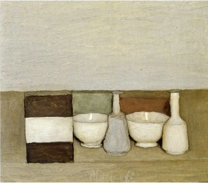 Giorgio Morandi's still life is monotonous, all elements look identical to each other.
 Basic 2D Graphics course." width="800" height="870" />
The second still life uses rhythms of heights, widths, distances. Author: Anna Aboimova, Basic 2D Graphics course.
An empty space with not many details helps create an area of relaxed attention. Rest islands are necessary to distribute the observer's attention and not overload them with a lot of information.
Basic 2D Graphics course." width="800" height="870" />
The second still life uses rhythms of heights, widths, distances. Author: Anna Aboimova, Basic 2D Graphics course.
An empty space with not many details helps create an area of relaxed attention. Rest islands are necessary to distribute the observer's attention and not overload them with a lot of information.
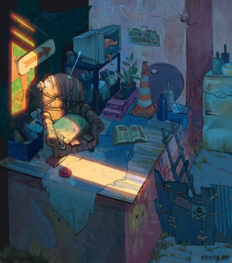
 Around the central character there is a lot of air and freedom, the background is hidden in the сумраке dark glass. Thanks to this effect, our attention is focused on the girl. Author: Andrey Surnov.
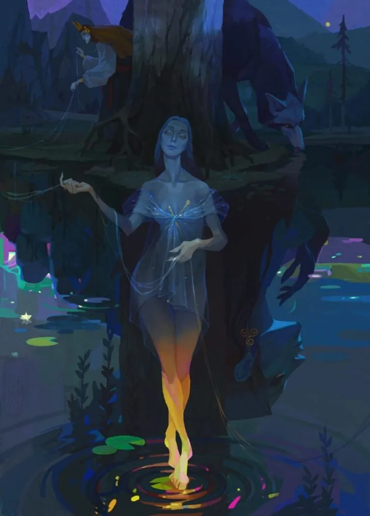
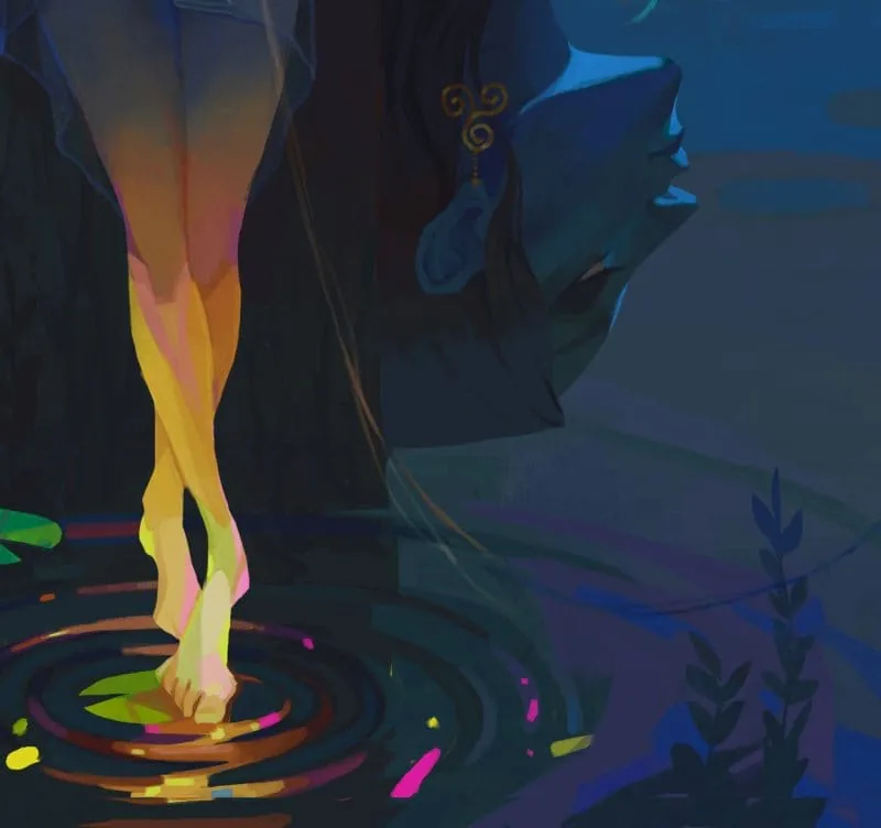 Characters of different scales are surrounded by a huge amount of space compared to them. There is much more water than shore, and microscopic details are noticeable on its surface: water lily leaves, algae, glints. All together creates a whirl of events that draws us into the plot, we want to study the illustration. Author: Elizaveta Parfenova.
 We recommend a useful article: digital painting. Illustration
 A character concept sheet is put together structurally, information is distributed into subtopics (line, angles, general look). But at the same time there is more emphasis on color, emotion, and posture. Author: Valeria Lugovaya.
 «Proun» by El Lissitzky is closer to design, project painting. There are more semantic and rational structures in the composition.
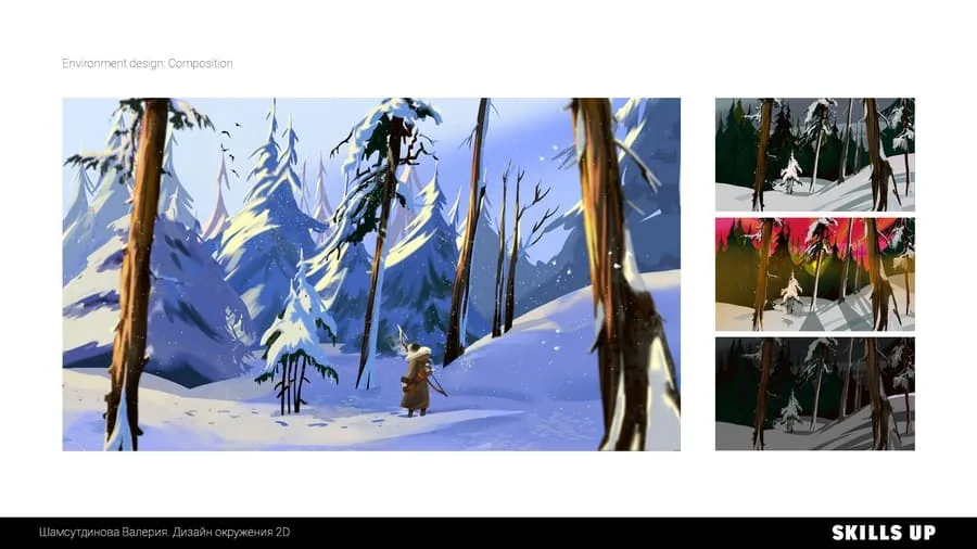 In the winter landscape, the order of vertical rhythms, sharp and soft forms, and the boundaries of the space of the earth, forest, and sky are clearly visible. There are a lot of structures in it, but, first of all, we are caught by the plot, artistic techniques, and emotional content. Author: Valeria Shamsutdinova, course Design of the environment in 2D.
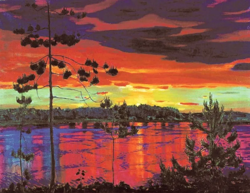 Arkady Rylov's sunset landscape is bright and saturated, but the colors are chosen according to the principle of complementarity. Blue corresponds to orange color according to the color circle. The artist uses their related combinations.
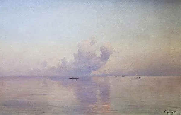 The color scheme of the marine landscape was created by Nikolai Dubovsky from gentle adjacent colors. We see many nuanced shades of blue, blue and lilac.
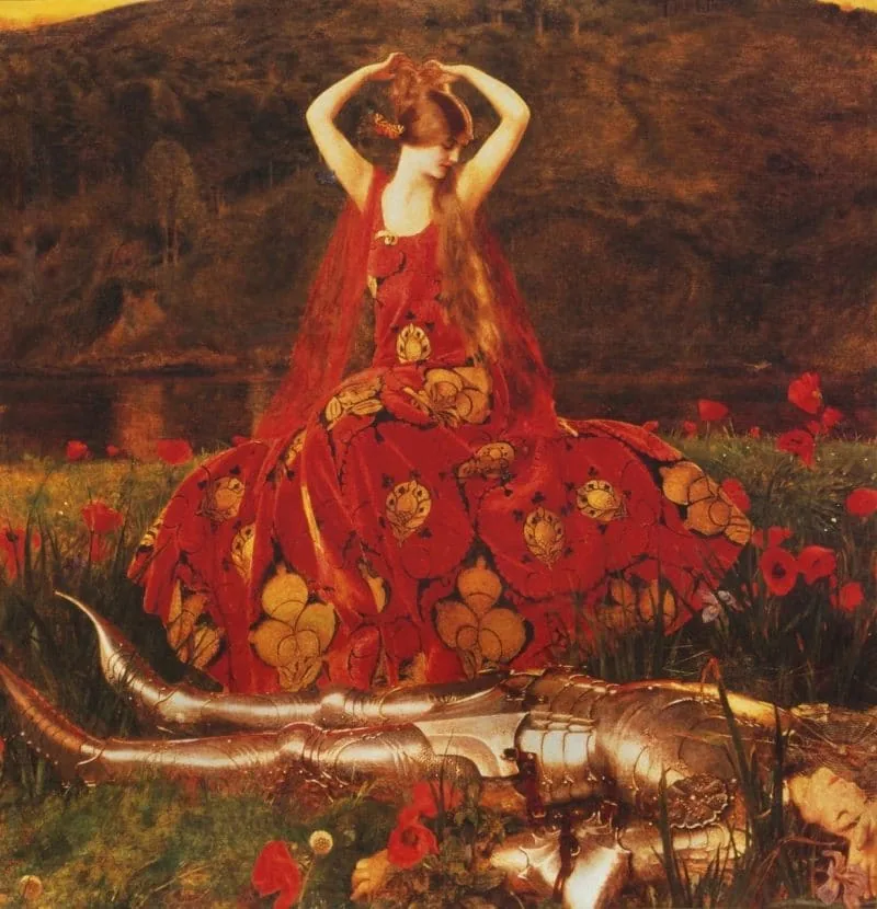 At first glance at the canvas, we see a beautiful girl in a red dress on a poppy field. Upon more prolonged examination, we notice a sleeping or killed one, and the meaning of red changes from passionate to dangerous, tense. No wonder the work is called «Ruthless Beauty». Author: Frank Cadogan Cowper.
We recommend a useful article: basics of color theory
At first glance at the canvas, we see a beautiful girl in a red dress on a poppy field. Upon more prolonged examination, we notice a sleeping or killed one, and the meaning of red changes from passionate to dangerous, tense. No wonder the work is called «Ruthless Beauty». Author: Frank Cadogan Cowper.
We recommend a useful article: basics of color theory
 In the thematic interior, the chair is highlighted with light. In this area, a very contrasting combination of colors was obtained (orange, golden, pink, blue, green), and around all the other participants are shrouded in a purple-blue haze. Author: Daria Stepanova, course 2D graphics Pro.
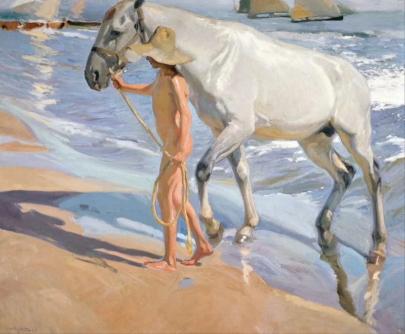 We see a sunny bright day, a young man leads a horse to the shore, everything is shrouded in warm summer light. In the shadows we see more cold shades (violet, greenish and blue) than on the illuminated elements. Author: Joaquin Sorolla, «Horse Bathing».
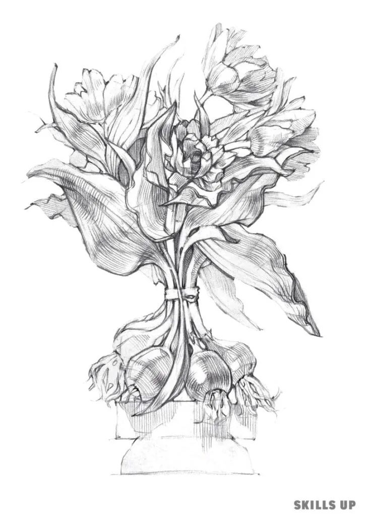 In the sketch of a bunch of tulips, leaves and roots with fatter strokes and an active boundary line come to the fore in the foreground. The composition is simple, centered along the axes, all attention is on the plants. Author: Zhenya Shubina, course Drawing.
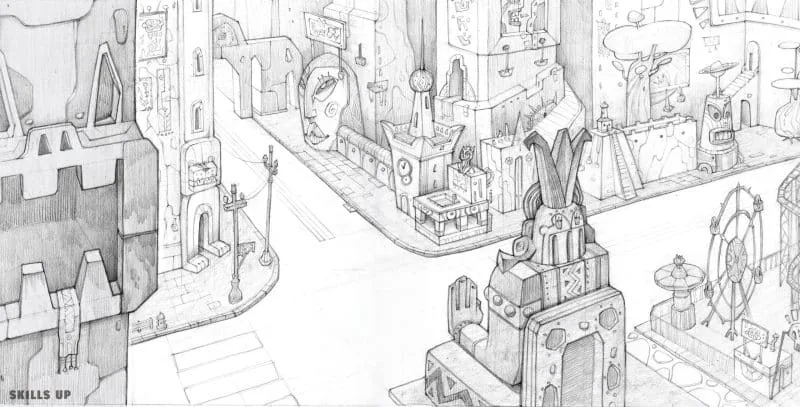 The urban fantasy landscape was created using the rule of thirds. The main elements are distributed along the axes of the «tic-tac-toe» grid, and the buildings closest to us have a more noticeable stroke and a pronounced line of the silhouette. Author: Alexandra Khorosheva, course Drawing.
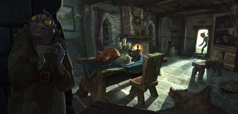 We see several techniques in the illustration: color contrast, support of the environment, highlighting with a silhouette and light. There is a feeling of the composition's striving towards the center and to the right, the rhythm of the lines of shadows, the perspective reduction of the room is directed at the incoming character. Authors: Azat Nurgaleev, RинаOld masters studied the laws of composition, experimented, and created spectacular canvases. Artists knew the secret that composition is the art of bringing a large number of details on the canvas to a single expressive whole, and the most important thing is not to go in favor of physical laws and meticulous copying of the world around. They tried to combine different techniques to achieve maximum connection with the viewer.
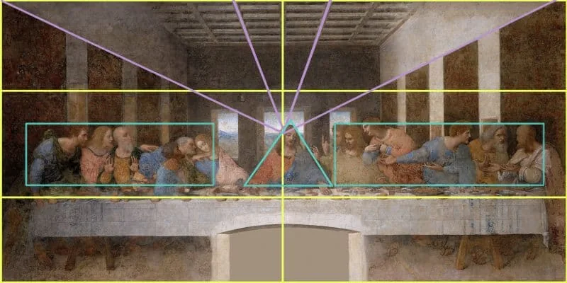
Let's take Leonardo da Vinci's famous fresco as an example. In one work, more than one grid is used: it is combined from two techniques. The figures in the painting interact with each other and with the viewer, and he becomes a participant in the plot. Here two spaces meet: deep (guiding dark squares on the walls to a distant landscape outside the window) and flat (limited by the table). We feel the contrast not only in tone, but also in space.
The composition is lowered, which should create a дискомфортное feeling of falling down, but thanks to this, there is a lot of air and volume on the fresco. The main character is surrounded by emptiness, but at the same time, people point in his direction with gestures or glances – perspective reductions are invisibly directed at him. The artist used not an open technique of identifying the compositional center, but hid it. He also composes the characters into different geometric shapes (rectangles and an opposing triangle).
We see several techniques in the illustration: color contrast, support of the environment, highlighting with a silhouette and light. There is a feeling of the composition's striving towards the center and to the right, the rhythm of the lines of shadows, the perspective reduction of the room is directed at the incoming character. Authors: Azat Nurgaleev, RинаOld masters studied the laws of composition, experimented, and created spectacular canvases. Artists knew the secret that composition is the art of bringing a large number of details on the canvas to a single expressive whole, and the most important thing is not to go in favor of physical laws and meticulous copying of the world around. They tried to combine different techniques to achieve maximum connection with the viewer.
Let's take Leonardo da Vinci's famous fresco as an example. In one work, more than one grid is used: it is combined from two techniques. The figures in the painting interact with each other and with the viewer, and he becomes a participant in the plot. Here two spaces meet: deep (guiding dark squares on the walls to a distant landscape outside the window) and flat (limited by the table). We feel the contrast not only in tone, but also in space.
The composition is lowered, which should create a дискомфортное feeling of falling down, but thanks to this, there is a lot of air and volume on the fresco. The main character is surrounded by emptiness, but at the same time, people point in his direction with gestures or glances – perspective reductions are invisibly directed at him. The artist used not an open technique of identifying the compositional center, but hid it. He also composes the characters into different geometric shapes (rectangles and an opposing triangle).
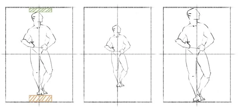 The first figure is the most successful in its location in the sheet – it is in the center, slightly raised, but there is free space above and below it, in which it feels comfortable. The central and right options are not very good: either there is too much empty space, or the figure fits in and touches the edges of the sheet.
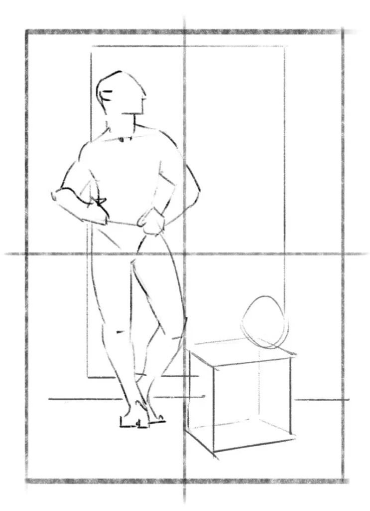 The diagram shows a static composition, the person is located in the left half of the sheet, and the cube and the ball balance the composition.
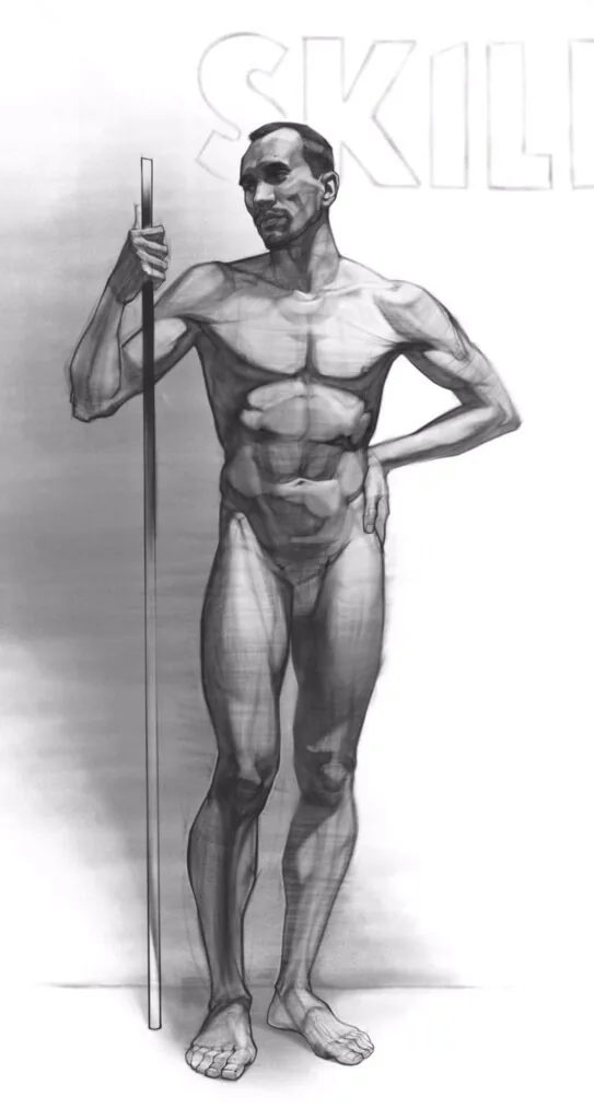 In this drawing, all attention is given to the figure, it is large in relation to the sheet format, and the background is simple.
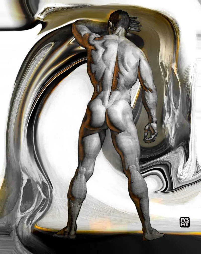 In this work, the background is more complex and interacts with the hand as its continuation, as if the hand launched a wave. Author: Azat Nurgaleev.
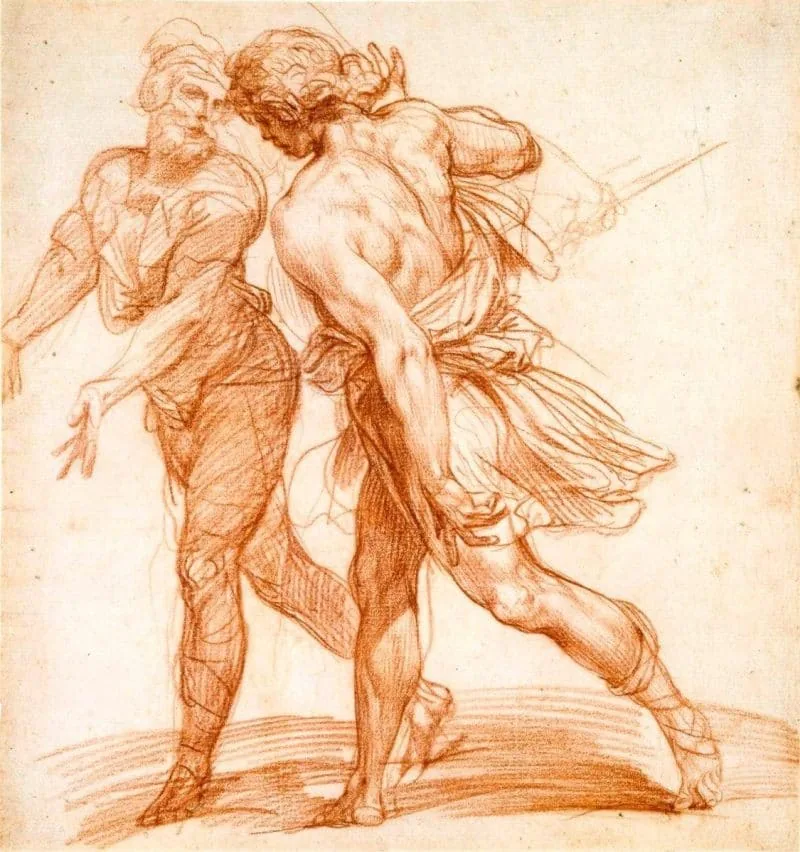
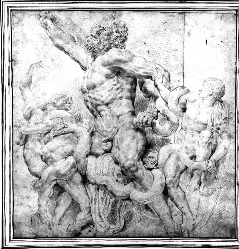 In Paul Rubens' drawings, the figures are connected by plot, movement, plastic, there are zones of more voluminous content, and there are simpler ones that do not catch the eye.
Composition is a very interesting phenomenon. Its principles will help to create a more attractive and bright art, and it should not be forgotten: play with techniques and try new solutions!
In Paul Rubens' drawings, the figures are connected by plot, movement, plastic, there are zones of more voluminous content, and there are simpler ones that do not catch the eye.
Composition is a very interesting phenomenon. Its principles will help to create a more attractive and bright art, and it should not be forgotten: play with techniques and try new solutions!
A grid will appear, after which you need to adjust its parameters according to the compositional rule of shares or thirds that you are comfortable with.
Change the values in the «Line every» item to increase or decrease the number of guides. With the CTRL+H key combination, you can turn the grid on and off.
In Procreate you can also adjust the grid. Go to the «Actions» panel, select «Canvas», turn on «Guides» and go to «Edit guides». You will go to a window in which you can adjust the number of axes, transparency, color and angle of the grid.
We recommend a useful article: How to draw in Procreate
Basics of composition for beginning artists: basic rules for building an illustration
We do not always draw a single object. Especially if a multi-level complex illustration is being created. If it is homogeneous, with the same elements, scales, patterns, it will not be attractive. To avoid this, use the following rules for building an illustration:- Rhythms, not similarity
Giorgio Morandi's still life is monotonous, all elements look identical to each other.
Basic 2D Graphics course." width="800" height="870" />
The second still life uses rhythms of heights, widths, distances. Author: Anna Aboimova, Basic 2D Graphics course.
An empty space with not many details helps create an area of relaxed attention. Rest islands are necessary to distribute the observer's attention and not overload them with a lot of information.
Around the central character there is a lot of air and freedom, the background is hidden in the сумраке dark glass. Thanks to this effect, our attention is focused on the girl. Author: Andrey Surnov.
- Different scales
Characters of different scales are surrounded by a huge amount of space compared to them. There is much more water than shore, and microscopic details are noticeable on its surface: water lily leaves, algae, glints. All together creates a whirl of events that draws us into the plot, we want to study the illustration. Author: Elizaveta Parfenova.
- Contrasts
- Connections
We recommend a useful article: digital painting. Illustration
Artistic composition
Composition is used in different fields, but techniques from design or project art may not be suitable for artistic tasks. In creative works there is more freedom, unconventional solutions. The emphasis is more on the sensual part than on the rational, as art should catch attention, become emotionally close, and not just carry information. You should not strongly structure illustrations like a poster or magazine layout, because excessive orderliness will make it dry and lifeless.
A character concept sheet is put together structurally, information is distributed into subtopics (line, angles, general look). But at the same time there is more emphasis on color, emotion, and posture. Author: Valeria Lugovaya.
«Proun» by El Lissitzky is closer to design, project painting. There are more semantic and rational structures in the composition.
In the winter landscape, the order of vertical rhythms, sharp and soft forms, and the boundaries of the space of the earth, forest, and sky are clearly visible. There are a lot of structures in it, but, first of all, we are caught by the plot, artistic techniques, and emotional content. Author: Valeria Shamsutdinova, course Design of the environment in 2D.
How to create a composition in painting
The basic laws of composition are also applied in painting. The composition should be clear in meaning, whole, contrasting, all elements included in it are subordinate to each other and harmoniously located on the canvas. Also, the image should be expressive, that is, to catch the viewer with a concept, something new, color scheme. It must be taken into account that in addition to tone, color will be used. It will also control the viewer's attention, directing it to the compositional center, then to secondary plots. And when working with color there are basic tips that will help improve the composition:- Harmonious palette
Arkady Rylov's sunset landscape is bright and saturated, but the colors are chosen according to the principle of complementarity. Blue corresponds to orange color according to the color circle. The artist uses their related combinations.
The color scheme of the marine landscape was created by Nikolai Dubovsky from gentle adjacent colors. We see many nuanced shades of blue, blue and lilac.
- The influence of color on emotions
- Red is associated with passion, excitement, danger
- Green – positive, pacified
- Blue – calm, harmonious or sad
- Yellow and orange – energetic, joyful
- White – neutral, clean, light
- Black – strict, tense, majestic
At first glance at the canvas, we see a beautiful girl in a red dress on a poppy field. Upon more prolonged examination, we notice a sleeping or killed one, and the meaning of red changes from passionate to dangerous, tense. No wonder the work is called «Ruthless Beauty». Author: Frank Cadogan Cowper.
We recommend a useful article: basics of color theory
- Contrasting colors
In the thematic interior, the chair is highlighted with light. In this area, a very contrasting combination of colors was obtained (orange, golden, pink, blue, green), and around all the other participants are shrouded in a purple-blue haze. Author: Daria Stepanova, course 2D graphics Pro.
- Warm-cold colors
We see a sunny bright day, a young man leads a horse to the shore, everything is shrouded in warm summer light. In the shadows we see more cold shades (violet, greenish and blue) than on the illuminated elements. Author: Joaquin Sorolla, «Horse Bathing».
The concept of composition in drawing and its types
We use composition in different directions, including in drawing: the choice of material does not affect its quality, it only adds a certain character and «tastiness» to the final work. The basic laws of composition remain unchanged: for drawing the idea, balance, balanced distribution of objects in the sheet, unity of elements, and style are also important. We use the principles of searching for a compositional center with the help of axes, the rule of thirds or shares, the golden section. In drawing we often use line and spot. It is important to remember:- The line should be different
- The depth of space depends on the thickness of the line
- Line and stroke control attention
In the sketch of a bunch of tulips, leaves and roots with fatter strokes and an active boundary line come to the fore in the foreground. The composition is simple, centered along the axes, all attention is on the plants. Author: Zhenya Shubina, course Drawing.
The urban fantasy landscape was created using the rule of thirds. The main elements are distributed along the axes of the «tic-tac-toe» grid, and the buildings closest to us have a more noticeable stroke and a pronounced line of the silhouette. Author: Alexandra Khorosheva, course Drawing.
Highlighting the compositional center in the drawing
There are several techniques that help to accentuate the compositional center, make it more noticeable, bright and effective:- Tonal contrast
- Color accent
- Highlighting with light
- Contrast of scales
- Highlighting with a silhouette
- Highlighting with heat and cold
- Highlighting with support of the environment
We see several techniques in the illustration: color contrast, support of the environment, highlighting with a silhouette and light. There is a feeling of the composition's striving towards the center and to the right, the rhythm of the lines of shadows, the perspective reduction of the room is directed at the incoming character. Authors: Azat Nurgaleev, RинаOld masters studied the laws of composition, experimented, and created spectacular canvases. Artists knew the secret that composition is the art of bringing a large number of details on the canvas to a single expressive whole, and the most important thing is not to go in favor of physical laws and meticulous copying of the world around. They tried to combine different techniques to achieve maximum connection with the viewer.
Let's take Leonardo da Vinci's famous fresco as an example. In one work, more than one grid is used: it is combined from two techniques. The figures in the painting interact with each other and with the viewer, and he becomes a participant in the plot. Here two spaces meet: deep (guiding dark squares on the walls to a distant landscape outside the window) and flat (limited by the table). We feel the contrast not only in tone, but also in space.
The composition is lowered, which should create a дискомфортное feeling of falling down, but thanks to this, there is a lot of air and volume on the fresco. The main character is surrounded by emptiness, but at the same time, people point in his direction with gestures or glances – perspective reductions are invisibly directed at him. The artist used not an open technique of identifying the compositional center, but hid it. He also composes the characters into different geometric shapes (rectangles and an opposing triangle).
Composition with figures of people
The main dominant when working with figures, of course, is the figure – it must be placed organically in the sheet. The composition can be single-figure and multi-figure.Single-figure composition
The key task is to place the figure in the center of the sheet, lifting it up a little, since visually the lower space of emptiness will narrow due to the peculiarities of visual perception. Do not try to make a very large or small figure.
The first figure is the most successful in its location in the sheet – it is in the center, slightly raised, but there is free space above and below it, in which it feels comfortable. The central and right options are not very good: either there is too much empty space, or the figure fits in and touches the edges of the sheet.
Figure with background
The figure should interact with the environment, since now you have not one object to depict, but several. Arrange them as a whole system, immediately considering the place for all objects from the composition. The environment can be, for example, objects, landscape, wall. It is important to remember that the background should help to identify the figure in the sheet.
The diagram shows a static composition, the person is located in the left half of the sheet, and the cube and the ball balance the composition.
In this drawing, all attention is given to the figure, it is large in relation to the sheet format, and the background is simple.
In this work, the background is more complex and interacts with the hand as its continuation, as if the hand launched a wave. Author: Azat Nurgaleev.
Multi-figure composition
In a multi-figure composition, it is important to create a system of semantic connection between the characters. They can be turned to each other, touch, pass some objects, talk, or, conversely, be quarreling. If we simply depict a row of figures, then each will look separate, as if in a catalog. Therefore, it is necessary to prioritize, identify the most important figure and work harder on its tone, silhouette, make it more voluminous – this will create the depth of space and set the necessary accents.
In Paul Rubens' drawings, the figures are connected by plot, movement, plastic, there are zones of more voluminous content, and there are simpler ones that do not catch the eye.
Composition is a very interesting phenomenon. Its principles will help to create a more attractive and bright art, and it should not be forgotten: play with techniques and try new solutions!
Useful video «About composition, dots and lines on a plane»
Related materials

Article
Frontal perspective in drawing
October 1, 2025
Article
Texture and finish in the drawing
November 15, 2024

Article
Statics and dynamics in drawing: creating mood and movement
March 24, 2025

Article
All about brushes in digital drawing
February 13, 2025

Article
Stylization in drawing
January 27, 2025

Tutorial
Chiaroscuro in drawing
December 17, 2024

News
Превращение 2D-рисунка в 3D-скульптуру с помощью ZBrush
February 4, 2026