How to Draw a Flower
Learning to draw a flower from scratch: composition, large shapes, warm and cool colors, negative space, touches, and tone. Step-by-step analysis and video lesson by artist Azat Nurgaleev.
Hello, friends. Today we are drawing a flower. We have a beautiful protea in the studio, and we will break it down from the first spot to the final highlights. I work digitally, but I'll say right away: everything we do can be easily repeated either with a round brush in Photoshop or with paints on paper. Ninety percent of the work is not about brushes, but how we work with tone and spots.
This is a painterly story, so forget about perfectly even contours. We will think in terms of large spots, masses, and touches, and the details will come naturally once the silhouette is in place.
What you will need
A tablet with any brush or paper and paints. If you're drawing digitally, I create an A4 canvas and then expand it to about A3 size through cropping. 300 dpi resolution is more than enough. If the term dpi means nothing to you, don't worry about it; it's only necessary for printing. And right away, create layers: a background layer for the base layer-background and another separate layer for the flower itself. This makes it easier to move and edit the flower without affecting the background.
Composition and masses
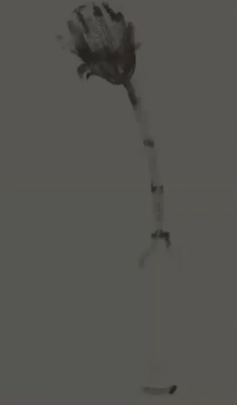
First, very roughly sketch where the bottle and the flower will be. The main rule: don't place the flower exactly in the center; shift it slightly to the left. And remember the distances; there should be more space from the bottle to the first leaf than it seems. In composition, we always work with three sizes: large, medium, and small. A large mass or large hole should not be followed by another of the same size; place a medium or small one next to it. This makes the picture more expressive and interesting. Also, make sure the flower and leaves don't end exactly in the middle of the canvas; leave different amounts of space at the top and bottom. And since this is digital, I immediately duplicate the flower layer just in case, so I have something to revert to if I mess up.
Tone: large, medium, and small
Even before considering color, we decide how the tone will be distributed. In composition, three mass values always work: large, medium, and small, and it works the same way with tone. A convenient ratio is approximately: medium tone about sixty percent, light about thirty percent, and dark about ten percent. It can also be the other way around, dark thirty, light ten, depending on your mood. Squint at the setup and decide in advance whether you will have more light or shadow. This is a fundamental thing: decide in advance, and then the composition develops consciously, not randomly.
Color and Warmth-Coolness
I fill the background with a medium grayish tone right away, so there's something to work from, and I take it not into a blue, but into an earthy, yellow-green, but very muted color. Then warmth-coolness comes into play: if our background is warmer, ocher, then I take the flower itself in the opposite direction, into a cool violet. These two colors support each other, and the flower stands out brighter. You can take it denser; we think in terms of a spot, not a contour. If there's too much red somewhere, I mute it into a grayish tone so that the only bright color accent left is the flower itself.
Related courses
All courses
Book illustration: The first page page
9 000 ₽3 900 ₽
Векторная иллюстрация для начинающих
15 000 ₽12 000 ₽

Character Concept: My First Hero
10 000 ₽4 500 ₽
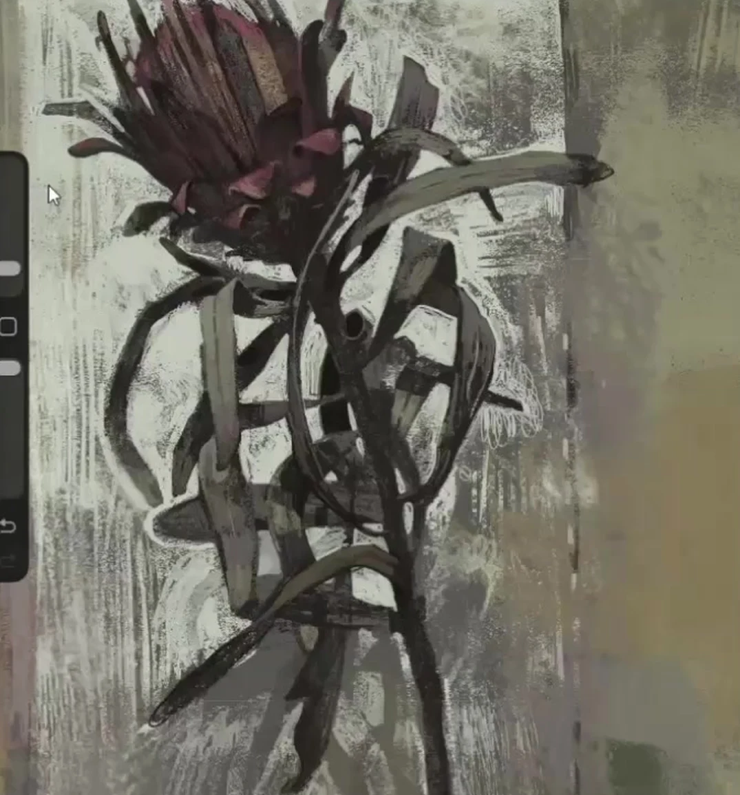
Silhouette and Working with Spots
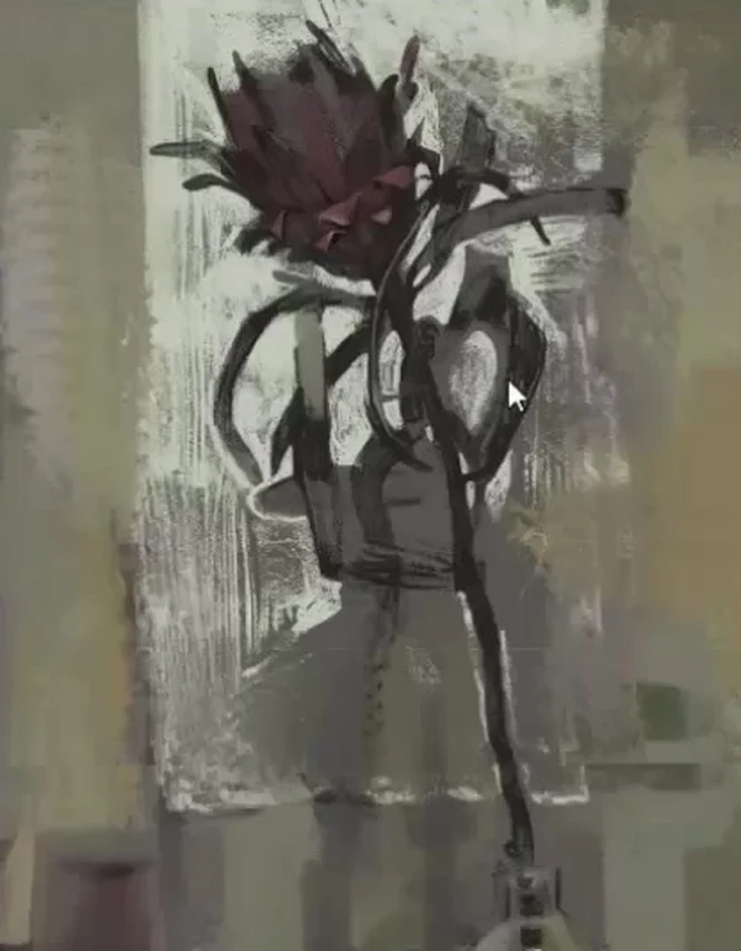
This is the most important part. Our task is to get inside the spots, into the silhouette itself. If you've hit the spot well, consider it done, the picture will come together. If you haven't hit the silhouette, it will be difficult later, no matter how much you smooth out the details. Therefore, in any unclear situation, work with spots. If you don't like how the spot lies, move it, tell it to move, and it will move. This is especially convenient in digital art, but the logic is the same on paper: first, the correct masses, then everything else.
Bud and Petals
When the silhouette of the bud is found, we begin to trim the petals with a darker tone. We take a darker tone and carefully cut out the edge by edge with it, watching which petals turn out and which of them go thinner into the depth. Where the shadow is deeper, there we deepen more. Look at the reference a little longer, and these moments will begin to appear on their own, it's very interesting. Don't make all the petals the same; it's the variety that gives liveliness.
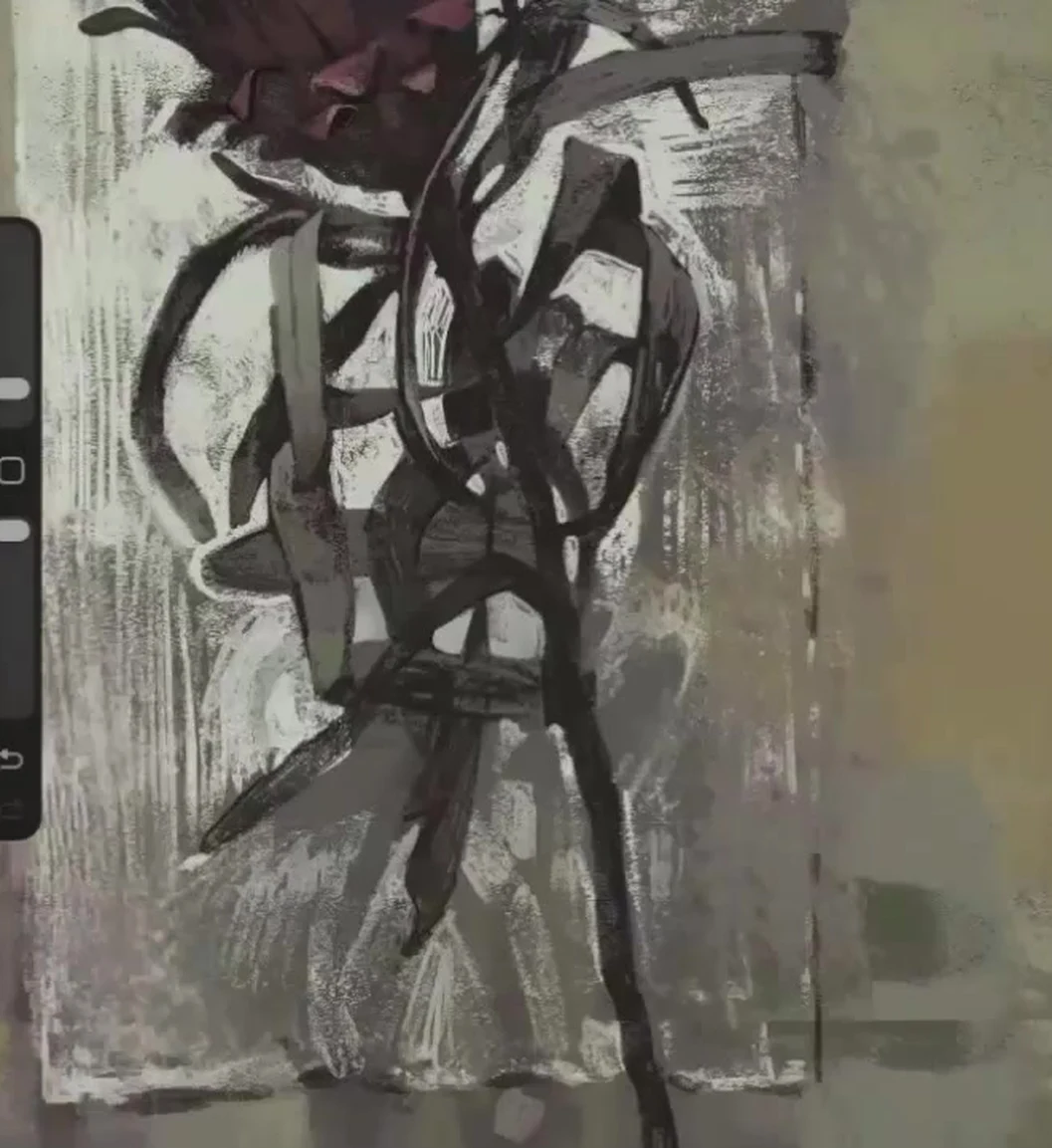
Leaves, Intertwining, and Negative Space
We outline all the leaves at once, not thinking at first about where the first one is, where the second one is. We need a lively medley of intertwining, thin branches that grow out of the flower and cross it. First, just spots, then gradually we refine the proportions. And here's the main technique: draw not only the leaves themselves, but also the space between them. This is called negative space, and through the gaps, the silhouette of the foliage is read even better than if you draw each leaf head-on. Be sure to show how the leaf is attached to the stem, at what distance and on which side of the trunk it comes out. Don't draw a child's Christmas tree with twigs tick-tick-tick at equal intervals. We lead the main vein of the leaf lighter in some places, darker in others. And remember, some leaves will be worked out in detail, others will be left calmer, the whole thing rests on this contrast. There's also a trick with the backing: I tint the gray background between the leaves with light pieces, and this backing ceases to be just a background, it becomes the mid-tone of the drawing and begins to read itself as foliage. You don't need to paint the entire white sheet all the way, we deliberately leave a gap, an unpainted gap, somewhere, and there's joy in that.
Tone and touches
Next, we work with tone and watch the touches. The edge of a leaf or petal should not be a smooth piece of paper. In the digital medium, there's a finger, a smudge, which can slightly destroy the contour, make the touches different and more interesting. It's like a line in a drawing: the same thickness, but the texture can be rough, sharp, or ringing. That's the kind of variation in touches we're looking for. In some places, the edge is soft and dissolves, in others, it's on the contrary hard and sharp.
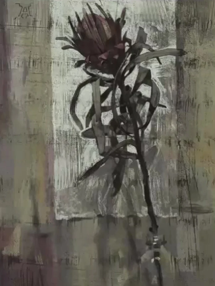
Stem, bottle and highlights
Pay attention to the shape of the stem, it's tricky. It's not just a smooth arc, it has twists, going this way and that. If you haven't drawn plants using bioplastics before, I highly recommend it, it greatly helps later with drawing people, there's a lot in common. Our bottle is not simple, it's like an Ikebana: it has a clear contour in some places, and the contour disappears in others, don't outline it with a solid line. You can add a bit of light, gray-brownish next to the bottle, as it is lit, and show a greenish tint at the bottom. The light areas on the glass are not highlights, but rather vertical stripes, like on fabric. And make sure the drapery knot doesn't touch the bottle closely, let there be air between them, otherwise it will look ugly. I would make the highlights myself cold, greenish, and wouldn't make them too clear. Let the highlight have such a dashing texture, not a neat glassy speck. We place the most vibrant accents last and sparingly.
Focus, shadows and finale
The shadows from the flower also work for us; they create their own rhythm. Just don't make them too distinct; the shadow shouldn't merge with the leaves, but it also shouldn't clash with them, let it flirt gently. At the end, we decide where our focus is. We leave some leaves more detailed, others more relaxed; this is what gives a beautiful contrasting result. If a leaf turns out too smooth, like a frame within a frame, don't finish it off completely; slightly shift or soften the shadow on one side. From time to time, step away from the canvas and look from a distance; this immediately shows what's been lost. And don't give up on the work when it gets complicated. This is precisely when you need to push through to the end; it's better to struggle but get it done, then you'll grow faster.
Common mistakes
- The flower is in the center. Shift it to the left, leave more space from the bottle to the leaves.
- Identical masses side by side. Place a large one next to a medium and small one, not next to another large one.
- Rushing for details instead of the silhouette. First, hit the mark with the shape, then add details.
- Even, identical edges. The touches should be different, soft in some places, harsh in others.
- Leaves like a child's Christmas tree. Watch the attachment points to the stem and the negative space.
- The flower and the background in the same warmth. Warm background, cool flower, or vice versa, in terms of warmth.
- The entire leaf is painted evenly. Leave some unpainted gaps and keep the tone according to the sixty, thirty, ten scheme.
- The bottle is outlined with a solid contour. In some places, the contour is there, in others, it disappears, and the knot of the drapery shouldn't touch it.
A short tip to part with
Think in large strokes, maintain warmth and coolness, don't be afraid to move the masses and step back often to look from a distance. Drawing plants is pure pleasure, and even in an ordinary limp leaf, there can be so much poetry that an ordinary glance would not notice it. Your task is to show this beauty.


