How to Draw a Child Portrait
How to draw a child's portrait: where the brows and eyes go, why the nose turns up, how a child's skull differs from an adult's and how to keep the shading soft.

A child portrait may seem easy, but it's not. The head is small, the features are soft, and there seem to be fewer details than in an adult face. But for some reason, what comes out on paper is an adult who has been shrunk. The reason is simple: a child has a different skull, and facial proportions are measured from different points. Let's look at this honestly, and then draw a child's portrait from a photo.
The main difference: the child's skull is not yet fully developed
The baby's lower face is not developed. The zygomatic bones, brow ridges, upper and lower jaws are just beginning to form, they are smaller in volume and take up less space than in an adult. That's why the facial part looks small, and the cranium, on the contrary, is large and round.
Look at the age from zero to one and a half years: the lower part of the face barely reads. The forehead is often sloping, and you can forget about the brow ridges, there is a maximally calm surface. The chin is tucked in and does not protrude at all, it is still forming. The upper lip protrudes slightly more than the lower one, with age this evens out.
Proportions of a child's face: where the eyes actually are
This is the moment that most often results in a miniature adult face. If we draw an adult, we divide the head vertically in half and place the eyes in the middle. This doesn't work with a child.
In a baby of about one to one and a half years old, the eyebrows land in the middle of the head. We divide the lower half in half again and get the base of the nose. And we place the eyes already under the eyebrows, that is, noticeably lower than the middle. The mouth line goes a little higher than the middle of the lower segment, and not a third, as in adults. Because of this, the top of the head reads as voluminous, and the face is gathered at the bottom.
The second point about the eyes: in children they are set wider. The distance between them is noticeably greater than the width of one eye. Do not bring them closer together, otherwise the face will immediately cease to be read as childish.
And a clarification about this middle: we divide the whole head, not the distance from the hairline to the chin. The error comes precisely from here: the artist measures the usual "face", gets the middle not there and draws an adult again.
Why a child's nose is always snub
Pay attention to where the zygomatic bones end. In adults, they are on the same level as the base of the nose, and in children a little lower. Plus, the large nasal cartilage is just beginning to grow. This all adds up to that upturned nose: the base is slightly higher, the tip points up.
And more about plasticity. All the drawing plasticity of a child's face works through soft arcs. No hard angles and chopped planes that we so love to look for in an adult head.
What to draw with
I draw in Procreate, but everything that is analyzed here works one to one with a pencil on paper. You need a soft pencil for tone, an eraser, and one good reference. Plus, the habit of keeping the drawing as a whole: looking not at the detail, but at the whole head.
Related courses
All courses
My first figure
5 000 ₽3 750 ₽

Book illustration: The first page
9 000 ₽4 950 ₽

Prop concept: render and atmosphere
9 000 ₽4 950 ₽
How to work with a reference
Take a photo where the head is turned at least a little, a clean front view is harder and drier. Do not copy the picture literally: the photo lies in perspective and often eats up the volume of the cheek. Look at the shape and decide what to strengthen and what to remove.
It's useful to change the distance between the eyebrow and the eye: lower the eyebrow somewhere, raise it somewhere, achieving resemblance. We don't have to repeat the proportions with millimeter precision, the task is to catch the image of a particular child.
And keep the age in mind. The analysis above is for one to one and a half years, when the differences are maximum. The older the child, the closer everything gets to the adult scheme: the facial part grows, the chin comes forward, the brow ridges are defined.
Start with the silhouette
I always start with the silhouette, and here it is especially important. The silhouette must immediately incorporate the tilt of the shape and the understanding that the head has a side plane that wraps down. If this is not there, the portrait will turn out flat, no matter how many details you draw later.
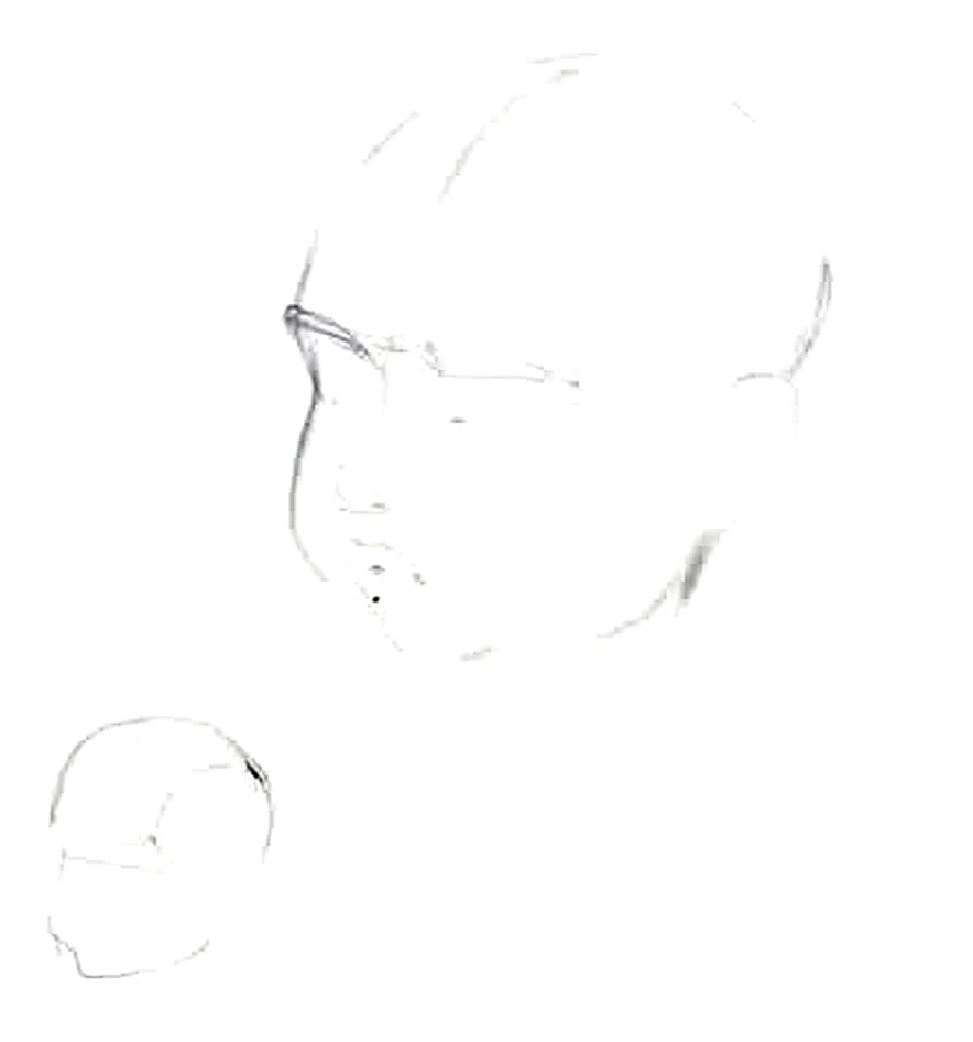
Marking and facial features
Next, we mark the child's portrait: the middle of the head is the eyebrows, below is the base of the nose, the eyes are under the eyebrows, the mouth is slightly higher than the middle of the lower segment. We outline the features with light arcs, without pressure. At this stage, check the distance between the eyes and how small the lower part of the face is. If it has grown, then you have quietly drawn an adult.
Another check at this step: the cheekbone should not turn into a hard edge. As soon as it sticks out at an angle, the face instantly matures, even when all the proportions are correct.
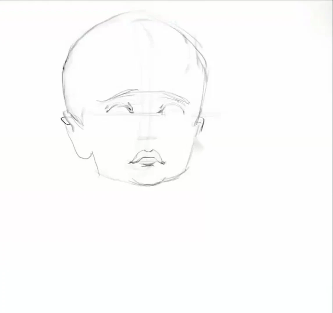
Light and shadow: cheek, not cheekbone
In an adult portrait, the zygomatic bone runs the show. In a child's, the cheek works in its place. The shape is soft, so the transitions of light to shadow are soft, stretched out. A hard shadow boundary will age the face.
Work with relationships, not individual spots: compare the tone of the cheek with the tone of the forehead and the tone of the hair, then the head remains intact. The shadow under the chin of a child is soft and short, it's better not to put a long, heavy shadow there, it stretches the face.
Eyebrows also don't like a hard line on top. Blur it a little so that the eyebrow comes out airy, made of soft hairs. We slightly recess the eye into the shadow, add the iris, and leave the highlight as the brightest spot on the face.
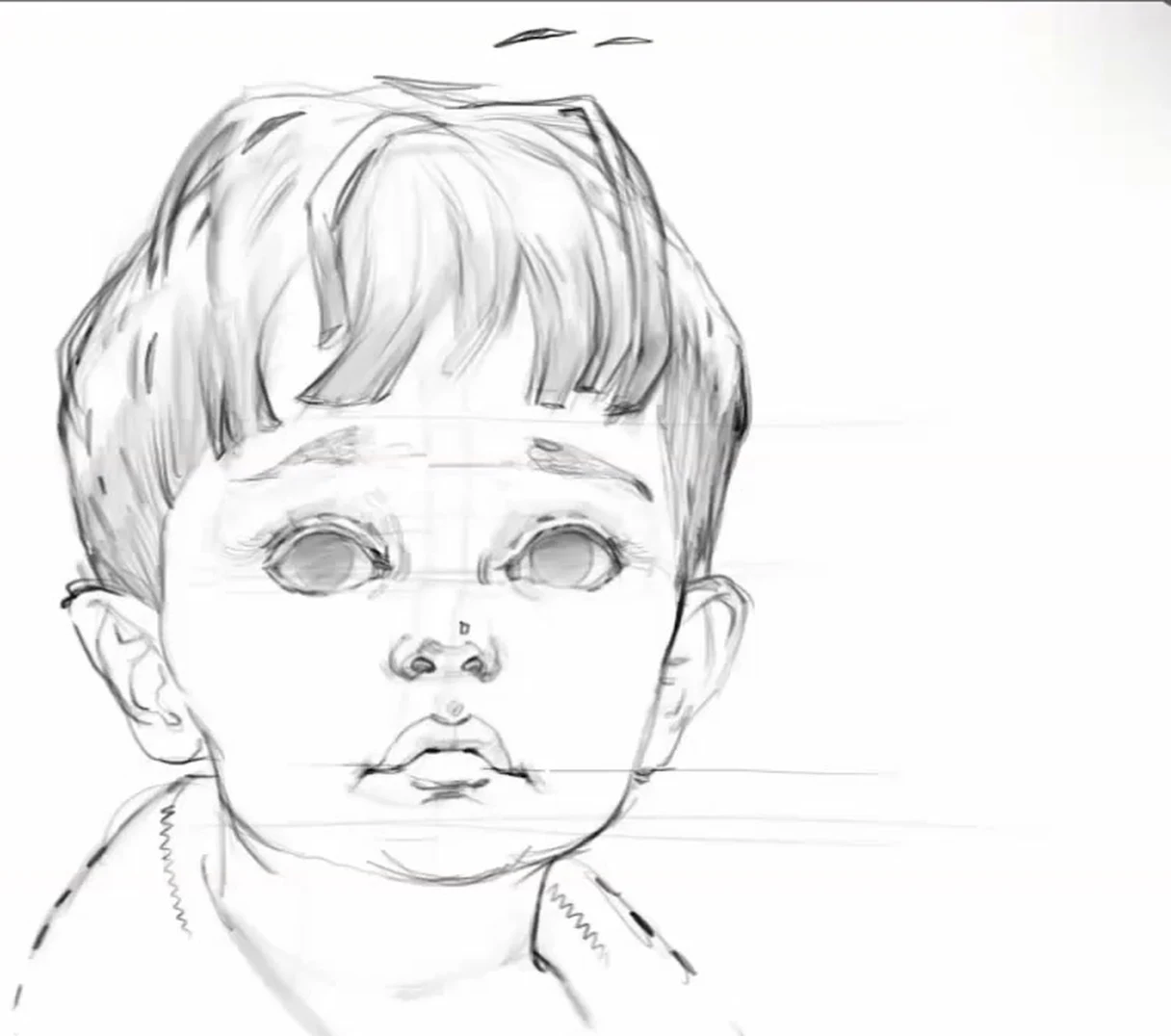
Hair: first a spot, then strands
We never draw hair as in a photo, hair by hair. It looks strange, and big artists always have an interpretation: either working with an artistic spot, or stylizing the shape. In this regard, I really like Leyendecker, he does a great job of chopping the shape compositionally.
The order is this: first, outline the general spot of hair, then inside this spot look for small shapes, holes, darkening. They will give depth. And don't sit for a long time in one place, switch between hair, face and background, otherwise your eye gets numb to it and that piece falls out of the overall tone.
Details that finish telling the age
We draw the ear as in an adult, there are no serious differences: the same tragus, the same helix. Except the tone is a little pinker, age-related pigmentation is not there yet. The neck is short, long necks are rare in childhood, and this is also part of the image.
Lips: we always look for volume in the upper and lower ones, two rounded masses that light and shadow bring out. We make the highlight on the lower lip delicate, it gives way to the highlight on the eyes. On the nose, we fix the shape of the large cartilage and look at how the nasal septum goes: it can stand slightly above the nostril wings, or it can go along the arc in the other direction.
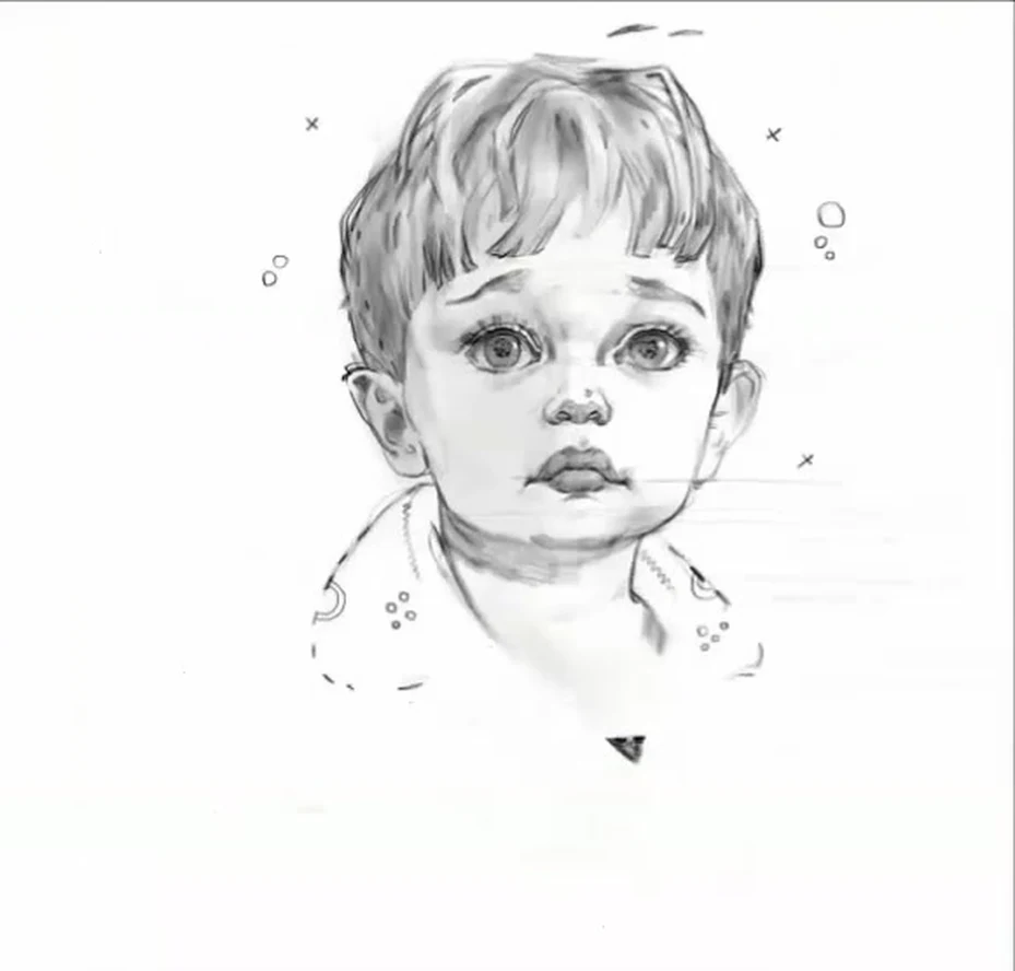
Common mistakes in a child's portrait
The first and main one: a miniature adult face. Eyes in the middle of the head, large jaw, pronounced brow ridges. The portrait is technically neat, but there is no child in it.
Second: close-set eyes. It seems that this makes the face neater, but in fact it loses its childishness.
Third: harsh light and shadow and sharp lines. Children's shapes live on soft arcs, a sharp contour breaks the age.
Fourth: a protruding chin. It simply doesn't exist at this age, it's tucked in.
What to draw after the lesson
Take three references of different ages: a baby under two years old, a child of about five, and a teenager. Draw one head each and compare where the middle of the head turned out to be for each and how much the facial part has grown. This is exactly the exercise after which the proportions stop getting confused.
Then add angles. The profile shows the sloping forehead and tucked-in chin most honestly, and three-quarters make you work the side plane and the turn of the shape. Leave the front view for later, it's the driest and forgives the least.
Start with one reference and bring it to the end. It happens that the first sketch turns out to be better than the last, and this is normal.