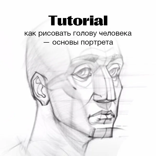
How to Draw a Plaster Head
Learning to draw a plaster head from scratch: composition and silhouette, centre line and tilt, facial proportions by thirds, large form planes, light and shadow from shadows to halftones, and hatching along the form. Step-by-step video lesson by Azat Nurgaleev in Procreate.
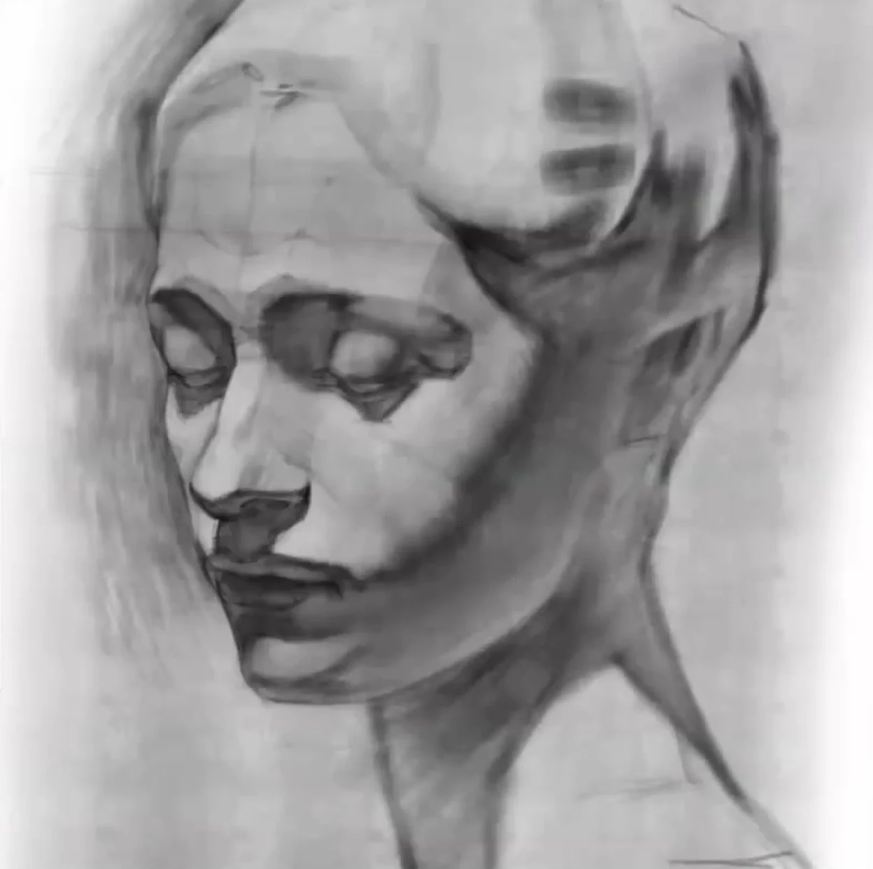
Hello, friends. Today we're drawing a plaster head, and let's agree right away: I work digitally, in Procreate on the iPad, but you can easily repeat all the same things with a pencil on paper. The principle of academic drawing does not depend on the tool. We have a female classical head in a three-quarter view with a slight tilt, and we're looking at it slightly from above. It's important to remember this from the very beginning, because due to the angle, the lines of the eyes and lips will not go straight, but along an arc.
The main idea for the whole lesson is this: we go from large shapes to details and from shadows to halftones. First, we find the silhouette, proportions, and large planes, then we analyze light and shadow in large patches, and only at the very end do we touch the small details. And one more rule that will save your drawing: don't bring the tone to a dead black. The form should breathe.
And right away about the approach. A plaster head is not about copying spots, nor about bare anatomy. Two things are needed at the same time: construction, that is, understanding how the head is built in space, and tone, which sculpts this construction. Anatomy alone does not make us one, but without understanding the form, tone alone will turn into a photocopy. Therefore, all the way we keep in mind the volume and structure, and do not just copy light and dark.
What you'll need
Digitally, Procreate and a pen are enough for me. I use a pencil brush, soft, it's convenient to both sketch with a light line and build up tone. I keep an eraser handy to whiten the highlights on the volume. If you're drawing on paper, take a larger sheet, it's convenient to work on A3 format, and sharpen the pencil more than usual, exposing the lead, to hold it at an angle and draw with a wide surface, not like a writing pen. This way, the hatching lies softly and follows the form.
Composition: Silhouette and Placement on the Sheet
The first thing we do is outline the head's silhouette and estimate where the top of the head, chin, ear, and neck will be. At this stage, it's not about anatomy, but about proportions: we maintain the dimensions more or less as in reality. The head needs to be placed on the sheet so that it's not cramped, but also not hanging as a small spot in the middle. The silhouette should be interesting right from the start. A little trick for digital art: I start drawing slightly smaller and then gradually enlarge the image, as if zooming in on the sketch. This doesn't work on paper; there, we work in the desired size from the start.
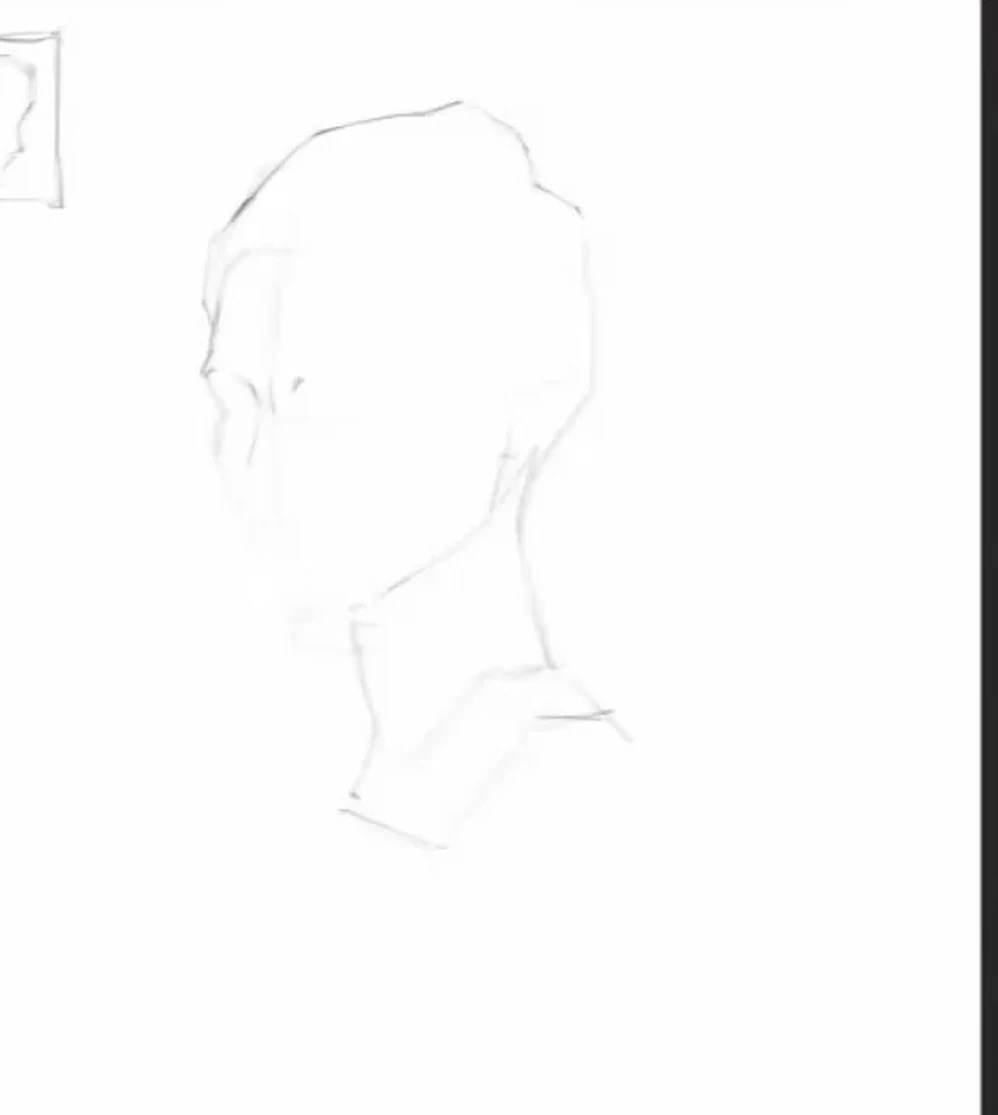
The centre line and the tilt of the head
Next, we outline the cross, the central axis of the face. To find the centre line in this turn, I look at the eye socket and estimate the distance from its edge to the bridge of the nose, and then it's clear where the centre line goes. The head is a bit of a cube and a bit of a ball at the same time, so we catch its tilt: slightly to one side, slightly to the other. Because we're looking from above, the eyes don't go strictly in a straight line, and that's okay. I often correct students: the lips are drawn as if you're drawing a portrait from the front, but we have a three-quarter view, so they should open up in an arc, along the lower jaw block.
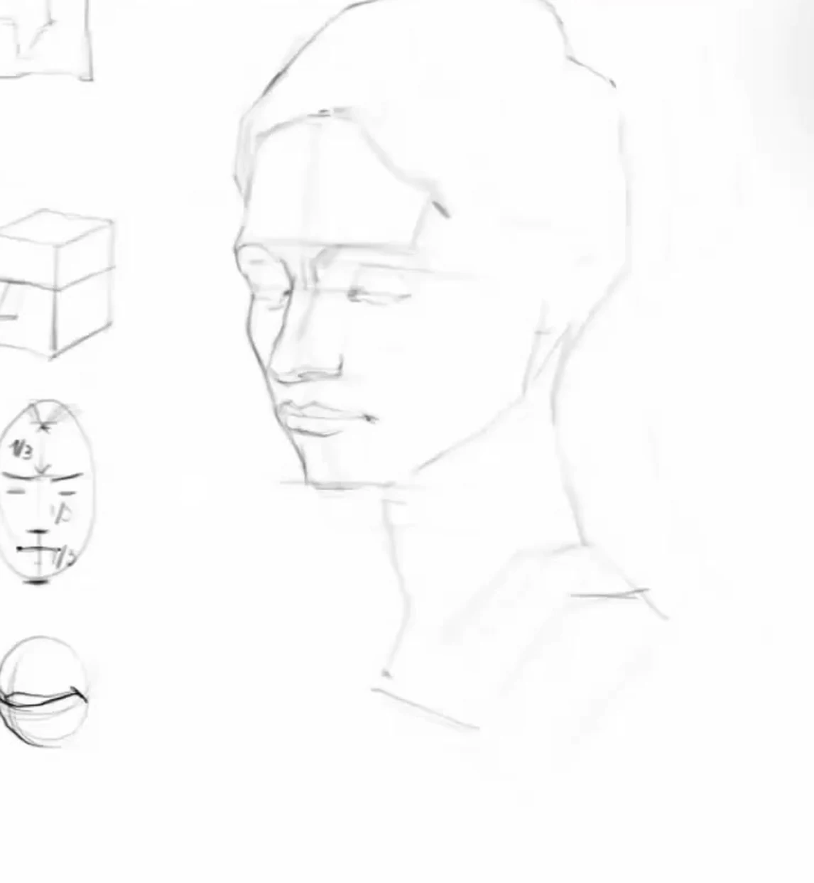
Proportions: the face in thirds
Now the facial module. We find the brow line and the hairline. We divide the space from the brows to the chin into two equal parts, and the lower plane of the nose sits in the middle. We get the classic three thirds: from the hair to the brows, from the brows to the base of the nose, and from the nose to the chin. The eyes are about halfway up the height of the whole head; people often forget this and place them too high. We divide the lower third, from the nose to the chin, once more, and the mouth line runs closer to the nose. And again, we remember the angle: all these lines, due to the top view, gently bend in an arc rather than lying parallel to the horizon.
Related courses
All courses
Book illustration: The first page page
9 000 ₽3 900 ₽

Векторная иллюстрация для начинающих
15 000 ₽12 000 ₽

Character Concept: My First Hero
10 000 ₽4 500 ₽
Large planes: chopping the form
First, we design one large form and leave the details for later. It's like writing a piece of work: first, you get the overall canvas, a massive form, and then particulars appear within it. I go over the head in a blocky manner and mark where the frontal plane turns into the side one: on the nose, on the forehead, on the cheekbone, on the chin. Where the front part of the forehead ends and the temple begins, where the nose has a front platform and where it has a side wall. At this stage, we keep the line very light, almost weightless, so that we can erase and move it at any moment. We keep checking the proportions all the time: the more details appear, the more noticeable it is if the sizes go off somewhere.
We separately monitor paired forms. In the three-quarter view, the near and far sides of the face are visible differently, but it's still a symmetrical pair: the far cheekbone, far eyebrow, and far eye recede from us and diminish, and it's easy to place them crookedly. It's useful to check if the eyes are at the same height, if the ear hasn't risen upwards, if the cheekbone doesn't overlap the nose line. The nose should intersect the far cheekbone and not hang separately. These checks on a light line are inexpensive, but later, in terms of tone, correcting them becomes difficult.
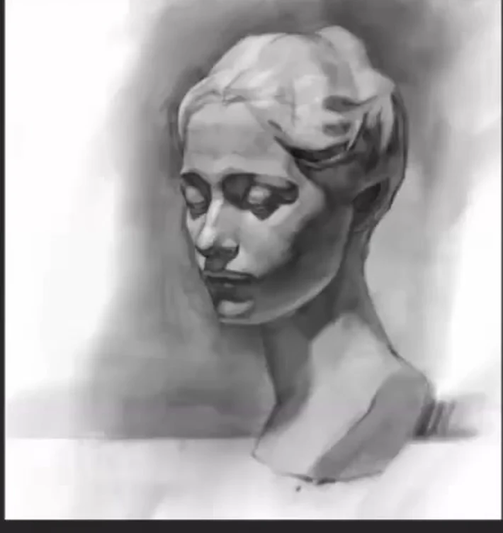
Large shadows: spots of light and shadow
When the construction is found, we punch through the general spots of shadow and light. We outline the form shadows on the form itself and the cast shadows that it casts. An important point: now we only need the darkest spots, without nuanced halftones. To see them, squint, then the small details disappear and large dark masses remain. I deliberately don't start detailing for a very long time: I calmly spend half an hour clarifying the proportions and scattering the spots. These spots already suggest how the nose, eye, cheekbone will read, and then it's much easier to work.
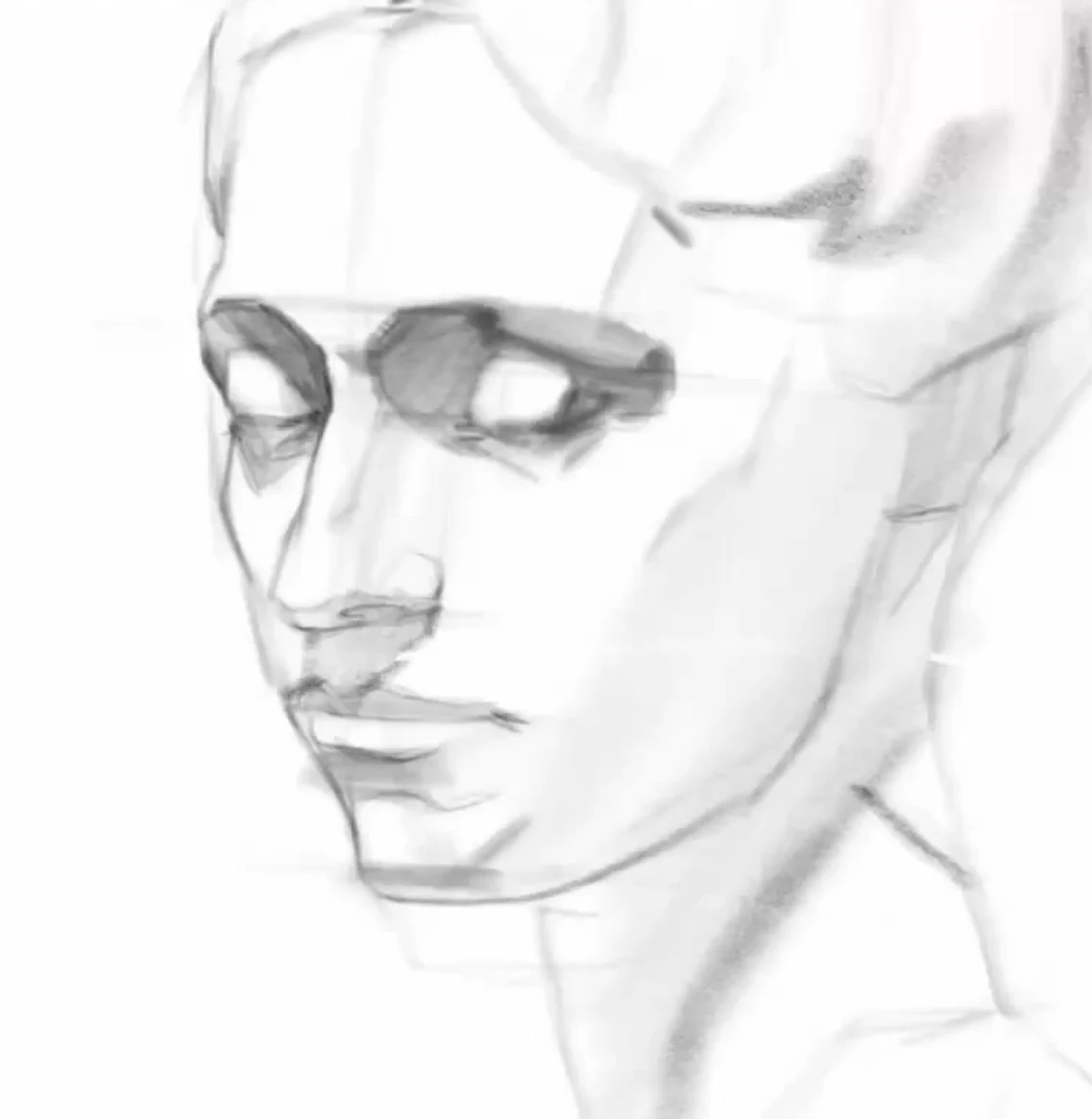
From Shadows to Halftones and the Terminator
Here's a rule that distinguishes a neat drawing from a mess: before tackling halftones, work out the shadows everywhere. If you start mixing shadow and halftone right away, everything will blend together and turn out messy. At the same time, we don't make the shadows deaf and black. It's still a long way to black; the shadow is truly dark only at the edge of light and shadow. If you fill it in with charcoal, the form will stop breathing and become reinforced concrete, but we need air. We place the most active tone at the form turn, at the terminator, but it sounds like a slightly enhanced voice, not a scream. Everything inside the shadow is soft, without harsh transitions, otherwise the form will shatter. But we model the terminator itself smoothly: remember how a cylinder is smudged so that the border of light and shadow flows softly. On the head, this terminator runs along the cheekbone, zygomatic arch, and temporal muscle, more active in some places, gentler in others.
Modelling the Form: Tone by Planes
Now we sculpt the volume with tone. On each plane, we show the form turn through three tones: lighter, medium, and darker. This is how the cheekbone and forehead with its front, inclined, and side surfaces are read. A very common problem for beginners is that the forehead and eyelids remain white paper. Go over the entire work with a light, glazing tone, remove the excess white, and then carefully reveal the light where it is really the strongest. Only the highlight on the top of the head remains truly white; the sides don't go white. And all the time we follow the stroke: it should follow the form. If the stroke lies across the form, don't be lazy to erase and reapply.
We also think about the contacts, that is, how harshly or softly one spot borders another. In some places, the contact is clear in the light and shadow, in others the form fades and the border melts. Above the eyebrows, we place a light halftone with two soft strokes; the brow ridges on a female head shouldn't be active and heavy. Everywhere we ask ourselves one question: does this border follow the form or just outline the contour. We don't need the contour, we need the form.
Details: eyes, nose, lips, cheekbone, and hair
We approach details when the large form is already established, and we work one by one: we finish one detail and move on to another so that the drawing does not turn out spotty, where one thing is rendered and the next is empty.
We draw eyes not as eyes, but as the orbital area: first, the eye socket into which the eye is inserted, then the lowered upper eyelid and the lower eyelid with its volume, and the shadow from all of this. The light on the upper eyelids is not white, keep it tighter. We divide the nose into front and side parts, look for a highlight on the front surface, then it becomes voluminous and lively, and we draw the nostril not straight, it has its own twist. Lips are a separate trap: we draw not the lips themselves, but the shape on which they lie. They are not cut out of paper and not glued to the face like a leaf, so the light and shadow goes slightly above the red border. The cheekbone is a separate story: a competent halftone on the cheek immediately distinguishes a person who has studied the head from an amateur. But on a woman's face, it should be given delicately and softly, so as not to turn a young model into an old woman. Hair should also work in volume, together with the cranial box, and not lie as a separate wig, and through the hairstyle we, as sculptors, reveal the frontal plane on the frontal bone.
Background, plinth, and generalization
Remember: there are no lines in a portrait. We don't outline the contour with a hard wire, but blend it into the tone and background, then the solution becomes more subtle and artistic. We take the background in a medium tone, not as dense as the shadows, and use it to gently define the silhouette along the edge, and wrap the far part of the contour into the background very gently. There's a plinth under the head, a piece of plaster cast, give it texture. Under the chin we look for the reflected light: it should be a little lighter than the background, and to make it work, sometimes we have to tone down, slightly darken the background itself. The cast shadow from the head is usually sharp, but since it falls far away, we make it softer. In the end, we squint again and look for what hasn't been finished. We place the accents: the most active light and shadow gather on the eyes and hairstyle, and we lighten and flatten the bottom and the heavy black. We don't make both lower corners of the plinth equally active, otherwise it sticks out like a symmetrical claw, it's better to mute one edge so that the other dominates. If you wish, you can subtly indicate the horizon line, it will help to place the head in the environment. We sign it, and now we have a complete, lively plaster head.
Common mistakes
- They straighten the perspective. In the three-quarter view, the eyes and lips follow an arc, but they draw them as if in a frontal view, in a straight line.
- They mix shadow and light at once. The shadow turns out to be like dark light, everything merges. First, shadows, then halftones.
- They apply solid black right away. The form stops breathing. The shadow is dark only at the edge of light and shadow.
- They divide the form inside the shadow with harsh transitions. Everything should be soft inside the shadow.
- They leave white what shouldn't be white: the forehead, eyelids, lower jaw, unnecessary reflected light.
- They draw from memory. Our brain is lazy and suggests familiar images, so we draw not what is there in reality, but what we already know how to draw. Keep bringing your gaze back to the plaster.
- They render unevenly: one detail is polished, the adjacent one is neglected. Go from detail to detail.
A final word
There's no magic in this, it's the magic of tonal values, and in fact, I just draw and refine, draw and refine. I didn't learn to draw right away: I took a lot of courses, visited dozens of workshops, and at some point, everything starts to come together. So the most important thing is not to give up and to practice. Draw your plaster head and send us your work for review. Good luck and beautiful tones to you.