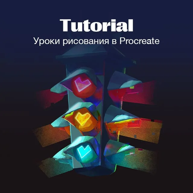
How to draw a still life
Learning to paint a still life from scratch: composition with three shapes, background fill, large masses with silhouettes, palette and saturation, light and shadow of objects, drapery with folds, render of a teapot and lemons. Step-by-step video lesson by Azat Nurgaleev in Procreate.
Hello, friends. Today we're painting a still life: a white teapot, a couple of yellow lemons, and drapery on a warm red background. I'm working digitally in Procreate on an iPad, but you can easily replicate this with gouache or oil paints. To be honest, digital painting is about sixty to seventy percent about drawing and composition, and the rest is about color. So if the composition and form are weak, no amount of beautiful color will save it.
We're not doing a twenty-hour polished setup, but rather a lively sketch of medium detail, deliberately flat and slightly grotesque. We're going from big to small: first composition and large masses, then the palette and light and shadow in large shapes, and only at the end the details. And one more rule for the whole lesson: harmony lies in one color winning and the others losing. If you make all the colors bright, they will start to overpower each other, and it will turn into chaos.
What you'll need
Procreate and a stylus, or any familiar medium. I use fairly stiff brushes, plus one funny textured one for the background. I actively use the smudge tool: it's convenient for softening edges and blending textures, and you can also put brushes on the smudge tool. I keep each object on its own layer: the background separately, the drapery separately, the teapot, the lemons. At first, layers seem inconvenient, but then you get used to them and can't imagine working without them.
Composition: three shapes and space on the canvas
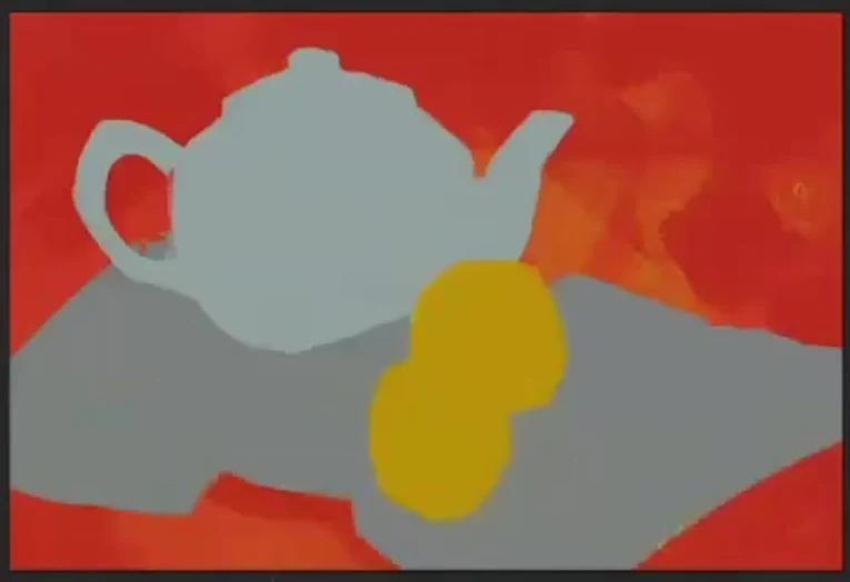
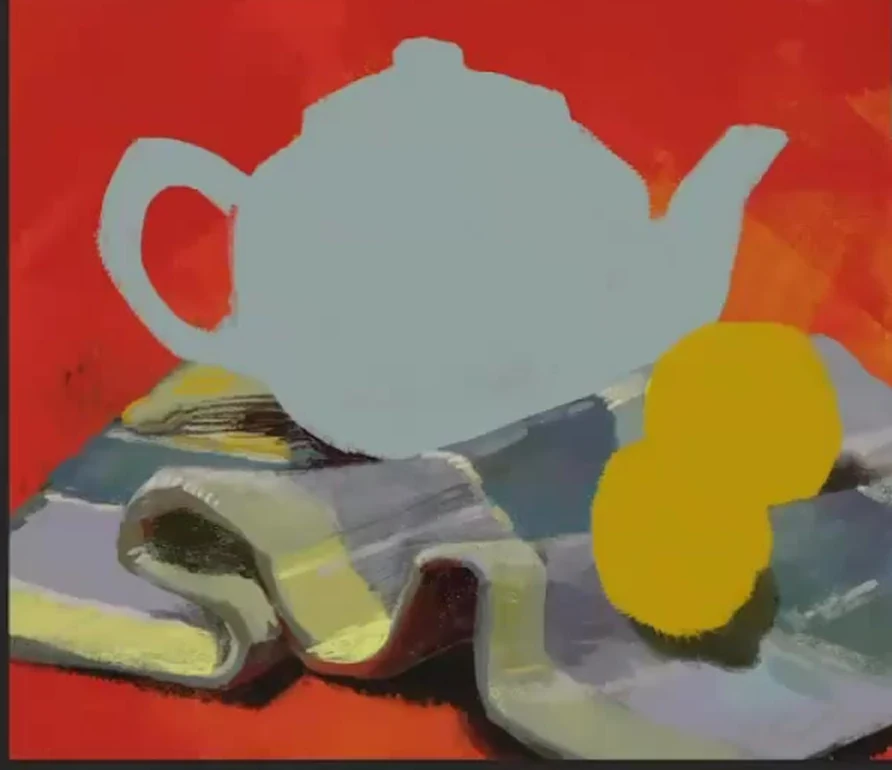
I take a canvas that fits the proportions of the setup, slightly longer than A4 vertically. Then I compose it with three shapes, these are the basics of composition. The large dominant shape is the drapery along with the teapot and lemons, the medium shape is the red background, and the smallest one, about ten percent if you squint, is the white top of the teapot. The teapot should take up more than half of the canvas, don't draw it small. I place the bottom slightly below the middle, the spout extends beyond the vertical center. And right away about a common mistake: with lemons, everyone pays attention to their mass and forgets about their placement. Two lemons should work diagonally and give a slight convergence, not just lie around randomly.
Filling the background: two colors and texture
I fill the background with two colors on different layers at once: yellow-green on the bottom, red on top. And I don't apply the red evenly, but texturally, with that funny brush, so that the yellow-green shows through in places. In some places it's there, in others it's not. This way, from the first stroke, we get a color contrast of red and green, and the background is immediately lively, not just a flat fill. This is actually the main principle of color for the entire still life: we always work through color pairs. Green sounds next to red, orange or ocher next to blue, lilac next to yellow. Where there's yellow, we always look for a bit of purple too.
A little later, I make the red denser at the top, apply it more thickly, and it turns from the brightest into a medium tone, on which the objects are already clearly visible. I almost always choose colors by eye and mix them right on the canvas, including with my finger, rather than taking them ready-made from the palette, so the shades turn out complex and don't sound falsely pure.
Large masses with silhouettes
Now I'm placing the main masses. I outline each object with a flat silhouette on its own layer: the mass of the teapot, the masses of the lemons, the mass of the drapery. I don't even color in the lemons in detail yet, just silhouettes. I refine the shape of the teapot: its handle is like an elfin ear with a notch at the top so that the finger doesn't slip, and the spout and handle end up roughly level. If the handle has moved, I use the lasso tool to move it down. At this stage, I immediately plan the shadows: I outline the cast shadow under the teapot and under the drapery with a solid tone, not putting it off until later.
Related courses
All courses
Book illustration: The first page page
9 000 ₽3 900 ₽
Векторная иллюстрация для начинающих
15 000 ₽12 000 ₽

Character Concept: My First Hero
10 000 ₽4 500 ₽
I work all the time from the large shape to the small one. While I only see large masses, it's easy to make a mistake with proportions, but as soon as you start drawing the small shape, the details, it's immediately clear where the size has gone wrong. This is what happened with the lemons for me: when I added the drapery, it became clear that the lemons were too big and were crowding the bottom edge, so I made them a bit smaller and moved them up. So don't fuss over details too soon, first achieve the correct large relationships.
Palette and saturation
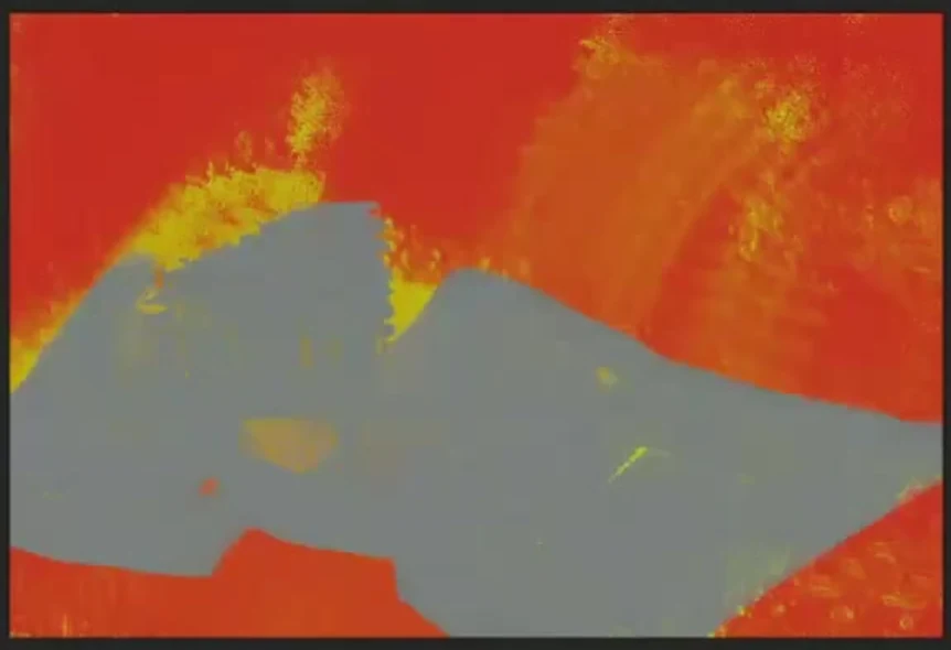
This is the heart of painting. We have one brightest and most saturated color, the red background, which is the dominant. We tone down all the other colors, taking them towards gray. I build up the drapery with complex but subtle shapes: yellow-green edge, lilac, violet, gray-blue and turquoise undertone, white lines with a greenish tint. I take what seems to be gray, but against the red background it still reads as lilac, and that's great. The main rule of shadow: the shadow should not be as saturated as the light. It differs in both saturation and preferably in warm-coolness. If the light is cool, we make the shadow warmer, and vice versa. If you make the shadow as vibrant as the light, you'll get equality, and equality in painting is boring.
Drapery: folds by shapes and rhythm
Drapery is the longest and most useful part. Don't be afraid of it; folds are the forerunner of the entire natural world: mountains, water, bark, clothing. Dürer and Leonardo painted drapery in a way that is breathtaking. First, I outline the shape of the folds with large shapes, how they bend and where they fall, using chopped lines, without polished realism. I watch the rhythm: if there is a huge equal distance between the folds, I break it up into smaller ones, the folds should go unevenly. Then I add those muted color shapes to the drapery and look for a bright reflex at the junctions of light and shadow. And another trick: the texture of the napkin sets the style for the whole work. My napkin has squares, so I also make the highlights on the lemons and the pattern on the teapot square to keep everything in the same style.
Light and shadow: light, shadow, reflected light, highlight
The light in our setup is cool, so the objects in the light are slightly greenish, without rich saturation. I show the full set on each object: light, obligatory halftone, form shadow, cast shadow, and reflected light. The reflected light is the brightest just between the light and the shadow. The lemons have a lot of orange in the shadows because everything around them is red and the environment colors them with its reflections, and purple notes appear inside the shadows, because purple always lives next to yellow. If an object merges with the background, like the mirror side of the teapot with the napkin, squint and separate them with a light shadow along the edge.
Render of the teapot
I move on to the teapot. In Procreate, I click on its layer and enable alpha lock to draw strictly inside the silhouette and not go beyond the edges. The color of the white teapot is not white at all, but complex: from greenish to pinkish tints, the light on it is unsaturated, gray-blue-greenish. I make the blue gzhel pattern on a new layer on top through a clipping mask, then I can change its tone at any time without damaging the teapot itself, and I keep the spots of the pattern square, in the general style. Inside the shape, I set the breaks, the ribs with bright lines, otherwise the shape is read inaccurately. I blend some of the edges with the smudge tool, and leave some hard. I make the bottom of the teapot darker and denser, and the shadow under it warm, with a reddish-pink tint, applied with a stroke. I place highlights of different intensity, and the final, most resonant highlight is the one from the window, purple-blue.
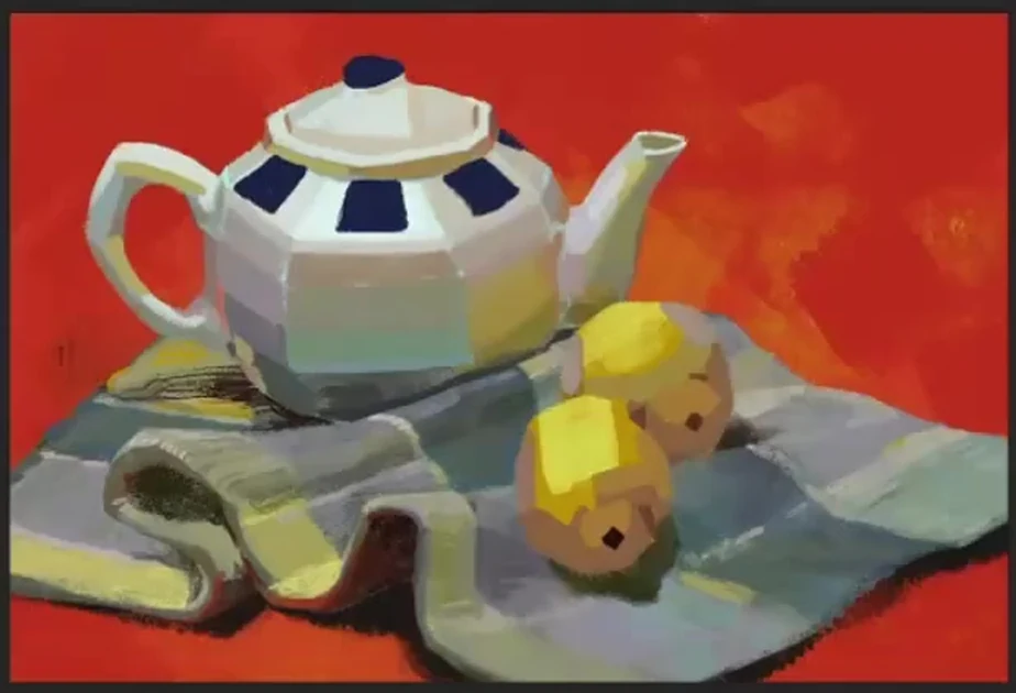
Lemons and the foreground
The lemons are meant to be a snack, so I worked on them a bit less than the teapot. In the light, they are greenish, in the shadows they are orange from the red environment, and the highlights on them are also square. But the foreground, the near edge of the drapery with tassels and the carpet fringes, on the contrary, is the most detailed and interesting, I put maximum details there. The tassels cannot be made identical: some are closer, others are farther, the distances between them are different, this is graphic rhythm. When the foreground began to blend with the red background, I darkened the red behind it and brightened the carpet itself to restore contrast and focus.
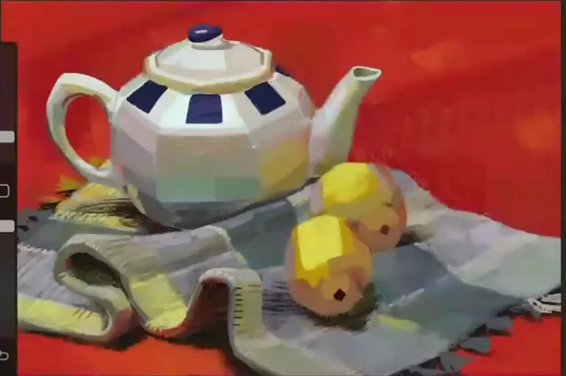
Generalization and finale
Towards the end, I constantly move the picture away and check everything at once for color and tone. When you go over the tone and color on all the planes, almost nothing remains of the base fill, a clear structure of the form remains. The foreground is the most detailed, further towards the background everything is calmer. Somewhere I increase the contrast, somewhere I mute it, and the still life comes together into a single, lively work. I would even leave it at that.
Common mistakes
- The teapot is drawn too small. The main object should occupy more than half of the canvas.
- They pay attention to the mass of the lemons and forget about their arrangement. Objects should work compositionally, diagonally.
- All colors are bright and saturated. They overpower each other, you need one dominant color, and the rest should be muted.
- The shadow is as saturated as the light. Make the shadow less intense and different in warm-cool tones.
- The folds of the drapery are the same, evenly spaced. A lively, uneven rhythm is needed.
- The foreground merges with the background. Increase the contrast behind it, otherwise the focus is lost.
- Rushing into details right away. First, focus on the big shape and major relationships, then add the small details at the end.
A final word
Knowledge comes only through practice, there's no point in just sitting and watching, draw in parallel. A trained artist's eye sees and notices much more than an ordinary one, and it is trained through work. If you want to grow in painting, look at the old masters: Klimt, Dürer, Leonardo, Brughel, Chagall, learn the mood from the Impressionists. Draw your still life and send us your work for review. Good luck and beautiful colors to you.