How to draw a landscape
Learning to paint landscapes from scratch: a close cool palette, the 60-30-10 rule, large shapes and silhouettes, night sky, moon, spruce trees, and foreground grass. Step-by-step video lesson by Azat Nurgaleev in Procreate.
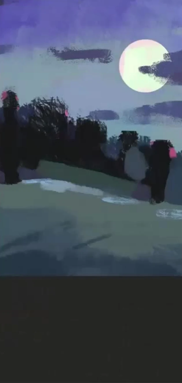
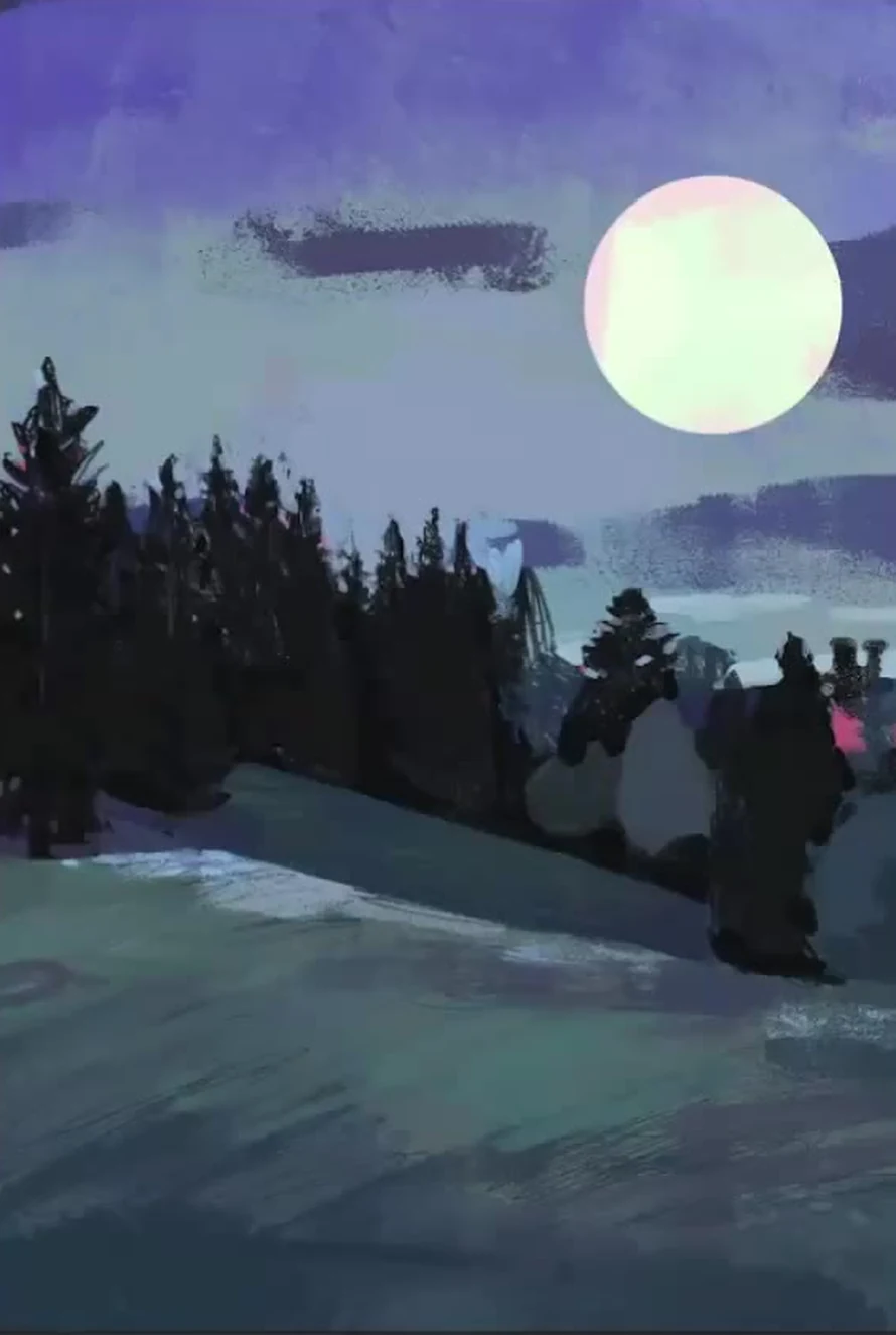
Hey ho, friends. Today we're having a date with painting: we're creating a night landscape with a big moon, spruce trees, and a meadow in the foreground. I'm painting in Procreate on an iPad, but the principle is the same everywhere, so feel free to repeat it either digitally or with gouache on paper. The main thing I want you to take away from this lesson is that a beautiful landscape doesn't rely on small branches, but on large shapes, tone, and palette. That's what we'll be focusing on.
Our entire work is in a close, cool palette. It's night, everything is muted, everything is through gray. If you remember only one rule, let it be this: don't go for saturated colors. Take a color from the middle of the palette, not from the bright corner. A saturated blue in a night landscape will ruin everything, and you won't get a beautiful painting.
What you'll need
Procreate and a stylus, or any tool you're used to. I use three brushes. The first is a hard brush with a sharp contour, textured or round, it doesn't matter, the main thing is that it's not soft, like from a spray can. A sharp contour is needed so that the shapes are readable, as if we were working with a real brush. The second is a small textured brush for grass and pine needles. The third tool is a finger, I use it to smudge the sky and gently guide the clouds. I also keep an eraser and an ellipse tool handy, it will come in handy for the moon.
Reference and palette: don't copy the photo
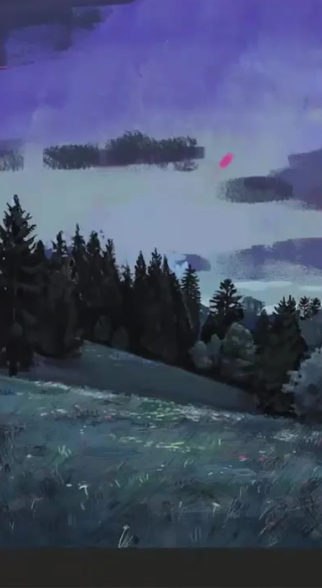
I took a photo with a big moon, dark spruce trees, and a meadow, but I'm not painting strictly from it. A reference is a push, not an icon: I change the composition to suit myself, add my own clouds, move the moon where it works better. I immediately decide that the whole picture will be cool and close in color. Nature is generally the most generous thing, it gives all the texture and all the trigger, but you need to look at it like an artist, not a copier. So first of all, I don't grab for details, but look at the big picture: where it's dark, where it's light, what's more in the frame.
Underpainting: a warm base layer under a cool night
Before applying the cool night colors, I cover the entire canvas with a warm tone. I use orange, playing with shades from reddish to pink, and paint the entire background. Why a warm underpainting for a cool night? Because the cool layers on top won't lie flat, and the warm underlayer will show through in places. This creates a complex, lively color instead of a flat wash. Later, I even transform the underpainting from orange to pink by adjusting the tone and saturation, it's more interesting that way. And where I want to add a reflected color, I simply punch through the top layers with the eraser, and the pinkish warm tone shows through. Keep this in mind for the entire lesson: a warm underpainting is our secret helper.
Large shapes and the 60-30-10 rule
On a new layer, I start placing the main shapes. There's a rule that never fails: the proportion of shapes is 60-30-10. One tone dominates the frame, more than half, the second is noticeably less, and the lightest one is just a little. In our landscape, the lightest part is the moon, there's not much of it, and that's why it stands out. If you spread the shapes evenly, the picture will become static and boring, there should be no equality in the composition.
I paint the sky with a blue-violet color, lighter and more violet on top, and a grayish-blue haze lower towards the horizon. I use more sky than land. My grass is not green as we usually know it, but gray-greenish-blue, and its tone is dense to cover the warm underpainting. I decide the trees with a dark dense mass right away: in the shadows, they go into violet and reddish, it's more lively than just black-green. And I throw all this down with large masses, a large brush, no small details at the start. First, we need hard, clear shapes, we'll blur and refine later.
Related courses
All courses
Book illustration: The first page page
9 000 ₽3 900 ₽
Векторная иллюстрация для начинающих
15 000 ₽12 000 ₽

Character Concept: My First Hero
10 000 ₽4 500 ₽
A little trick for tonal variety: I duplicate the bottom layer and shift the copy down. This creates another tone, and the frame doesn't fall apart into two identical shapes. And I immediately think about the planes: I make the distant ones cooler and bluer, and the closer ones denser and more contrasting. This is the aerial perspective that makes the landscape have air and depth, not a flat picture-collage.
Trees: Silhouettes, Rhythm, and Different Heights
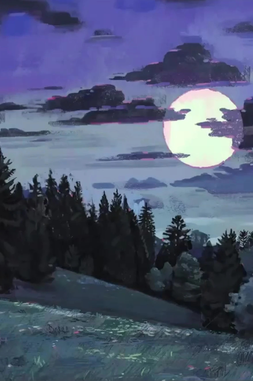
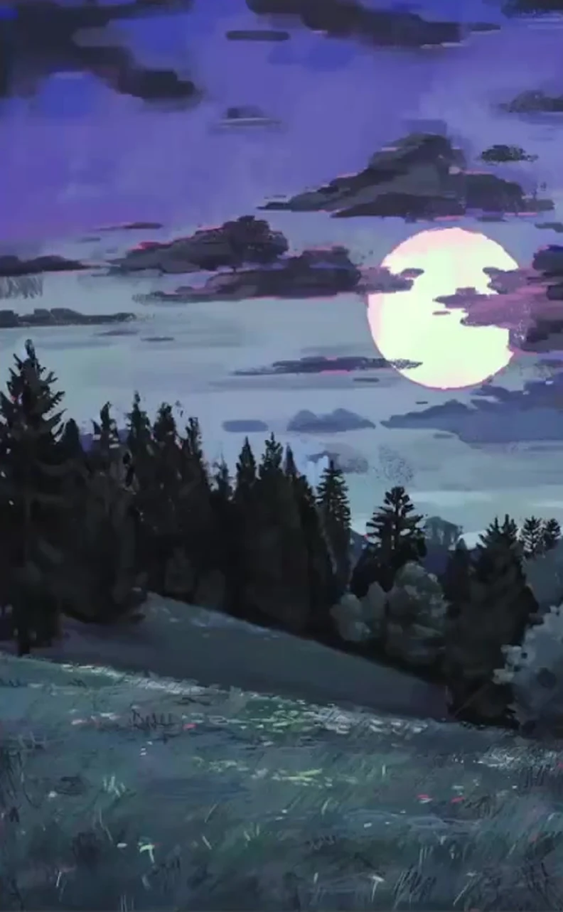
I paint the forest as one shape and preserve its silhouette. When there are many trees, individual branches don't matter; the overall line of the forest is important, and that's what needs to be refined. At the same time, spruce trees can't be made the same height, otherwise the work comes in for review and all the trees are uniform. In a living group, each tree has its own height and its own hierarchy: some are taller, some are shorter, some are just little ones. I find the trunks of the spruce trees, dig down to the inner clearings, and use the eraser in some places to make the silhouette broken and lively. I always thicken the shadows near the trees, so the space becomes visible. I keep the edges of the forest firm. And another important thing about composition: we don't place the forest line exactly in the center. Equal space above and below creates stasis, and it almost always loses. It's better to shift the horizon slightly below the middle.
Foreground and grass
A meadow is a place where it's easy to mess up the tone. A common mistake is using a tone that's too light, which stands out and disrupts the picture. The light tone should differ from the dark one just slightly and fit within the overall tone. My darkest and lightest tones on the grass are almost next to each other, and only the flowers are a bit lighter. I'm very close to how Andrew Wyeth worked with grass, and I proceed similarly: I apply texture with a small brush, strokes in different directions, creating a carpet of many strokes, and smudge some areas with my finger. The grass should be styled differently, with its own attitude, not combed in one direction, which is what makes it a lively mix of herbs. At the junctions of dark and light, I use a pink reflected color from the underpainting with the eraser, and I scatter the bluish flowers sparingly as accents. Closer up, they're larger; farther away, they're smaller and more sparse.
Sky, clouds and moon
I draw the moon on a separate layer using the ellipse tool to make it smooth. Its color is very light, greenish-yellow, with some pinkish tones along the edge, but overall the moon is cold. I don't leave the edge hard and cut out: I go over it with a pinkish stroke so that the moon fits softly into the sky. I don't draw the clouds as in the photo, I make them my own, and always in counter-movement. Look: the main movement in the grass and masses goes in one direction, so I lead the clouds diagonally in the opposite direction to balance the frame. This is the basics of composition, and it should be thought out at the very beginning, not sought at the rendering stage. I draw the clouds themselves with my finger, with soft touches, unlike the harsh forest. I place small clouds next to large ones, the contrast of the masses gives beauty. I collect each cloud from bubbles and think about which one is bigger and which one is smaller. And I don't just copy the sky, I redraw it wisely, slightly stylizing it.
Detailing and the final stage
Now that the silhouettes and major relationships are established, we can afford to add details. In the beginning, we deliberately avoided getting into the small stuff, but now it's time. I go over individual spruce trees: looking for twigs and triangular brushes, building up volume within the silhouette, each tree has its own shape, one is powerful at the top, another has sparse areas at the bottom. On the blue trees, I make the shadows more purple and dense. By this point, I also refine the clouds: against the moon's backdrop, they become lighter and pinker, while at the edge of the frame, they go cold. Then I bring everything together, step back, and look at the picture as a whole, from a distance, as in traditional painting. If something stands out in tone, I tone it down. And in just a couple of hours of calm work, we've got a complete night landscape.
Common mistakes
- Intense colors at night. Take the tone from the middle of the palette, through gray, otherwise the painting will fall apart.
- Missing the tone on the grass. Too light a tone stands out and tears the frame, keep the light close to the dark.
- Trees of the same height, even, as if selected. Different heights and ranking within the group are needed.
- The forest line is right in the center. An equal amount of space above and below creates stasis, shift the horizon away from the center.
- Branches at the start. First, create the overall silhouette, add details only at the very end.
- Copying a photo one-to-one. A reference is a push, adjust the composition to suit yourself.
- Giving up when it seems like it's not working out. Most often, you just haven't persevered enough to achieve the result.
A final word
An artist is a person with a very large reserve of patience: learning to wait and work, wait and work. The muse comes to those who work, so start without waiting for inspiration. If during the process it seems that the picture is not coming together, don't give up, persevere a little longer, and almost always the situation changes. And when you've painted your landscape, send us your work for review. Good luck and beautiful painting to you.
Clouds are the heart of any landscape. See a separate guide on how to draw clouds with volume and coloured shadows.